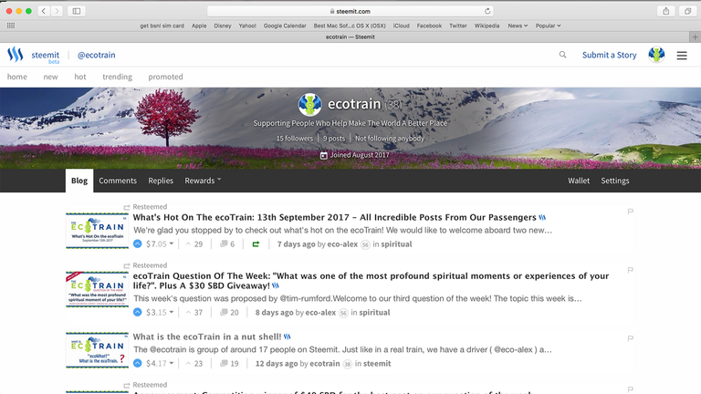
Since the new banner image feature was brought in, we have seen a lot more colour and personality brought to our Steemit home pages. Many of us will be familiar with using a header image from websites like Facebook, where it is very easy to just drop in an image and Facebook takes care of the rest. Steemit is different!
We have our Bio Information on top of the image we choose to use. This means that readability can be an issue if the background in the middle of the image is too light. Whilst Steemit did add a small dark drop shadow to our bio-text, in many cases text is quite hard to read.
I've been a web developer and designer for nearly three decades, and so with a bit of experimenting, I figured out how to do this properly. So, I'm very happy to have something really useful to share with you! I won't be focusing much at all on design, that is up to you, but more about the technical info and the specifications that you need to use so that your banner image loads fast, reads well, and looks good on all devices!
I will lead you through a step-by-step guide using Photoshop as the image editor. You can use just about any simple image editor for this as well, and these steps will be more or less the same. So let's start and see how its done!
Please Feel Free To Use this Image as a template for this tutorial

CLICK IMAGE TO DOWNLOAD
What Size Image To Make?
The first step in creating your banner is to create a new image with the canvas size set to 1920px 245px. This size will give you a good quality and resolution on all devices, including Retina Displays. If you really want your banner to 'pop' you could make it even bigger. If you want to keep the quality up, you therefore need to use an image that is at least 1920px wide. If you use a smaller image, Steemit will resize it to fit the width of the screen and the quality will reduce.

Things to consider before starting
Before you can start designing you need to know a few design points:
- General landscape photos or images without a specific object to focus on work the best. The reason for this is that we are all looking at Steemit on different screen sizes. This can cause issues where banners with an element at the far left of the image will be cropped out for people using smaller screens. Therefore, if you want to include an element that more people will see, consider putting it around 350px from the left or right edges. Also try not to put elements inside of the 'bio-text' area as it will be obscured and may make the text even harder to read!

- On mobile devices people will only see very center of the banner and wont see any design you make outside of that area. This is unavoidable, but worth remembering!
Choose your background!
You can choose an image OR you can have a solid filled colour or gradient colour. I have used a nice image of nature. Notice how the tree is in a highly visible area! If you start with a high res big image you can even resize it down until the objects you like appear in the right spot!. You can of course add your own elements on a different layer if you are being creative! Also please notice how the text is not very readable now!

Create a cover layer for readable bio-text
To ensure that your bio-text is readable with whatever background you choose to use, you should create a layer that helps to darken the bio-text area a bit, as follows;
- Create a new layer
- Select the square marquee tool and enter a feather of 25px. You can use a higher number like 50px or 75px if you want a more subtle blending.
- Select an area just outside of the inner bio-text lines
- Fill with solid black colour
- Adjust the opacity to around 50%. If the image you are using is very white you may want it darker so the text really pops. You can see with my image how much easier it is to read with this cover layer in. It looks a little weird without seeing the actual bio-text in place but once you upload it you will see it looks perfect!

Optimize Your Banner Image (PNG)
You're nearly there! Now just to save and optimize your image. Save this banner image as a JPG or PNG file. PNG is better quality, espeically for fine details and small text.
If you do use a PNG the final step will be to optimize this image to reduce the file size by at least half. or more. This helps loading speed, which can prevent delays in reading any bio-text as the image loads.
There is a fantastic on-line service that will take your PNG and at least half the file size without any noticable loss in quality. You can simply upload your image and it will convert and let you download the new one.
Host Your Banner Image
Once you have your new image you will need to have it hosted so that you can enter the URL in your Steemit Settings. You cannot drag and drop here like you can in your post creation form. I use https://postimg.org which is free and works REALLY well! Just sign up for an account, upload your image, and grab the Direct Link URL.
Change Your Steemit Settings
Finally head to your SETTINGS tab and add your copied URL into the COVER IMAGE URL field.
You're done! Enjoy your new looks!!!
If you are trying this and need help feel free to ask me in the comments and I will help as many of you as I can.
If I had to make any simple recommendations to @ned, @dan or the Steemit developers, I would recommend that you place a semi transparent dark PNG background image under the Bio-Text. That way everyone can read the text while the header image is loading, and also still read it whichever image they put in. It seems that the drop shadow that was added to the bio-text is not enough for clear readability in many cases.
Imagine my delight to witness another of your talents and possibly a passion. Technical material is likely the most difficult subject matter to write cogently and interestingly. Furthermore, you expressed yourself as if I were sitting across from you. Thank you for the information and the great job. Be well.
i DO love this comment! thank you mr Roberts!
This tutorial was really great. Thank you for posting it!
@davemccoy I think I found the perfect instructions to do the header image :)
thank you @amariespeaks ! glad you found this post! it is an old one now, i wonder how you discovered it!?
oh, I used the steemit search hoping to find a post about the best header sizes to use on here and your post popped up :) some people think that search is useless but I always use it lol
I love a good tutorial - especially if it helps to sharpen people's image on SteemIt. Thanks for sharing this! Upvoted and Resteemed.
thank you! really happy i did this.. !
Some very useful info Alex,its great to add a personal touch to our page. You've got a nice header. Thanks for the info
thank you jason! glad u found it helpful! I hope you make a nice one with this template!
I've been wanting to do this lately - this info is invaluable! Thanks!
@eco-alex, thank you for this! I'm not a wizz behind the computer but going to show my husband this info. So he can change the banner for me :D . Again tnx!
great stuff! i hope you have a nice image!
Wow. I just went through the pain of trying to do this. Took me 2 hours. You should have posted this 2 hours ago
lol, i tried to write as fast as i could! ;-)
A very useful step by step guide! Thanks for sharing. I'll definitely try this out to modify my profile banner. ❤
thank you! best of luck!
Again upvoting your post.. :)
thanks! again!!
Thank you!
This is a very good tutorial.
Great Post!!
i just wanted to thank you for this great howto! i followed your template and used Photoshop, and here is the result! How do you like it?
oh nice one! Thanks for letting me know.. makes me happy when people see and try out my tutorial.. I see you are also using this amazing plugin for Steemit.. i am also,, its too good!
Yes I like the plug in. It had been a while since I used photoshop but it all came back to me!
Thx again
that image is amazing.. lol WHAT colour! and you followed the instructions well i can see!
Congratulations on the contest win!!Great info @eco-Alex and I think your work deserved it and I'm glad @jerrybanfield has a sweet upgrade from that default banner 😉
STEEM ON!! 🔥🚀
thank SO much for that GREAT comment grow-pro ! glad you like it.. i wasnt sure when i posted it.. but with a bit of tweaking it is nice yes!
Steeming on! ;-)
@eco-alex, could you possibly post the header image with just the bio shadow? I don't have Photoshop, so I've really no way to parse the elements in the .png. I do have software where I can layer that into my header though. That shadow looks real nice.
but what about on smart phones?
it will show the center area of the banner on smartphones..
oh ok. cool, thanks.
Exactly what I was looking for! +1
UPDATE:
The darkened Area behind the Bio on the Image File is no longer necessary.
Inbetween of the Header Image and the Bio, Instead of a slightly darkened Background, that's still too light to make the Text readable, in most Cases,
there's now a very dark, but good-looking Drop Shadow instead,
that does a excellent Job of making the Bio clearly readable, even on the lightest of Backgrounds.
So a darkened Background for the Bio integrated in the Header Image
is no longer necessary.
thanku for great knowledge...