Hey there everybody ! Well I just noticed the nice changes to the Steemit front end and I have to say that I really like what I see !! I did a post awhile back talking on the points which I felt could be addressed and it seems now that they have been been rectified ! This is nice really to see, so well dont Steemit.Inc ))
Firstly I love the vectorial buttons which have replaced the old blockstyle buttons which I found a little rudimentary and lacking the sort of finishing in esthetiques which this high end product deserved ! I also like very much that the main menu now is centered and the rollover colour issues have been addressed and there is now a homogenuity to their change in colour ! Something which before was not the case !

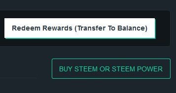
I notice that the "sign up" and "redeem rewards" buttons are still this big " clunky" old school block style design, maybe we could have this take on the same form as the "Buy Steem" vectorial button we see in the wallet section of the site, but having said that would be nice to see the rollover change in colour action here too no ??

Other than that I think the look and design now is really fabulous and could not be much better ! Also the toggle for the "Night Mode" is a very welcome addition and is certainly great when one is working long and hard on a post in the early hours like so often I find myself ! )) So yeah brilliant work guys !!
So with all that said, Id just like to really thank the team at Steemit for these very nice, small maybe ?', but important details taken into account and rectified in a way which I must say fits perfectly the product we are selling to the world !!


So Steem On Everybody, Lets Take this Amazing Blockchain of Steem Exchange and Reward to the Moon !!
I agree. It looks good.
But still people can take my reputation down and bandwidth issues at Steemit.
This great information I appreciate your crytocurrency news..thanks for sharing..
yes yes youre good