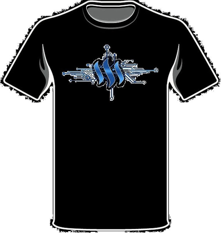
Yeah the size was completely arbitrary, as I was using MS Paint (ahahha). So it was more about the concept.
Actually for arguments sake lets see the blue on black on black....

Super basic, crappy MS paint version of the regular logo on blackground. Ignore the quality (and size) of the logo. Just for conceptual color purposes.