When I was a "Newbie" here all the figures and numbers were kind of confusing, especially when it came to the user levels and so on.
As with everything in life, these figures are not there to "label" people, but rather to exemplify achievements, to add an easy to follow method of monitoring your own achievements
Somewhat like at primary schools when we were rewarded with "Golden stars" or other types of visual aids to exemplify our work and efforts, our dedication and likewise some sort of visual reward that everyone can see and look up to and aim to achieve too one day.
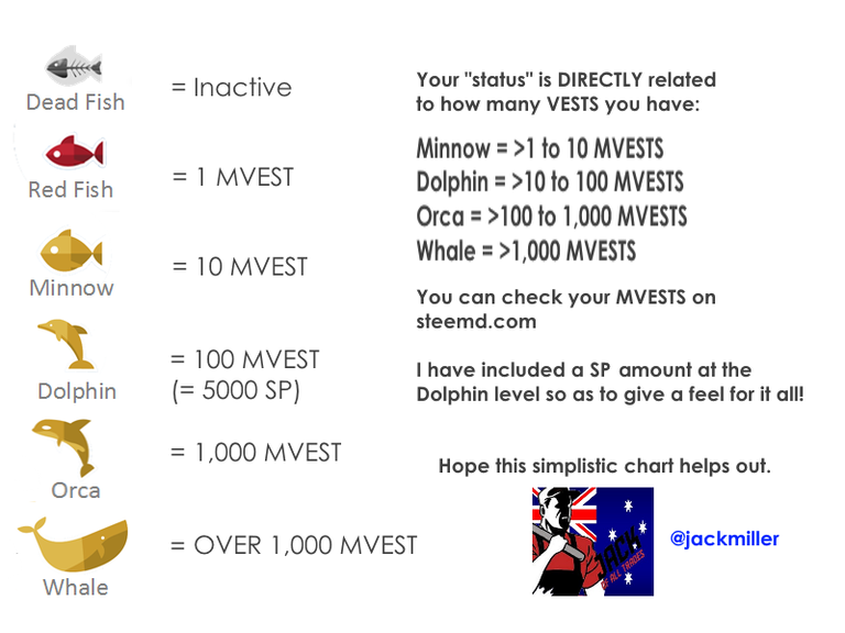
So rather than talk about how these "levels" work and what all they mean, what I want to do is to lay it all out nice and simple here in a makeshift chart I put together for all our new members on Steemit.
Here it is:

So the next time you hear the term "Minow", "Dolphin" or "Whale" it shall all make sense.
I guess a picture can replace a million words!
So to say! :)
PS. I have edited the picture above as per the notes in the comments below, so as to ensure that it be more effective in relaying a clear and precise message.
This was the original "chart"
As you can see through the comment thread that it was a little confusing, so I have edited it to the version that can be seen in the post now (and which is below in the bottom of this comment), which has minor edits, yet it makes the entire message much clearer.
I chose not to convert MVESTS to STEEM POWER (SP) as the calculation is in MVESTS and any other figure could be misleading in the event things were to change one day.
I have as is seen included a SP amount for the Dolphin level, which is there as stated "for a fell of things", so that new members can set themselves a goal straight from the beginning "From Minnow to Dolphin" and they know that it is at the 5,000 Steem Power level in their accounts that they can expect this.
I thank everyone who contributed to this discussion, and if anyone out there gets inspired to make some better charts for all new members of Steemit, then I have achieved my task.
I am not a graphics designer, but I felt that if a chart as the one above was there when I first got here, it would have made things a lot easier to understand.
Thanks again, to everyone who pitched in.
FINAL VERSION:

Wow Thanks for the exciting post. I also had that problem at school. Thanks for enlightenment and the Picture did replace a million words.
Great display of levels in form of marine life. I wonder if a newbie would understand what a vest is and what MVests means.
It's a great post. There is room for more information. Perhaps, I write longer posts that's why. You are the best judge.
Good work and keep it up!
Yeah I see your point, I guess that is why I decided to put the SP level for a Dolphin, just to give a basic guideline of how much Steem Power (SP) it equates to.
Or maybe I'm falling into the trap of using terms that I too am getting familiar with and not going back to the days when I started....
steemd.com comes to the rescue, everyone can check their MVEST level there, so it shouldn't make a difference if someone understands the term, as long as they can see where they are at.
This was important to me when I started, finding out "Where I am with the figures, not so much as to what they were", then again, I was totally new to everything here, from Crypto to blogging.
I'll sleep on your point and see how I can possibly improve the chart and post it in a comment here...
Thanks for the constructive criticism....
PS. This comment is literally me thinking out aloud..... and sharing what went through my head after reading your comment!
Nice pictorial Jack.
Knowing the levels helps people set goals for growth.
A good graphic is worth it's weight in gold. Well that one doesn't really work:/. Thanks for sharing this as I always forget the cutoffs for each "rank".
If I put a nice little Stars and Stripes on it, would that make it better?
:)
That would help a lot!
Couple of issues with the image, but it's a great start. I know I was confused about the fish names and levels and MVests when I first started out, and more information is always good.
Left column refers to Red Fish, while the right calls them Plankton. I've heard both terms, and pretty sure they're the same thing, but clarity is useful.
Left column is a bit misleading, giving the upper limit of each category, and the overlap of being on one of the dividers (1 MV is both a Red Fish and a Minnow for example).
I'm assuming that the Dolphin SP listing is for the bottom of the category, rather than the top as it implies on the image. I base this on my figures of ~500 kV and 260 SP. If 10 MV = 5k SP, then 1 MV would be 500 SP, which works.
Great start, and something would have been nice to see when I started out.
This should fix that, I think