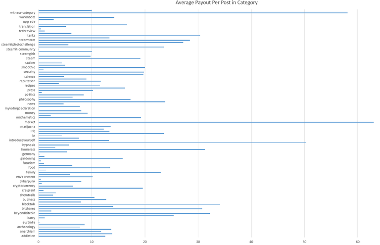
The following chart analyzes the total payouts that posts in each category get.
The chart below shows the percentage of posts to payouts. More orange means more money per post, more blue means less money per post.
The next chart is a bar graph of the average amount of payout per post.
Here is a table of the average payout per category, organized from largest to smallest.


Great post!
Thanks!
Nice graphs. I've done some similar things in my past two posts. It'd be really nice to see the data/code you used to create these graphs.