I believe Steemit will benefit from a gamify theme. Besides the fact that it creates a more visually appealing concept, it can entice the Steemian to engage with various aspects of the platform that might appear difficult or hard to understand. The UI is designed to work for everyone.
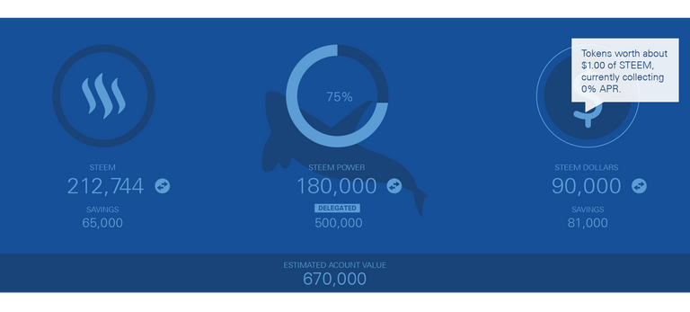
Powering Down indicator/clock function. Mouse hover provides info.
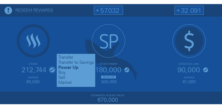
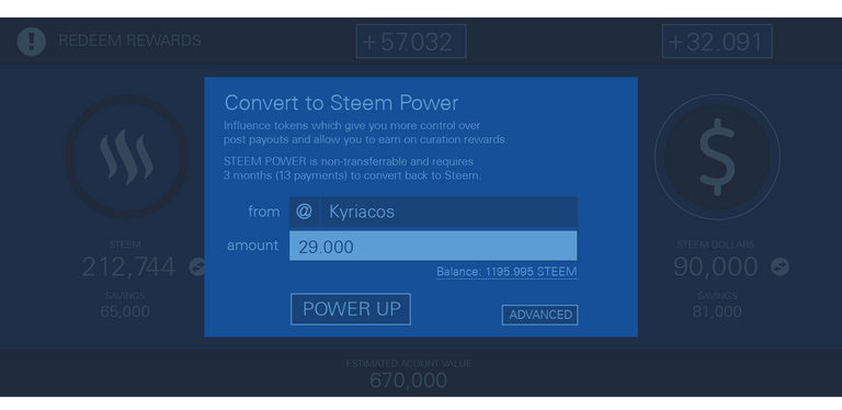
Redeem rewards will appear on corresponding area. Exchange buttons provide menus.
Feel free to add suggestions/recommendations in the comments.

Also maybe have an option to share an image of the wallet to other social media platforms.....Sure if facebook users saw that mock wallet above^, they would shit themselves and sign up lol.
lol. or get scared away
I think once people start understanding cryptos the steemit platform is going to compound ten fold.
yeap!
That is great design work brother, only if we can implement that on UI now that would be awesome addition :)
indeed!. thank you man
Looking forward for these upgrades to be ready. Will simplify things
Some one please help me!!
I'm just beginner in this association, i've join to this association 2 days ago. My topic is about YuGioh Duel links. it's themed about card trade gaming.
May i know? Can you tell me why every time i post some thing it's can not to reach $4. I hope some day my post can be a trending.
Thanks for all of you who have taken the time to read my comment.
Love you all steemit fellow
Yugioh Duel LinksFollow my steemit @akun2017
This guy akun is complete spammer. He posts identical comment everywhere, then upvotes it with his ~10 accounts.
Ah... well there may be a few reasons.
Firstly, perhaps the YuGioh player crowd on Steemit is small? Or perhaps they generally lack much impact per-interaction?
Another possibility is that your posts about YuGioh might lack a secondary appeal for non-players? I am not sure what that would be - maybe anime-style art or a pro-layperson-spectator element - but maybe those who do read your posts aren't feeling sufficiently engaged.
I am a beginner with no posts - so take my feedback with a pinch of Steem. :cP
Nice work! That is a really cool design!
thank you
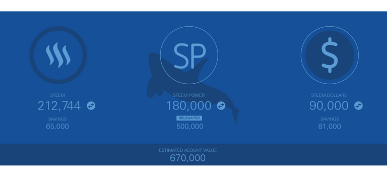
Really cool idea. The whale icon behind 'SP' could also change from a minnow up to a whale depending on how much Steem Power you have :)
yeap. that' s the idea
Nice. Good work :)
thank you
Good idea!
This looks really good,
I would add a rewards distribution bar for distribiting rewards between SP and SBD. Currently it is confusing where you set your rewards distribution, and this would be a good screen for it.
I would suggest implementing an embedded Shapeshift function and bitcoin/litecoin/dash/ethereum/ripple. This would require some additional code, but it would open up an easier conversion to Steem. The negative of this would encourage rapid movement of liquidity from the steem account, but Steem is already protected against this by its use of Steem power and the power down function, so this would only encourage people to use their Steem account more.
The rewards distributions are automatic.
the shapeshift function sounds interesting.
What i mean by rewards distribution are how much goes to steem power, and how much goes into SBD. you can change this with each post... you used to be able to set a preference somewhere, but i cant find it now.
its only 50/50
Beautiful design, we need this on steemit.
Very much needed in this wallet!
hopefully
It looks really cool, a good addition could be some mini games, I am not sure what, it needs a little bit of thinking but gamification without games, achievements and leaderboards is not possible =D
Yeah, icons and budges will slowly be incorporated. For example you can see the shadow of an orca in the background. fish, dolphins and various other sea creatures could come into play. This is only the first glance.
Beside cash , Leaderboards work very well for motivation purposes.
Very nice design. I want it!
:)
I like this is a very nice and clean looking wallet
thank you
Very good job kyriacos!
thank you
The design looks fantastic. :) I think that this user interface face lift is a good idea as it will make the platform easier to use. My suggestion is somehow integrating more in-depth tool tips or informational help would make the platform easier to use. It would be beneficial to someone who isn't that technically inclined to begin learning how to work with the platform.
The pop-up icons could be rendered to provide more information and even provide links in youtube videos with step-by-step explanations.
Is this available yet?
no, this is just concept design.
This is a great concept, would like for it to be implemented. I pledge my support right here.
thank you
Wow looks amazing..... Would be beautiful it comes live :)
thank you
are you able to shift to other crypto currencies, directly through the wallet, without shapeshift? That would be awesome.
no but it would be a really good function to have
beautiful design, I want to see it working
let's hope so.
The UI looks awesome. Cheers
thank you
this should be added
let's hope so
I'm sold, how do I get one? lol
well, so far you can't! :)
That looks really awesome. Would you envision someone building this as a 3rd party service via API or do you think the steemit maintainers will pick this up?
Thank you.
Hopefully they can pick up on this. Maybe a developer can do this as well. We will see from the responses.
I Like it. Great work
thank you
looks great
thank you
Wow that theme looks awesome! Yeah I think your onto something. Haha who do we need to talk to to make this happen?
And wow just a side note but my upvote made a pretty significant increase to your the post payout, is that what my increased steempower does that I bought yesterday?
Yeap! partially it works as an investment. If my post collects a lot of rewards you will get a portion back.
Yeah, one of my replies yesterday on someone's post netted $7...and it was a simply reply. That was day one on Steemit. After trading cryptocurrency's for a short while, I finally stumbled onto this gem of a platform.
None of my other replies have netted much, nor my posts that I've put quite some effort into though, so it's all a bit confusing.
it is not much but it aggregates a lot in time. You just have to spot good content
I like it as well how can we implement it?
hopefully in one of the upcoming forks
Welcome to the blockchain guys.
I just love it @kyriacos please do this to everything!
e..e...verything?
thank you man
The entire UI.
:)
biiig task :)
Really cool design!
And I completely agree, the fundamentals behind Steemit are very solid, but the design/aesthetics lack in quality still. Adding gamification plus a cooler design will surely boost the number of active users.
let's hope so
Looking good! I'd prefer more contrast for readability, but I can see what you're going for here.
it will be double the size...the posting space here is kinda narrow. almost impossible to display
Love it!
thank you man
It looks awesome man! Love it :)
I like it, though the colours of font and background maybe a bit too close to each other; Low contrast. I particular like to inclusion of the power down.
And where you can see this app?
it's a concept design
Understand=))))
This looks like a pretty cool idea... I hope it becomes a reality.
thank you
Coudnlt agree more. Gamification is "the" next big thing!! 👾
yeap
oh wow this is looking great!
thank you man
this looks really good! UI design goes a long way with keeping users engaged and something like this will definitely make things more fun for new users to interact with and explore.
as i joined just about a week ago, i'd say just the tooltips would be a great addition to our current UI. small and simple text messages to explain briefly what all the terms mean, etc.
great.
love your icon. i forget the anime i saw it from :)
i just remember it was an evil hacker.
it's from ghost in the shell! it's the icon of the "laughing man", definitely my favourite character in the series
oh yes! my favorite anime
This will be definitely a big chance to improve
thank you for your support
Amazing
This is lovely.
I would like the management staff to adopt this design
let's see..
WOW.... I like it :)
thank you
you are welcome :)
Great work on the design, I love the simplicity. I feel like the tabs should be more appealing off the screen. Like they're important tabs and should stick out more than the tabs on my browser! Haha! But a job well done on the idea. Hopefully the team is looking right at your post. Cheers!
#follow4follow
thank you
សូមស្វែងរកមធ្យោបាយងាយស្រួលយល់ជាងនេះផង!
អរគុណ!
That looks amazing! This would be so cool to add in a UI update.
yeap
Love the idea! Can't wait to see it implemented!
ⓐⓒⓘⓓ ⓖⓞⓓ ⓒⓐⓣ™
×ღ×ღ×
τες εφτζιές μου
This looks great.
thank you
neat graphics
thank you man
Why do you have 3 different Icon Styles that don't match? I would suggest making the steemit icon the same height as the $ icon. Meaning let the middle steem match the height of the dollar endings. Also make the $ tail lengths the same distance as the logo icon perhaps. I would then take the 12px ring as a standard for all of them and change with mouseover to your 2px white ring. And personally I'd use the same font for your SP. Like it is now, it needs a fair bit of work doing on it.
They actually do. same color scheme and typeface
it leaves too much space on the sides. Height or alignment is not the important part in a design. volume of overall design is
try doing your own version since you are an award winning designer and all. Your critique is pedantic. You simply wrote it because you got sour from the previous post.
nonetheless. I always appreciate critique. just make sure it has basis and it is a level about design 101 classes.
I'm not sour at all, i have more important things in life than keeping a grudge. But because we had a discussion, i like to try and understand how someone that obviously had an education can come up with such a... backfired topic. Nobody noticed though except me.
As for your design, it'sfine for a small company but if steemit want that A+ look then this paypalish design needs to be at least fine tuned.
Sure i can make one for you. Where shall i post it here?
your name is govegan. You are obviously not only prejudiced, you made your life a cult. I wouldn't be expecting an objective response from someone who's nickname was "go christian".
Yes of course I made my life a cult because you said being Vegan is a cult. Oh look you have a Greek name you must be Greek. That must mean that you have a narrow mentality, I lived in Greece for many years, so I know what Greeks are like. lol, Great comment, makes a ton of sense, not. I was a designer, you are a designer, so yes I was giving a totally unprejudiced view on your work, I wasn't aware that you can't take any opinion other than "great!" I think you need to learn to separate your feelings. The comment section is for others to express their opinions. I'm not going to put down anything of yours just because you're not one of my cult members, ffs get ahold of yourself. If your work is good or great or amazing I'll say it and this what you've done above is a great start but not star material for such a website. That's just a fact, not an insult.
I am not greek. I am cypriot :)
Mission accomplished! hahaha... Now try not to get your knickers in a twist as they say in the uk when I leave a comment. You don't have to agree with it, it's just an opinion. I like to debate and I like other peoples thoughts.
Is this version coming out soon? Looks good 😊
thank you. not this is just concept
lets make it happen :D
I love it! Hopefully we can get this implemented soon!
yeap
Beautiful UI! Although I do enjoy the plain white UI we currently have
thank you
Really like this concept, great job !
thank you