I have wallpapered my heart out, overthought the room layout and furniture choices, and arranged my grocery store flowers just so when the florist I wanted to buy from was unexpectedly closed. Yes my friends, it is One Room Challenge reveal time, and I’m ready!
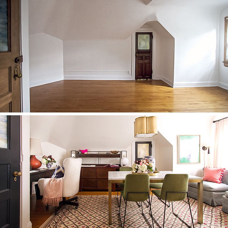
I work from home on this very blog, and I wanted a beautiful office to call my own. I’m doing more design work these days, for myself and for others, and it seemed silly that we’ve been here as long as we have (four years!) and I had yet to dedicate myself to an office proper when we have plenty of space to do so.
Shall we start with the desk? The exact place I’m sitting at right now as I type this post? Let’s.
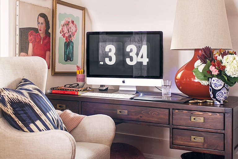
The chair! She’s so pretty! I always keep a blanket draped over the arm in case I’m cold. Sometimes I’ll keep the pillow on the chair and sometimes not, depending on what I’m doing and how mindful I’m being of my posture.
The desk is 5′ wide, so I have plenty of space for both my full-sized keyboard (I like having a number pad — probably a holdover from entering ISBNs all day for years) and my Wacom tablet. I started using a tablet years ago for art, but now I use it every day. I have problems with my wrists, and using a tablet instead of a mouse has been tremendously helpful.
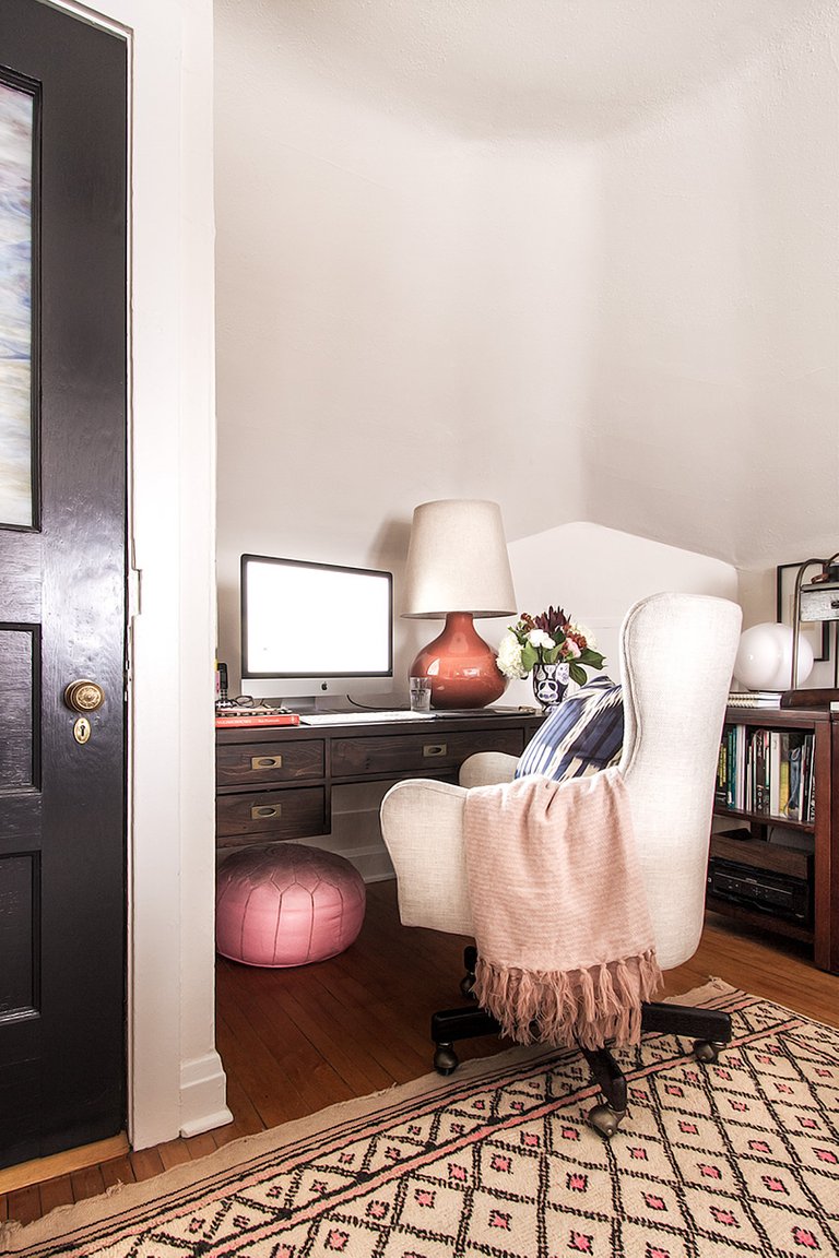
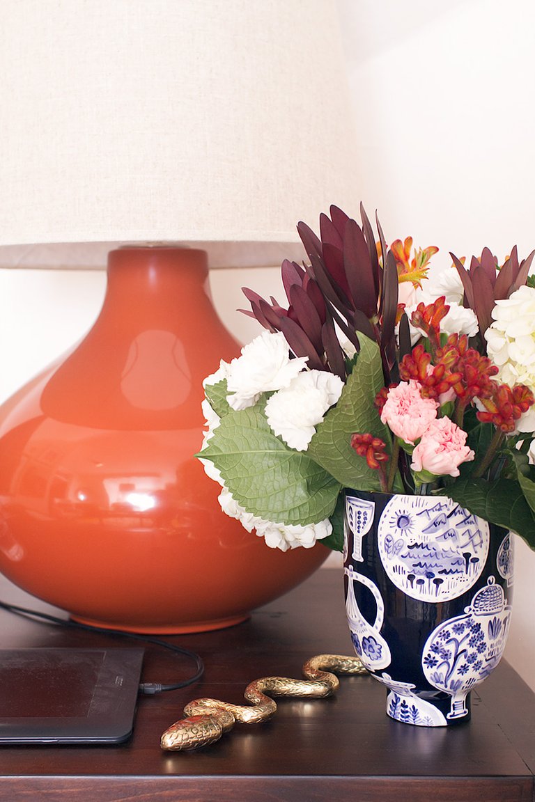
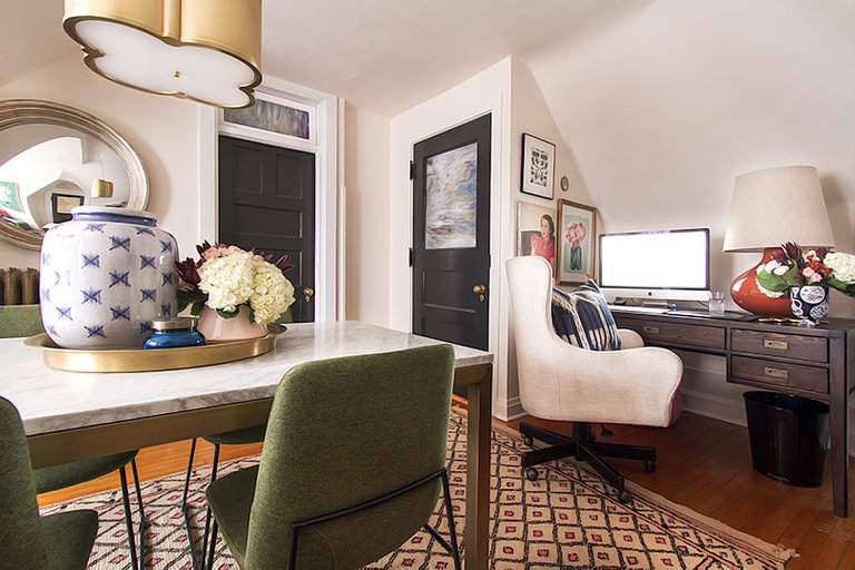
The oversized ceramic lamp was a risk with my sloped ceiling. I knew it would fit (thanks, 3D rendering to scale!), but would it look like it fit? Thankfully it looked just as I’d hoped and it balances the large monitor nicely. The vase hits that sweet spot between reverential and whimsical, and then the brass snake is just awesome. I also keep my pink leather pouf under the desk. Sometimes I sit with my feet propped up, sometimes with my legs tucked under me, and sometimes I even sit like a normal person! It’s a little ridiculous to have a Moroccan Pouf hidden away as a footrest, but eh. I already owned it and it’s being put to good use.
I took various photos with doors open and with doors closed, because I wasn’t sure which way everything would photograph best. Are you digging my vintage mannequins in the stairway?
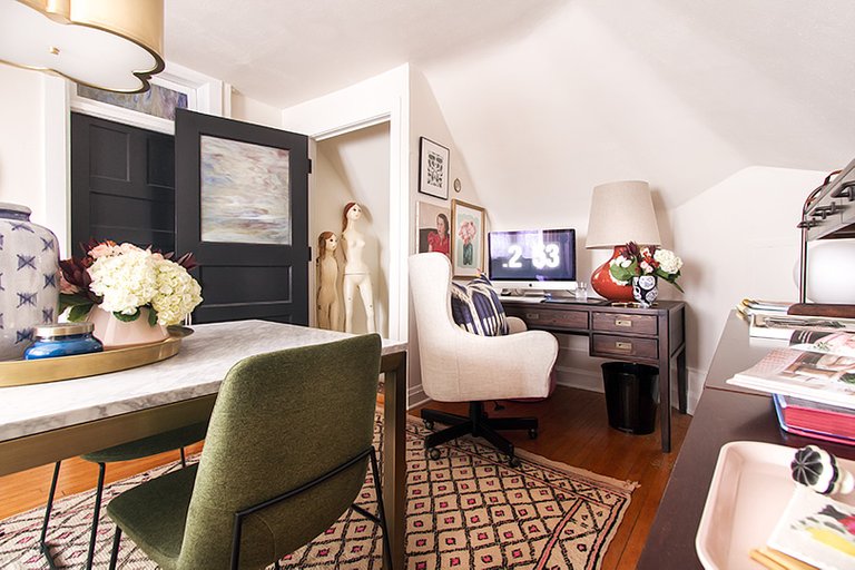
I hung a few prints and paintings on the angled wall to the left of the desk. I love the Beetles print and I chose it specifically for this room, but the the vintage portrait is from the 30s and I wanted her to grace the library. I’m stealing her for here, at least for now, but maybe things will change over time?
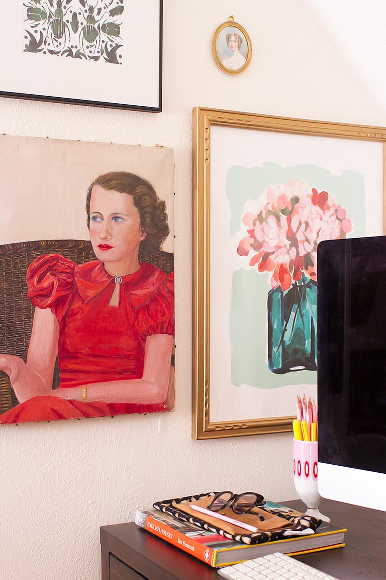
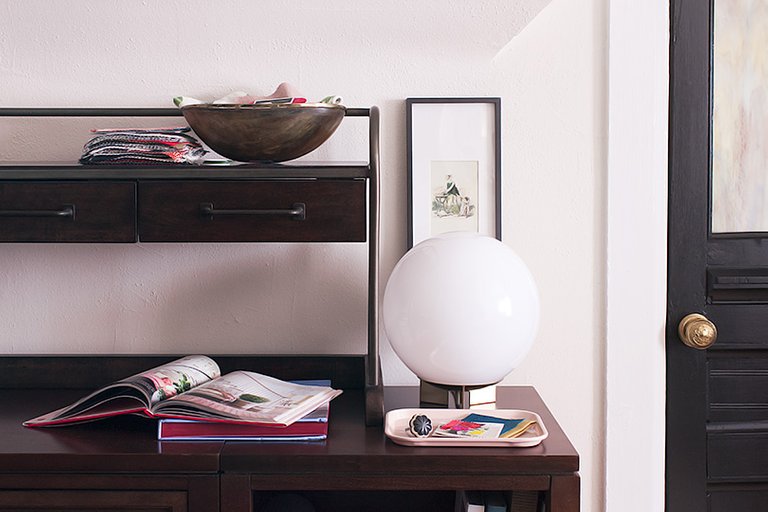
The desk has five drawers, which I lined with scraps of wallpaper that match the room’s closet. To my right when I’m seated is a long, low storage unit made of modular craft room furniture that holds my printer, trade catalogs, wallpaper samples, and more.
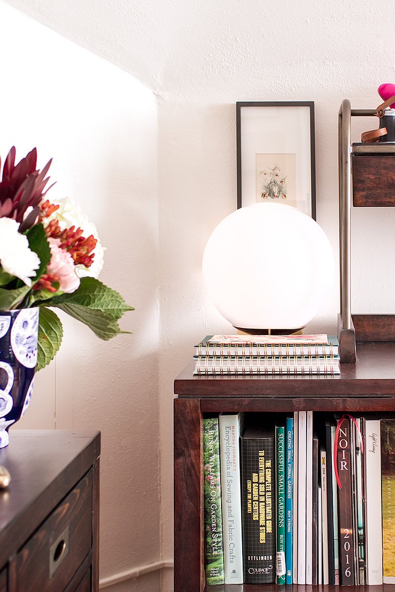
The shallow drawers in the hutch are handy for corralling both personal and client design work — paint swatches, fabric and wallpaper options, that sort of thing. I suppose it won’t be as neat when I’m juggling more than four projects at a time, but I’ve also got the shelf area above the drawers and the entire surface to spread things out on.
There is additional storage space in the closet, aka The Rainbow Room.
Someone in the comments of a previous ORC update suggested calling it The Aviary. I’m into it, but it was a quick ‘no’ from the kids. The Rainbow Room, it is. I think I’ll pick up a sheepskin or some floor pillows for them. They want to play and hang out in there, and I can’t blame them! I was always a special space, even though it’s really just a closet, and now the wallpaper makes it magical.
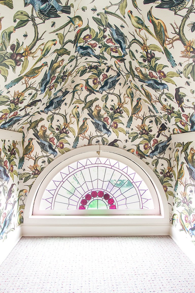
I have four walnut shelves, but I photographed the space with only two in so that you could better see the wallpaper pattern. The shelves are lovely and sturdy, and they’re already filling with fabric swatches, paint fan decks, equipment, and a nice stack of press (books, magazines, and newspaper articles I’ve been in over the years).
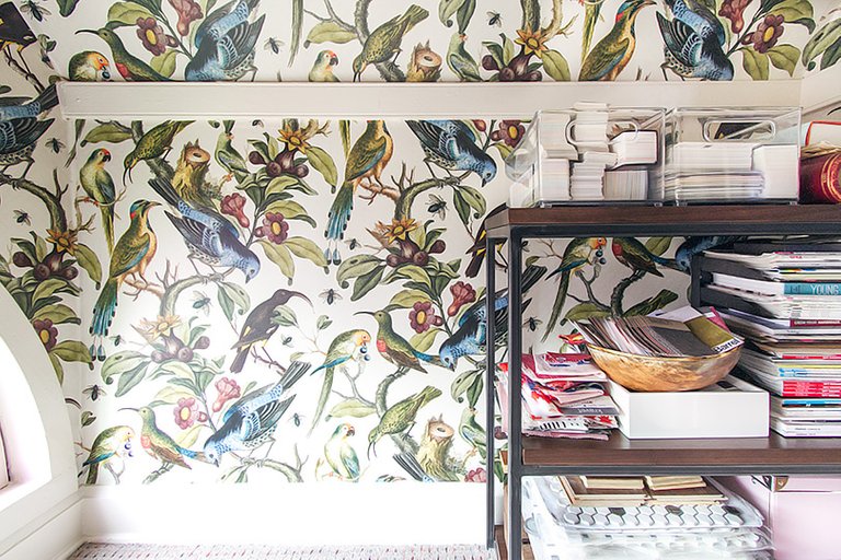
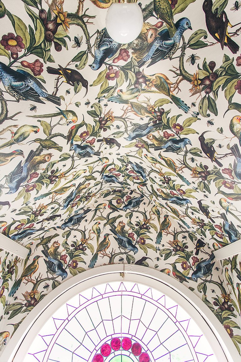
The light was just a bare bulb in a socket before, so while that little number you see peeking out below is nothing amazing, it’s certainly an improvement over what was there. I bought an inexpensive light with a pull chain, and picked up a white globe to replace the ribbed glass shade that came with the base.
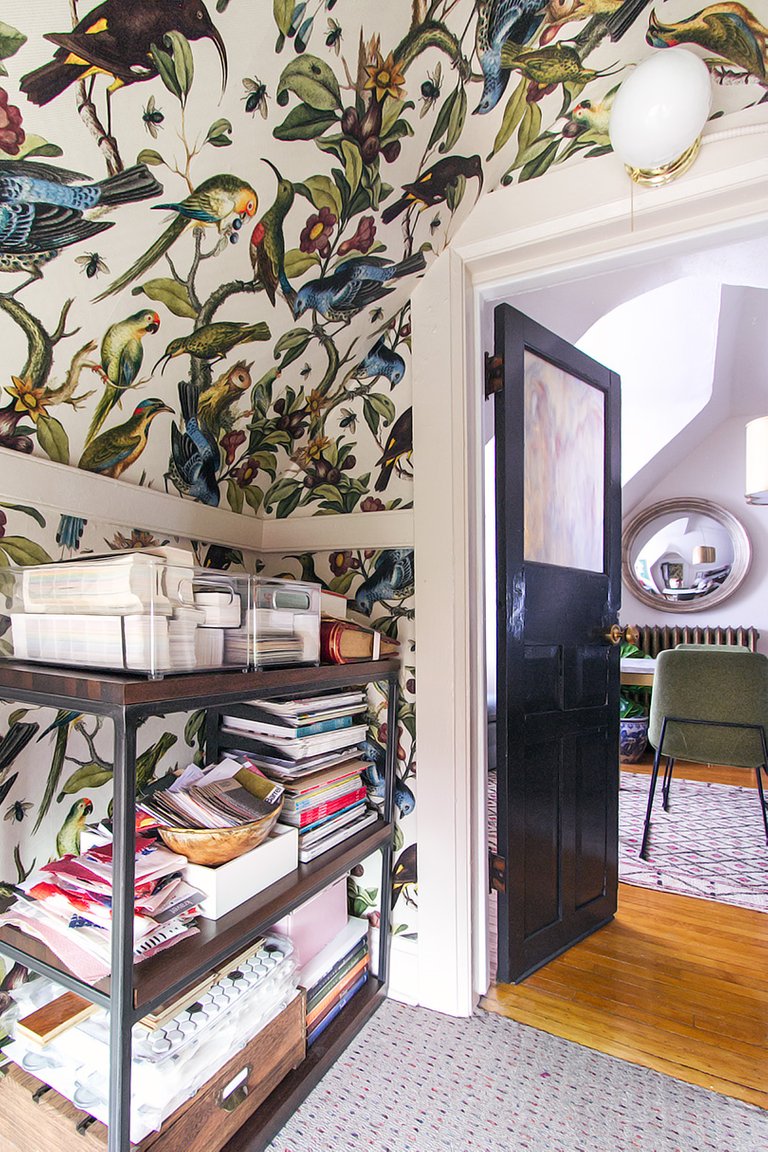
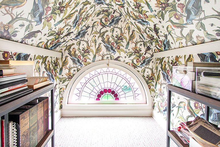
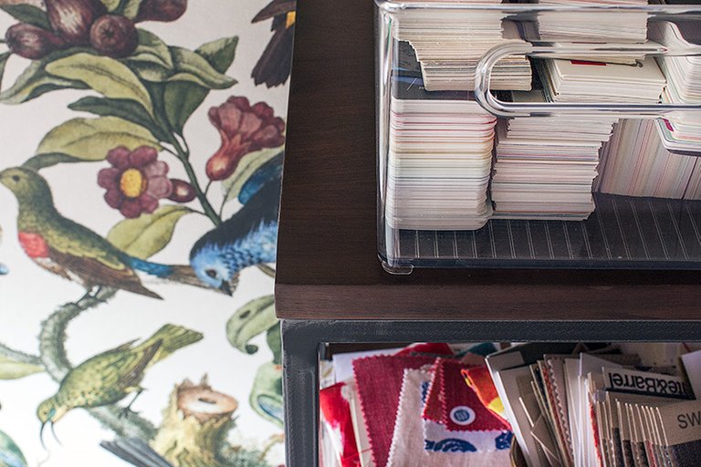
I did a ramshackle decoupage technique (cool/terrible band name alert!) where the two halves of the wallpaper met in the center. The seam would have been pretty noticeable and I had assumed I would be adding a piece of trim, but I ended up trimming around birds and leaves, overlapping the different sides so that the pattern blended together. I shared it on my Instagram Stories last week. I wasn’t sure if it was a brilliant or stupid idea, but I think it worked!
I love the wallpaper peeking out when I have the door open.
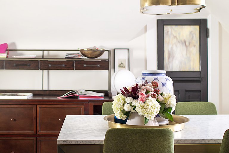
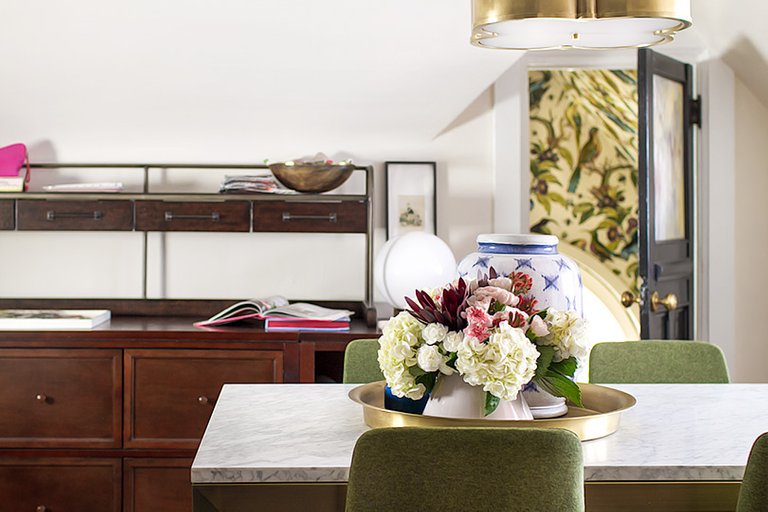
I had access to rugs both vintage and new from several sponsors, but I already had several rolled up and awaiting use. I have problems with rugs… namely, that I want them all. So look at me going with what I’ve got! I was going to go with a subtle pink wool ikat, but changed my mind and went with the rug I carried back in my luggage from Morocco. It’s a better fit, size-wise, and there are fond memories attached. The office is a great place for it.
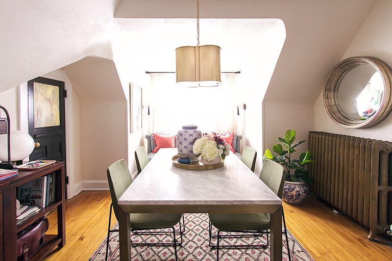
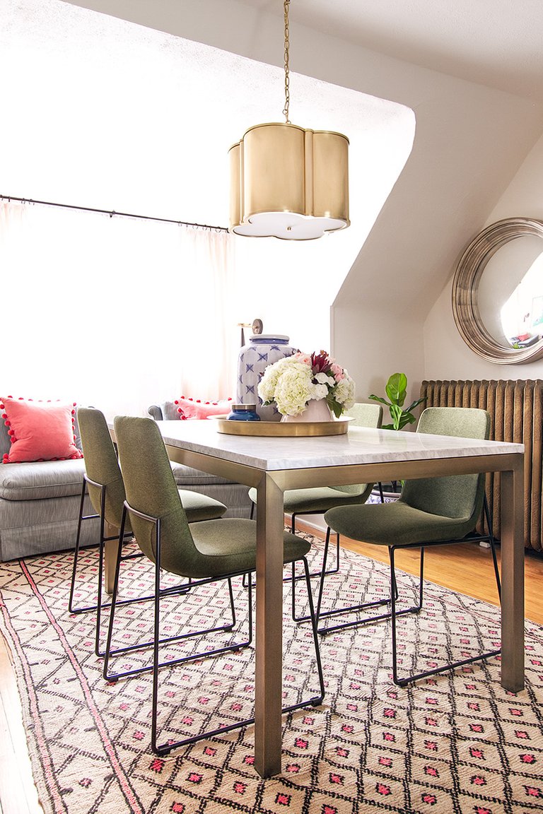
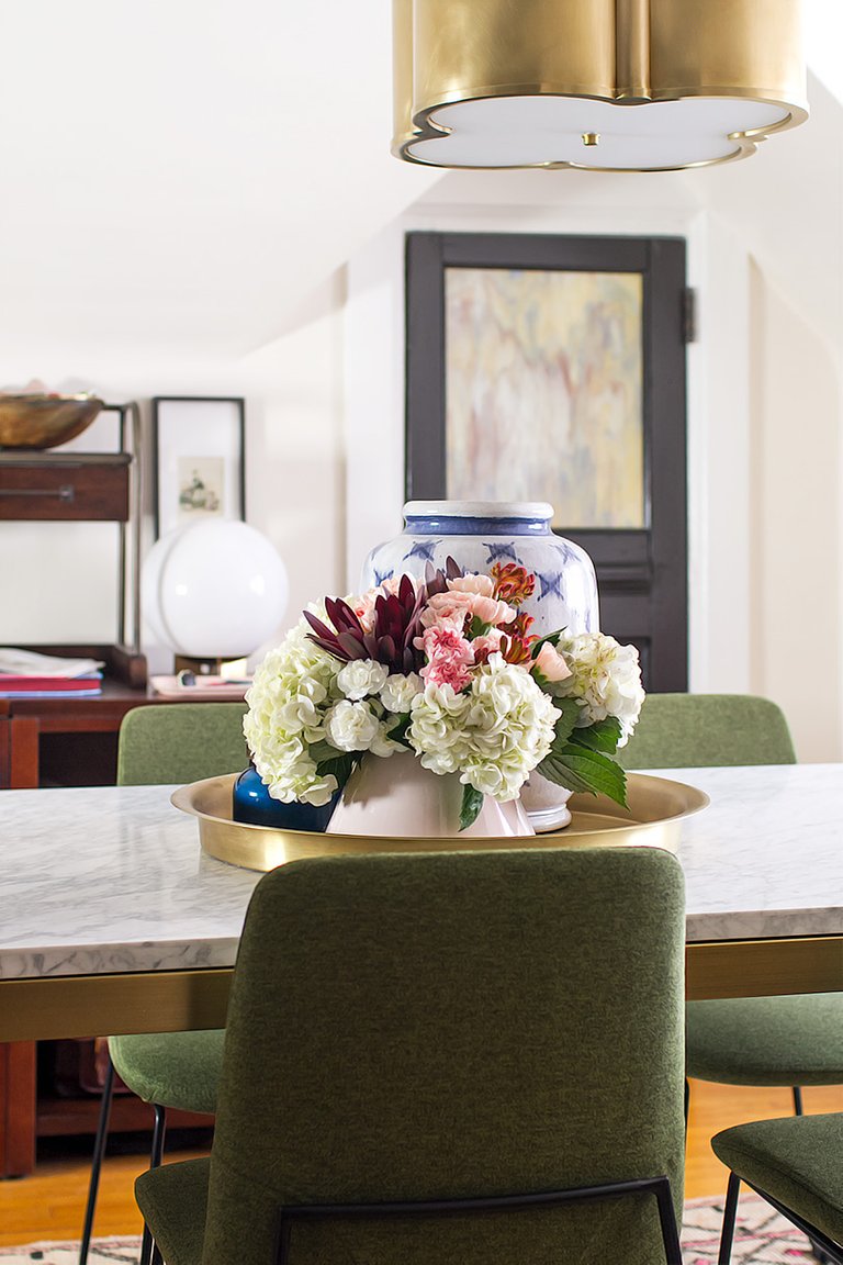
The brass pendant is so lovely in the space. And yes, it is wired in! I point that out, because several pictures appear to show otherwise. It replaced the ceiling fan that I took down, and I wanted the light centered over the table so I added a hook to the ceiling. I’m not one to heavily Photoshop my images, but I have edited out the chandelier chain and cord where I swagged it over from the junction box. Honestly, it was so distracting to my eye, and I plan on relocating the junction so that I no longer have to suspend it from a hook. I’m not trying to fool anyone and maybe you wouldn’t have even noticed had I not said anything (it’s cropped out in most photos), but I felt a little funny resorting to digital trickery because it’s not something I do. So if you happen to notice that the light seems to be suspended from nothing, that’s why.
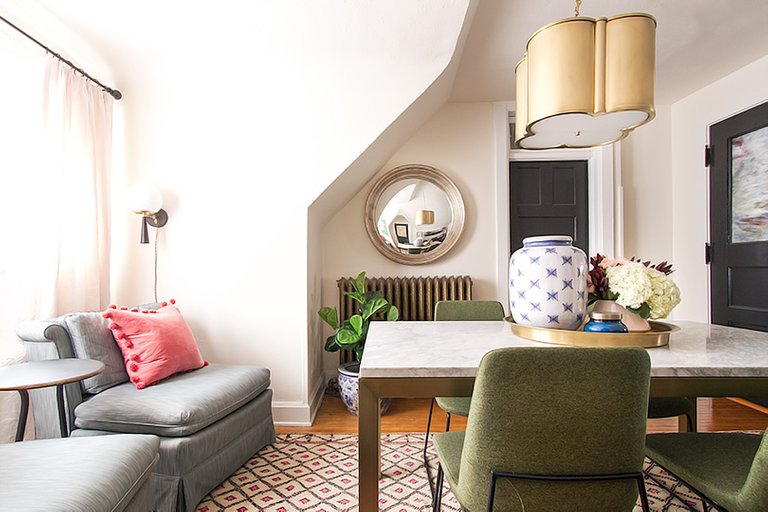
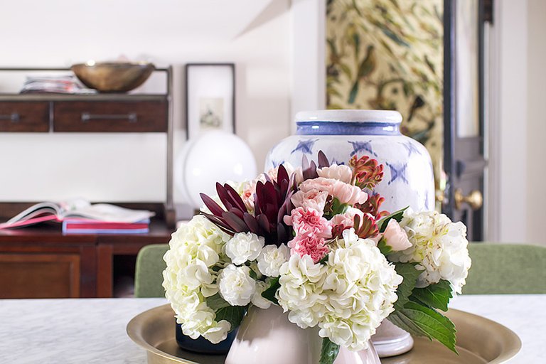
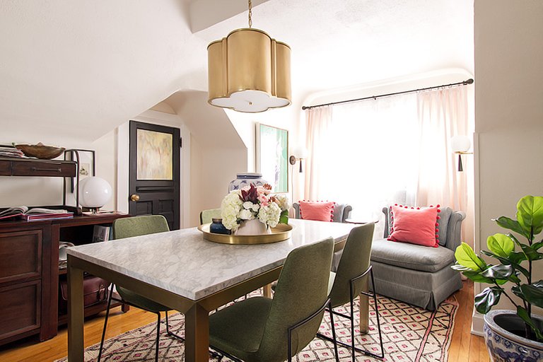
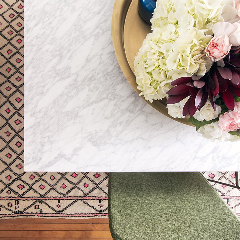
The center marble dining table is already proving useful (and beautiful). It serves as a desk, a project planning surface, a spot for the kids to hang out, and an alternative to my dining room for tabletop shoots. I knew I didn’t want another wood surface in the office since my desk and the modular storage were already representing that category quite well. I’m not a big fan of glass tops, so that sent me looking at painted or lacquered tops, or stone. The parsons shape of the table I chose is classic, and the combination of marble and brass is perfect. Green chairs in a streamlined mod shape bring a little more fun to the grouping.
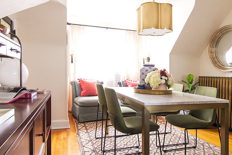
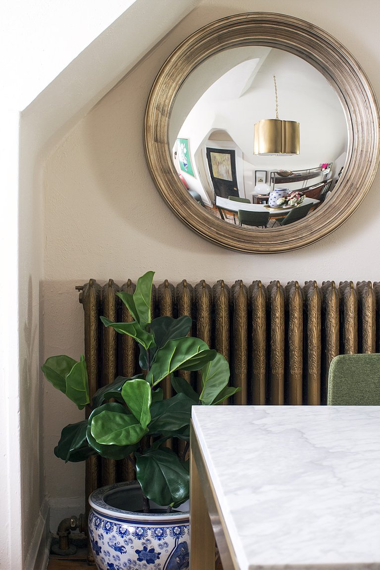
Hey there, traditional but cool blue and white planter! And hey there, cool convex mirror that I grabbed from another room! I’m very much disliking that the pendant is just hanging there in the reflection, but whatevs, we’ve discussed this. Moving on!
I bought these vintage slipper chairs for my first go at the One Room Challenge. I only used one, but when you find a pair, you buy (and hoard) the pair. And lo, I finally found the perfect spot for them!
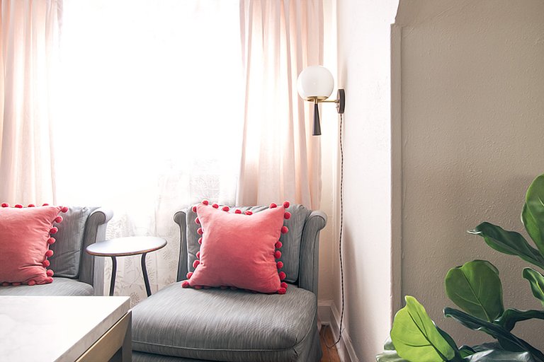
The little side table between them is dainty in form, but sturdy. The window nook is a nice spot to take a quick break and look through a design book or some magazines with a cup of coffee. And how amazing are those sconces?
I wanted sconces that could plug in, which these can be customized to do, and I also had a beautiful brass toggle switch added and chose and pretty French gray fabric cording. They’re a little now, and a little Art Deco, and oh so pretty. They were initially six inches higher, but they looked off so I took them down, patched and painted the holes, and put them back up 5-1/2″ lower. An hour’s worth of work for a small change, but I think it would have bugged me had I not done it.
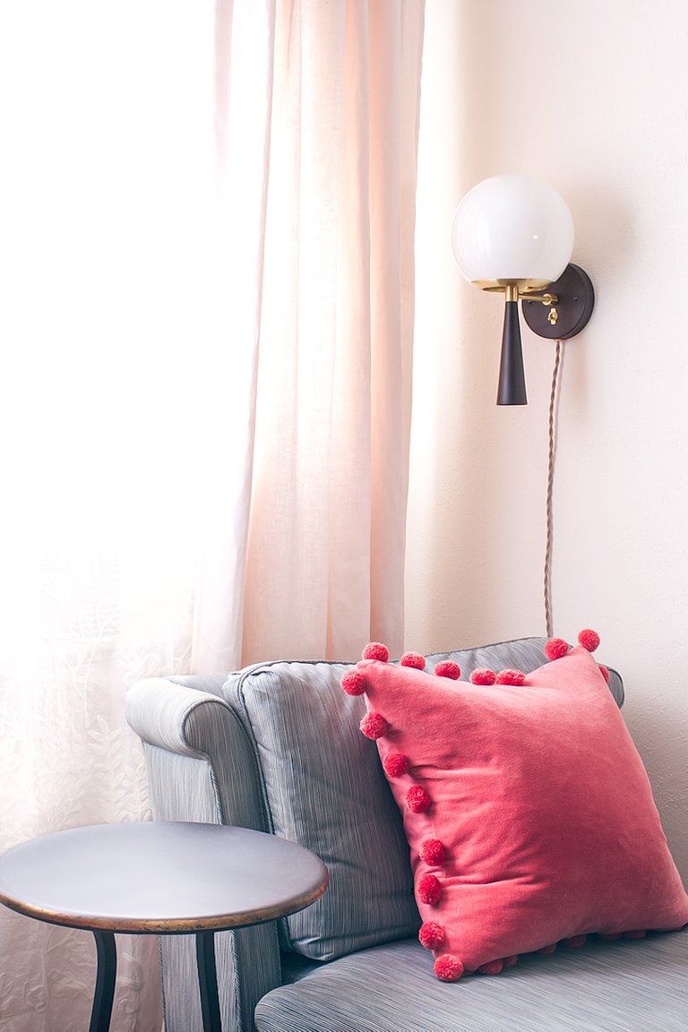
I took my pale pink linen curtains from another room, and the embroidered sheers arrived in time for photos (even though I know you can barely make out the details!).
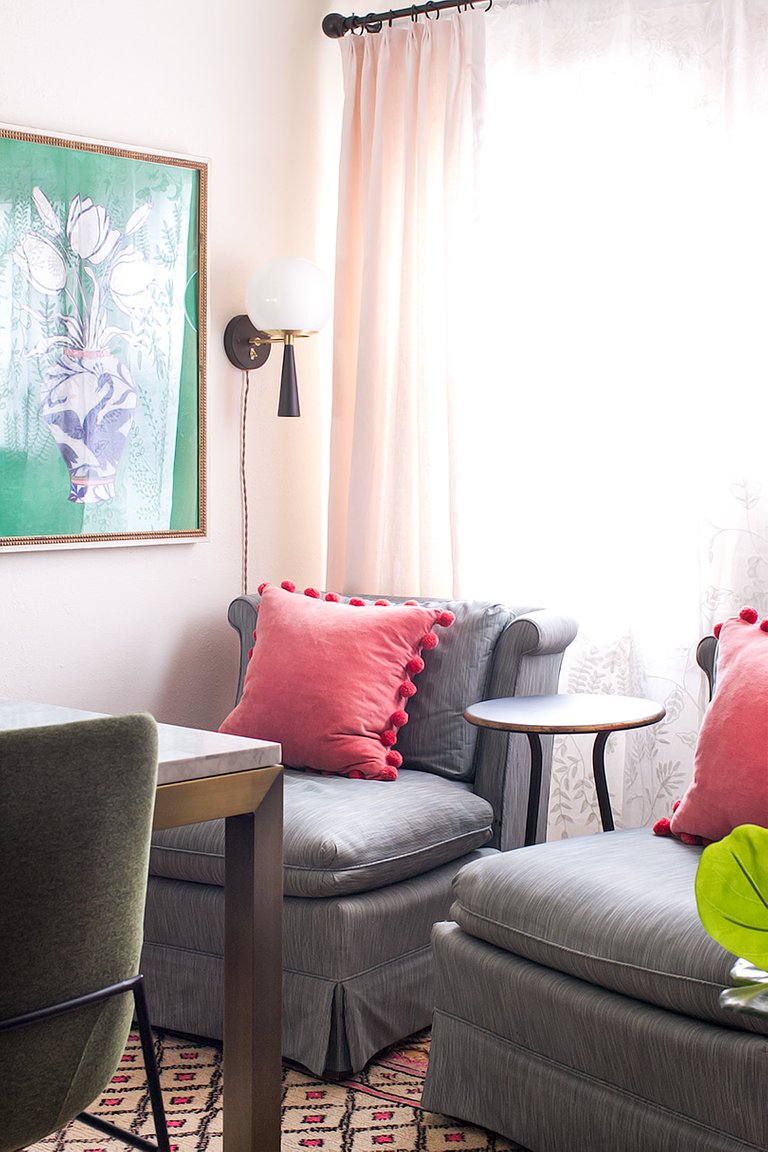
I’ve recently created a “Shop Our House” page, and you’ll find sources for everything there, including paint colors and links to the exact items I’ve used. The Home Office section is new and I will continue to populate it today. You can also take a look at the design plan from week 2.
Thank you to all of you for following along! Thank you to Linda of Calling it Home for inviting me back to participate again, and thank you to my ORC sponsors (listed below) for helping me bring this room to life. The other participants are also listed below and they are doing amazing work, so be sure to visit everyone and see how their reveals shaped up! Tomorrow is the big reveal for everyone following along too, and there are some impressive designs out there.
I’m thrilled with my new office, and I hope you enjoyed watching the process as much as I loved bringing the design to life!
