Charting Platforms
Chart is obviously the most important thing you need when doing any Technical Analysis. There are a lot of platforms on which you can do your TA. The most popular ones are Coingy and TradingView. I personally use TradingView because I really like how everything is organised and it just looks nicer to me.
Charts design
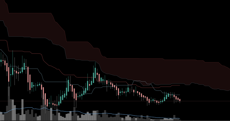
Well-designed charts will enhance your market analysis, believe me because I tried it on myself! Your reactions and information gathering changes as the colours are different. From time to time try to change your colours and then after like a month see what colour combination has worked the best for you. Then stick to that combination and when you will no longer be attracted or didn’t feel good about it, do the process again. That should keep you in much better mindset. You don't want to hurt your eyes and your mind. You must find some combination that is easy to read because don’t forget how much time you spend charting. I will show you an example of 2 colour combinations that I used and tell you the things I realised.

What colour combination seems nicer and easier on your eyes? I used the first colour combination when I didn't know anything about this. I was experiencing a bigger number of losses and little gains. After some time I started to feel like that red colour makes negative emotions in my mind and that it hurts my eyes when I chart. When I realised this I immediately changed the colours to blue/grey and everything was much better then. I started to have bigger gains and fewer losses. Now I want to have calm colours while charting so that my eyes and mind can stay calm with me. All colours must look nice together to create a well contrasted chart. I always keep neutral colours in the background and it seems like that black works for me the best. Then you should change your grid lines and these little details because it will make a lot of difference too. After that you must change colours on price bars and indicators. Don't forget that they should stand out from the background. I will show you mine chart so that you can see what do I use. My current combination is this Blue/Marshmallow one because it doesn't shine that much, I can see everything clearly and it makes me happy.

TIP for finding patterns
If you want to find patterns pretty easily I will strongly recommend you to use Grey/Dark Grey colour combination. Look at the pictures below this text. Do you see how easy and fast it is to spot patterns using Grey/Dark Grey candlesticks? I believe that you even feel the ease in your eyes. Then imagine finding the patterns on the Green/Red chart. Of course you can find them too but maybe it will take you a little more time and didn't you feel some pressure in your eyes? When I look at the Green/Red chart I can feel my eyes shaking and that I am a little bit distracted.

Conclusion
I don't want to recommend you any combination because it really depends on everyone individually. Take some time choosing the right colours and you will see for yourself that your thoughts, emotions, even your timing will change to better. Try to avoid having too much red on your chart and keep it well designed. Thank you so much for reading my article! If you liked it please leave a comment and upvote!
