You see it everywhere these days, hipsters and 'norm-core' fashion followers dressing up in vintage clothing items from the 60s-90s. From what I noticed the general goal in this rose-color revival trend is to be looked at as if the person had time travelled from the 20th century into the 21st century. Walking around a metropolitan city like Toronto it seems like there are more hipsters than ever.

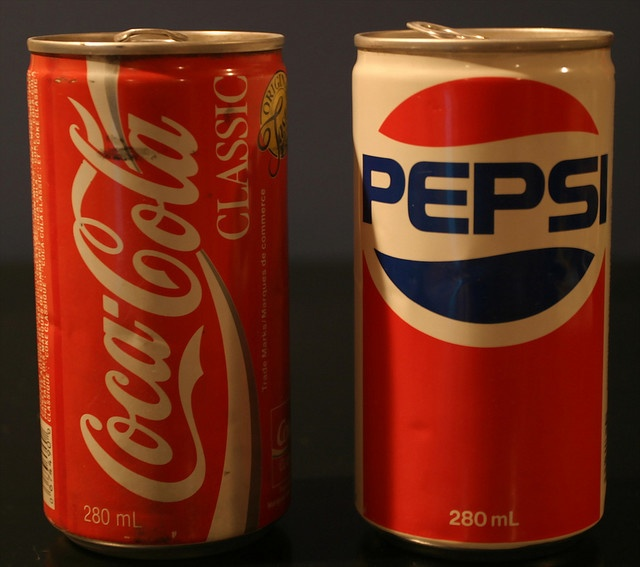
Pepsi has reserved logo compared to other Cola brands such as Coca-Cola. Just based on the design I would assume that the Pepsi is more pleasing the eye and therefor excited the shopper unknowingly to buy it over the latter.
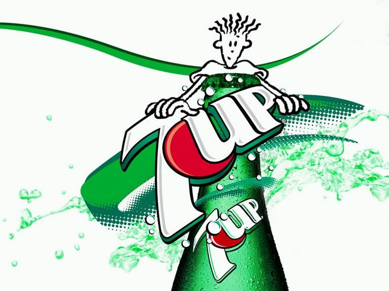
Going into any supermarket these days and the brand logos of almost every product has changed to have weird swooshes and ironically try be as visually stimulating as possible. Going into the Soda isle you see how bland and non-eye catching any of the product designs have become. A simple google search prefixed with vintage for any brand product like Pepsi, Coca-cola, 7UP, Reese's Pieces, etc will often show a stark difference in the products design to the one that you know today. I'm baffled that so many of the big name companies have been taking minimal to no advantage of this booming niche market demand.

Simplicity is always key, often times that rule gets thrown out the window in favor of developing an idea beyond its breaking point to a point where it enters the realms of the ridiculous because of it.

Sincerely,
@Pryce
For pure nostalgia alone, this is worth it! But a lot can be said for the efficiency of modern design... for businesses at least.
if they weigh the market and focus on product redesigning in metropolitan cities such as New York, Los Angeles, Toronto, I have no doubt the product will be bought off the shelf faster than the competitor who isn't doing it.