Just writing a long post without any separation between paragraphs and throwing images in tends to look really bad and many users still struggle with markup and styling their posts so I'll try to highlight and explain some of the best techniques to make your post stand out and look amazing. Lets jump right at it.


As I said, just writing a bunch of text and not adding some spacing between paragraphs looks bad and makes it really hard for the reader to concentrate on the the text and if he needs a brake it will be really hard to figure out where he stopped unless he overlines the point at where he decided to stop reading.
But if you include some space and separate your post a bit, it will look much nicer, improve the flow of your post and make it more pleasant and easier to read.


Images are a crucial part of the aesthetics of your post but sometimes they are just too big or don't fit as they should. You can easily fix the size issue by resizing your images in Photoshop or any other image manipulation program.
If you want to position images to the left or right and/or make text wrap around them you can easily do that with a simple line of code.
 ---> to make them go to the left side or
 ---> to make them go right
 --- >obviously centers your images
Confused? Let me show you what I'm talking about.


 <"pull-left">
Sample image source
I hope you can see how this can be really useful and make your posts stand out. It's also great when dealing with large pictures that you don't want to resize. Because they will be automatically resized to a much more acceptable size.

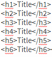
Titles are marked with h 1-6 and with 1 being the biggest and 6 the smallest.
You can also make your owntitles as I did for this post very easily. Just write the desired title in the font you want, export it as a image and paste in. Just be careful to use right sizes around 12pt.


Not quoting someones saying and using it for your posts is considered plagiarism.
I think this one is pretty self explanatory but I still see some users citing a bunch of text without quoting the right way. This actually might get you flagged so be sure to always use > "Your desired quotation" to quote. After > press space and start writing your quotation and when you are done press enter 2 times and write the author.
If you press a couple of spaces before your authors name you will get a cool looking font like this.
@runicar

Links are another good thing to throw in your because as with quotations you might get flagged if you don't put them where they are needed. So if you are using an image that isn't yours be sure to state source like in this example.


Click MeThis will convert text "Source" into a hyperlink that will open https://steemit.com/ check it out
If you want to make your links smaller you can use 
It will look something like this link tekst


Add your own personal touch to the post, something that will make it stand out and make it unique. It could be anything. A nice picture placed in just the right place or using customized titles and letters. You could also start your post with a capital letter like they do in the newspapers. That would be really cool.
I hope this helps. If you got any questions feel free to ask.
Have a great day and start styling your posts!


 Adding titles to your paragraphs is another crucial thing because it increases the flow and readability of your post. Gives an quick explanation and a hint on what the paragraph will be about. For titles you will need the following code.
Educational. learned something today. Upvoted and resteemed.
You didn't upvote or resteem lol
Yes I did. Both shows green on my page. Something must be wrong. If I try to click again it show remove vote and resteem. Can you help
Hey Runicar! You taught me most of these things but still some of them I never knew :)
I appreciate your work and hard effort to bring steemit closer to everyone.
Keep up the good work bro! I hope we continue to work on our project soon!!
Peace out
hey @enjoyinglife long time no see :) Thanks for your support and yes we shall continue our project soon :)
nice post runicar, sometimes it's hard to read a post that's too long and has too many words. Styles will definitely help a lot
Thanks
Upvote and resteem this post. It has really help me and i hope it will help others too. So many of this things are like an eye opener to so many steemians out there.i will try them out.
** most especially the pic taking to the right and left are new to me**.
I'm glad that I was able to help. Have a great day!
Am glad for the little gift of upvote too,i really appreciate.
I love this types of post, I used to have a few bookedmark with banners and what not for easy reference. I still have a few. IF you want to update your post or make another with free banners let me know ill send you some. ARe you part of the minnow support project discord? IF not, you should join us!
Thanks. I'm not sure I get what you mean, which banners? I'm, you can contact me on discord, name is same as here.
Sure, OI can DM you. Check this out in the meantime. https://steemit.com/howto/@scrooger/text-dividers-for-your-posts-easy-to-use-just-copy-and-paste
Thanks for the tips !
Thanks for the top Tips :)

Np :)
Hey! How do you centre text in our posts? I've tried to find a way but no luck. Appreciate any help you can give to help out, thanks.
Great post by the way, it should help new Steemians, will resteem and upvote.
Some title
Thank you, grateful for your help.
Just reading your post now to get some more tips for publishing posts. Thanks for the info. I have never used coding text before. Interesting to see it here on Steemit. Loving the learning curve.
Yea, the learning curve is definitely something else. I remember my first days here were quite exciting because of it.
I suggest you use Busy.org to write and post your articles instead of Steemit.com as busy doesn't require you to learn the code but rather gives you a simple and easy to use text editor.
Ok let me check it out.
That's pretty weird but it looks like a "cheaper" version of one of my post concerning Styling of pages.
I hope it's just a coincidence...Still a nice post
I haven't seen your post but now that you insult me by saying mine is a cheaper version of it I'm going to check it out. Maybe I learn something from you :)
Sorry, I didn't want to insult you I think we didn't understood each other. I was just saying that yours is smaller and had less content but It's really a good post, less detailled than mine but better explained I didn't want to insult you or something like this. Sorry, hope you are understanding me now ;)
The way you said it and the passive aggressive quote made it look that way.
I like to keep my posts short and informative as I know that most wont even bother reading long posts.
Hey Runicar,
Thank you SO much for writing this post, it's very useful to a Steemit newbie like me!
I've been so busy since I wrote my first post that I haven't been able to pen another. I'm looking forward to getting a chance to write my next post and use some of the useful information you have shared to make my blog look better and a little easier to read!
Thanks again!
Molly
Nelipot Nomad
Thanks for giving the tutorial and try to content from tutorial.
Very useful, thanks for sharing!!
You got a 25.79% upvote from @postpromoter courtesy of @runicar!
Thank-you for this, most informative. New to Steemit and Markdown Styling and this will certainly help me to get my act together. Gotta be easier than Wordpress and I have that licked ;) Meanwhile please feel free to pass by mine and let me know what you think of my offerings. Be well xox
Ty , I been silkscreener since 1985 custom apparel and do some graphics myself but I am the main printer :) I also have 2 clothing companies 1. #truthtrain and the other is Detroit Remedy . Check out some of my posts and ty for the tips im still figuring but this out
I don't have raw html editor, I only have classic post editor.
how did you get that?
Awesome tips for beginners. Thanks for the educational advice!