I actually quite like the style and pastel colors. I think the page looks better now than for a month ago..and most importantly, its working. :)
You are viewing a single comment's thread from:
I actually quite like the style and pastel colors. I think the page looks better now than for a month ago..and most importantly, its working. :)
I like the new interface, but don't understand the logo design all. It should be obvious what it means and it's baffling. There was such brand awareness with the original logo.
It looks like a Michigan Spartans college sports logo. Kind of irks me.
It's 2 chat bubbles.
Yeah, the logo is weird. Looks like the norwegian "federal express" logo
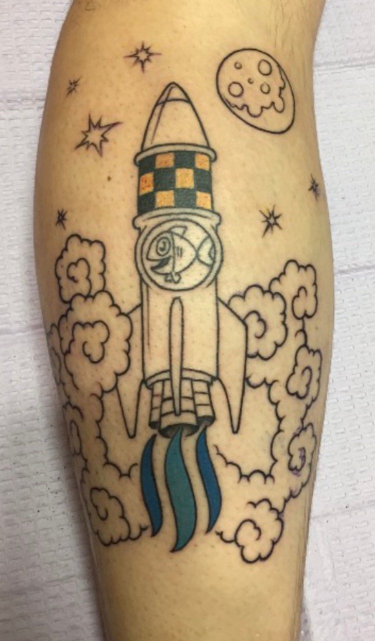
Ok, maybe it's because this new logo wont go with the Steemit tattoo I got...I've never seen a rocket ship take off shooting out chat bubbles.

Holy crap - is that a real tattoo or an amazing photoshop job? If that's real, that is some serious commitment to the cause redefining long term holder.
Whuut. For realz?
Real. Just found his old post:
https://steemit.com/steemittattoo/@intothewild/yes-that-is-the-steemit-logo-and-yes-it-is-tattooed-on-my-leg-steemittattoo
haha, yeah, it's the real deal. First tattoo in my life. And now it's a relic, lol.
Welcome to generic company
Looks like Trump's head to me )