*Disclaimer: photography taken by me.
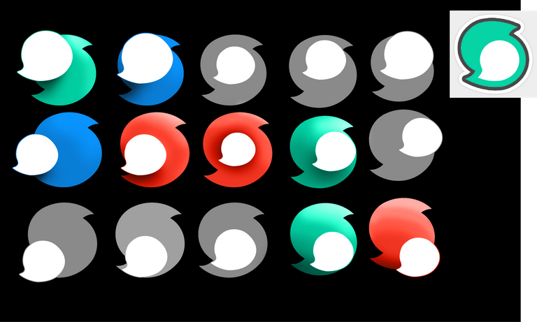
This short series of redisigning steemit's logo as a time passer has come to an end. You can check out below the final renders and the color testing I did to chose the one I am happy to go with.
Above at the header is a concept hasty made to display the readability of the image. Right below the banner I made for my steemit page(which now looks neat :D ) There is not much to say about it I really got to enjoy the whole process. I learn a few things new about illustrator too.
I used both illustrator and photoshop for this to happen, I really hope you like it.
Thanks for stopping by.

![]()
![]()
![]()

nice post.
Really nice use of the clipping mask on the first image! Nice work on the others too!
I am glad you like it chris.
Thank you for the beautiful and hard work my friend _)))
Great job. I loved your designed logo
Those logos look really good...did u design th3m?
Yeah is a mini series I started yesterday. I am glad you liked it.
Yes....good job....definitely adding ya
your picture is very-very good ok I've vote you have. do not forget also dead end vote got me.
Amazing logo
Great work as always!
Thank you ana
some cool logo's, I am one of the contestants for the steem cleaners image contest and saw your entry along with mine on the update post. I was wondering if you could enter mine? Feel free to enter my new contest to win some SBD click Here
Ill do you something thanks for commenting.