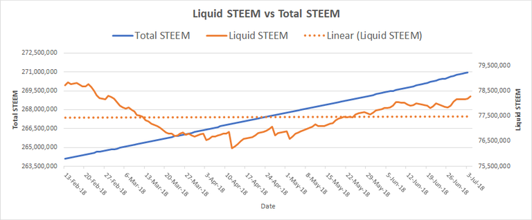
This is a historical graph of both Total STEEM and Liquid STEEM supply

Liquid STEEM is the remaining STEEM that has not been converted into Steem Power. (Orange Line)
- When STEEM is liquid, it can be readily sold and purchased. When locked away in SP, it is not liquid, It takes a significant amount of time to convert it back to a liquid form.
The linear line (dotted line) is a line fit to the Liquid STEEM to show if Liquid STEEM is going up or down over the entire time period.
I created this chart with data that I collected over the last few months.
Why is this graph important?
STEEM is created at a high rate. Currently 8.83% per year. Many Steemians have a concern about STEEM inflation with the high rate of new currency creation. This graph shows since February, There is less total Liquid STEEM. The dotted linear trend line shows that there is curently about a break even trend for Liquid STEEM supply over the last 4 months.
I hope you enjoyed reading my Blog. Please remember to Upvote, Resteem, and Follow. Thank you.
---------------------------------------
For a breakdown of how Steemit Rewards system works:
For a breakdown of Steemit Keys:
https://steemit.com/life/@socky/do-you-understand-your-steemit-key
For a breakdown of why Steem Power is Important:
https://steemit.com/steemit/@socky/why-is-steem-power-important-beginners-read
as soon as thousands and millions of steem get powered up vs powered down then we will start to see a breakaway in price that is not connected to bitcoin... good stats to keep an eye on
I would like to see a reduction of about 2 million Liquid STEEM per month. Including new STEEM production, that is about 3.6 million in total per month going into SP. I anticipate more STEEM being introduced to the market due to a few heavy SP owners powering down. After that if SMTs are popular along with some new apps coming out, we could see a drop in Liquid STEEM.
Hoping for the same!
Thanks for your information
This would be a lot easier to understand as a mountain chart where liquid steem and vested steem are stacked on top of each other to make total steem
I will consider it and will see how it looks.
The way I read it, adoption and steem power are creating a more steady steem ratio the bottom in march where the dip and correction happened your intesection occured, but although we dipped the rise became more natural and when we dipped again in june the liquid steem didnt dip again, that to me seems like its stability is a sign of increased adoption and potentially an insane extrapolation of value. I could see us going parabolic much sooner than i expected if the trend remains. Good work
With growth of Steemit "Monthly Active Users" the network value is expected to follow an exponential value to users. Metcalfe's Law is a general expectation. Essentially, every time the numbers of active users doubles, the value grows 4 times. Since Steemit business model has very little overhead, price is expected to mirror value.
I think with SMTs launching and additional apps launching, the Monthly Active User count will climb again and price will take off.
@socky , thats what I see happening, scaling is scaling and steemit is well..gaining steem! I see a very bright future here.
Though I have been in Steemit for the past two months now, little did u know that solid Steem can be converted back to liquid Form. Looking at the 📈 chart I mean the orange line It really shows that Steem is not always constant, it fluctuates. I think I have added an idea to the one I have before, thanks for sharing @socky I will resteem the post to educate others