Really coming together.
I'd make the logout button smaller, or even having it somewhere under a click it doesn't need to use that much real estate.
I'd also move the search above tags. It looks out of place there and could use that space for voting power, steem power, vote value, and other "stats" that really should be available when you login.
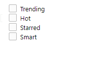
I know you had favorite tags before, but I could see this having an option for "my tags" and "smart tags"

My tags are tags you manually select to be shown. So you can filter the list by your favorites (starred tags)
Smart tags are a bit more clever and uses whatever tags you posted about in the last 30-60 days or whatever. Maybe merged w/ favorites. Even better have checkbox to decide what is shown.
For example:

Great feedback.
• agreed the logout button could be smaller and off to the side.
• the search tool should be in some fixed position in the header so i can agree perhaps it be relocated somewhere there
• as for stats etc. it’s overload to live in the header and since they are specific to you as a user when i start building the profile / my blog page they will live there. The page that shows our image avatar has so much missing. That’s where I’ll be posting that stuff. Thing of the home page as a logged in non-profile page but stats are coming. At least this is how i have my vision direction going until it poses an issue.
• tags - great feature i can add that in for sure. However the mechanic would be select tags tab at the top to display sort options within the tab content view. Similar to Reddit’s filterline when selected. But good you added additional features to help sift through relatable content.
Great comments! This all helps!