I finished designing the SteemJET: Time is money logo.
But I am not sure where I should post it. I was going to make a post but on a second thought, you already have a lot of pages to scan through.
I don't want to stress you any further, so I am just going to post the logos in your recent articles.
I didn't want to use the regular clock so I opted for a stopwatch because of its reliability and accuracy. Time is money, so every second counts.
I hope you like it. @dimimp



IF YOU PREFER IT IN 3D


WELL DON SHUTA !! HOPE THE BOSS LIKES THEM.. NICE WORK
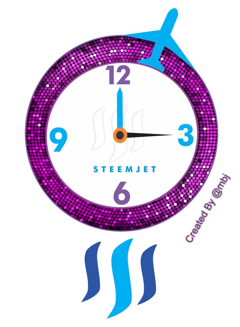
check out mine!!
Thanks man... I hope so too.
38/1362 Loving your image, bold and effective. You have a brilliant eye for graphic design
Thanks my boss... You deserve more..
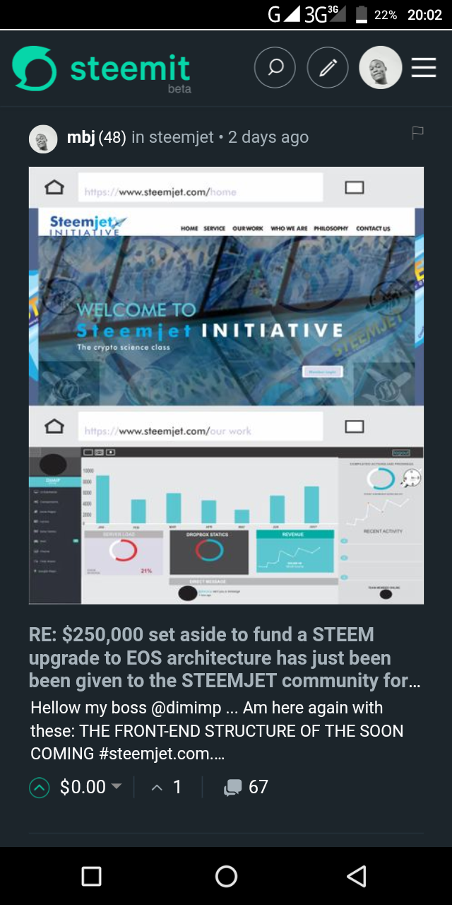
I made something for you.. Check it out
Please accept it.. https://steemit.com/steemjet/@mbj/the-front-end-structure-of-the-soon-coming-steemjet-com-proposed-subject-to-review! I dropped it in the comment box of your last post
Love this concept. Well done.
You are more of a natural when it comes to designing @jogreh ... Thanks anyway
Hahaha If you say so.. but I really like the first one in blue.
24/876
Thank you :D
68/832
Very effective images. I love the stopwatch that implies a more IMMEDIATE importance of time and since you don't have the hands to get in the way. The 3D image is strikingly concrete and powerful. This effect is brilliant, however, the 2D blue image is VERY steemy, and evocative of the powerful emotions we feel when we experience steem
Everyone has a thing for the blue image... I'm glad you picked it too. Thank you