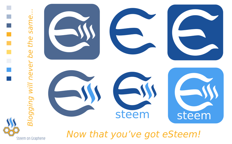
Created an 'e' with the use of the Steem logo broken up in parts. The 'steem' font I'm not yet too happy about, it's the Bitstream Vera Sans.

The 'e' has a certain magnetic 'feel' to it. And static electricity 'sparc' suggestion with the steem logo inbetween. Dynamics stream of electricity movement , attraction of attention. From a side angle looking like an M, for monetizing your time and energy.
And credo: "Blogging will never be the same, now that you've got eSteem!"
Watch it full size? CLICK HERE
They look really good! How about middle line of E also looking upward, how would that look?
I like credo idea as well...
Will have a quick go at it... :-)
Then other stuff to do, diner time etc...
Sure, no rush... thanks, good work on design though I like it.
Thanks!
Had to move the steem logo to the right a bit more.
For the complete sized one: CLICK HERE
Think this font fits better and it's an Open font licensed one (Open Sans):
Look at it in full? CLICK HERE