Thanks for taking the time to offer your thoughts @nateaguila!
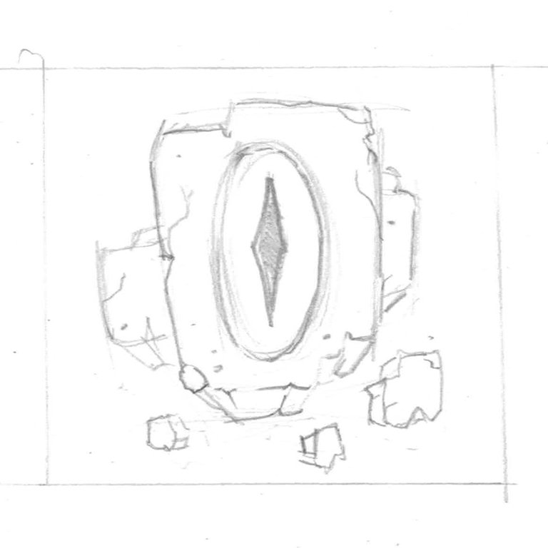
I agree that a logo should be flexible in all different applications. Something that this design kind of lacks. Following your idea of using the monster eyeball as the iconic brand image, I sketched a quick idea that can be used as an "alternate" to my original design. Mostly for social media avatars like you suggested.
I've placed the eyeball front and center and added some floating stone debris behind it to support it. I think once pursued, both designs will be clearly part of the same family.
I think I might take the time to complete this idea. Honestly, I'm just having fun playing around with this concept :)
Shoot me an email if you need an extra hand or if you want to collab on future projects!

Nice! I dig it.
Although I should warn you. We’ve been working through color, typography, and layout guidelines. But working on the actual logo itself has been dependent on finalizing the theme and identity of the project.
What started off as a monster fighting game is evolving into a fantasy world with a depth that extends beyond the original scope.
As such, that vibe may bleed into the branding and how it’s conceptualized. In other words, is this a monster game or a fantasy game? I think we’re getting close to a balanced understanding of the final destination (and how to best emphasize those theme attributes, whether they be monstrous, magical, warfare, faction-based, or otherwise).
It’ll be a lot easier once that stuff is settled.
Right, I understand what you're saying. It's hard to finalize a brand image for something that's very much still in the development stages.
Either way, I'm just happy to provide some inspiration at the very least. I'm excited to see what direction the game and brand goes. I'll be following closely!