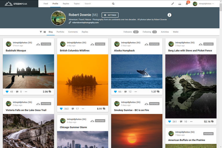
For most of us Steemit.com provided our first gateway into the STEEM blockchain. While super enthusiastic about the concept behind it, I have always felt the Steemit.com design interface was lackluster when compared to the commercial social media alternatives out there. I would go as far to say that as a professional photographer, who spends most of my life focused on maximizing the design aspects and symmetry of the world around me, the thought of sending my steemit.com link to my 80k followers on social media or a potential client was almost embarrassing. It seems all development of the user experience had stalled while the Steemit team focused on securing a scalable future for the blockchain itself and making sure that things like Hivemind and SMT’s become a reality in a reasonable timeframe.
Into this void stepped the guys at @steempeak, and it has been amazing to see what such a small team has been able to achieve in literally a few months. I have been testing the platform since its inception, and it's now at the level where I have shifted over to it for all of my interactions with the STEEM blockchain. So what are my favorite things about steempeak.com?
• Simple modern interface – in my opinion the most important factor holding back the mass adoption of the STEEM blockchain. Steempeak.com does not look like it was designed by tech geeks in the late 1990s. It is intuitively designed with lots of small but significant tweaks to improve the user experience.
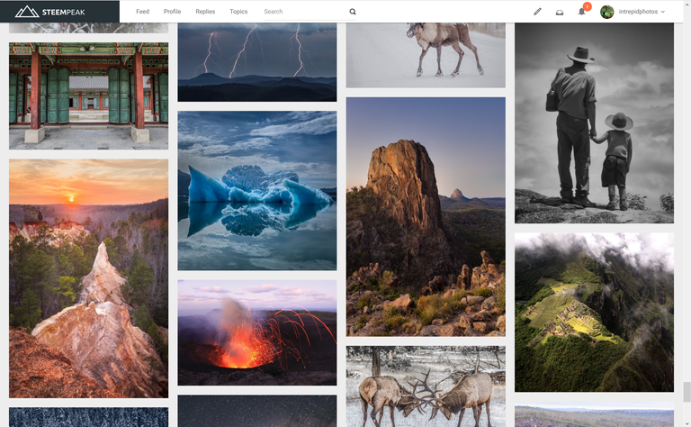
• Grid view – the option to view using a grid is a revolution when scanning though feeds or profiles.

• Side by side editor – see your post preview as you type.
• Bookmarks – lets you store users, topics, and pages.
• Draft and schedule posts – for someone who spends a lot of time in the wilderness away from internet being able to schedule a post this is a life saver.
• Blockchain interaction queue - allows you to interact naturally as it automatically schedules blockchain interactions such as liking as commenting rather than giving you an error message asking you to wait until your next interaction is allowed.
• Dashboard with analytics – lets you monitor your progress on the platform.
• Multi account switching – seamlessly use multiple STEEM accounts.
• Portfolio view – produce a super clean minimalist interface for sharing your work.

Best of all the team is super responsive to feedback and is implementing new features at a rapid pace. I don't have any affiliation with the team at steempeak.com ; I am just a supporter of anything that will improve the user experience of STEEM and speed up new user adoption.
hereThe title shot is of Ama Dablam at 6,812 metres (22,349 ft) in the Nepalese Himalayas. I took the shot after a few weeks of arduous trekking having climbed up the mountain on the other side of the valley to get that view. It was taken on Fuji Velvia slide film. If you would like to learn a little bit more about my background in photography you can read the interview @photofeed did with me
Robert Downie
Love Life, Love Photography
All images in this post were taken by and remain the Copyright of Robert Downie - http://www.robertdowniephotography.com

It is a great overview of yours of the great interface. You've pretty much nailed it down from both design and functional perspectives. Reading your post I realized why I also was reluctant to share my Steemit enthusiasm with friends/colleagues/customers. Indeed, the original design is so basic that one can ask himself - are they seriously think there in Steemit that THIS interface can compete with commercial platforms?
I'm going to resteem your post and really hope it will get the well deserved virality.
Yes; just imagine that dynamic playing out over and over again where people are a just a bit reluctant to share and how much negative impact that can have.
I was bouncing between steempeak and busy for a while as they both have features that I really like. Have been using steempeak a lot more than anything else these days, including Elegance which I had intended on trying out at some point (and probably would have done if I only did art here). I still find busy's notifications and comment jump reply a lot more useful, but steempeak won in the end with the horizontal editor which mades good use of my big monitor XD
I've also been sending people to busy and now steempeak for pretty much that reason of they're just prettier/more appealing to more people XD
Yep I tried Busy for quite a while as I was using their drafts but it has quite a few things that are frustrating in the interface and kept having to switch between steemit and buys.
I'm a big fan of steempeak. What they've done in such a short time is amazing. I recommend it to everyone whenever the topic of the steemit front end comes up.
Great image too!
Yep. It has given me confidence in steem as a platform again
Steempeak is great. Nice review of it.
Thanks Sara. Hope your well and life is interesting !
Thanks Robert. Life is very good. I am going on a trip to Utah tomorrow so that is exciting.
Well, somehow I do agree with you at least 100%... And just wanna add a few more points about the design, there are two main decision when it comes to starting any online initiative,
#1: be perfectionist, like me, and do your best in every single details
#2: starting the initiative and then try to improve it step by step
And in my opinion, both could be correct regarding the market possibilities and behavior.
I think they decided to choose the second one in order to avoid loosing the contest.
And after all, I do like your article very much ...
Thanks for the detailed response ! Having a bit of perfectionist in you is always a good thing.
yea, agreed
;-)
glad you're liking it ... always fun to see which features people point out the most. Seems each person has a favorite... but the overall look and feel isn't just a feature it's a foundation so we're glad you like it.
Also your potfolio looks slick https://steempeak.com/@intrepidphotos/portfolio
Thanks Jarvie. Love what you, @asgarth , @dmytrokorol and now @r00sj3 have been able to achieve with this platform.
Totally agrred! I am still myself little ripped between Steemit and Steempeak - but I must admit that the second one is much more modern and user friendly. Good post, let the people know about great alternative platform in STEEM world.
I was using both but I have made the full switch now and have not looked back.
Ah, yeah - and about the shot - Magic! Well done!
Thanks !
I didn't know about this, thanks for sharing!
It is worth looking at thats for sure !
It’s amazing!!
It is
Wow! That is an incredible user interface upgrade. I love it and will be switching over as my primary.
Glad I could help you find it.
Steempeak is excellent👌, Good review ..
Thanks
good job
Thanks
Looks very interesting — thx for info and great pics!
Thanks
very valuable and informational post your imagination is great and included picture beauty is so great. welldone intrepidphotos (67)
Thanks
most welcome