Hello dear Steemians,
As you know currently I am doing regular exercises in order to improve my Watercolor skills and to find my way. Watercolor is in general very tricky medium that difficult to control and it is very moody. If you have not paid much attention then it will destroy your painting and of course will destroy you good mood.
Two are two subjects that I love to express with watercolors, first is portrait because it makes portrait so transparent and airy. My other subject is architecture, I love old city centers with old architecture, there are many artists who can create such complex architectural buildings with very easy few strokes and mixing minimum colors.
So my goal to improve my architecture painting and that is why when on and off I see beautiful photography of @barbara-orenya who is lucky to live in such beautiful place like Annecy I immediately wanted to try it.
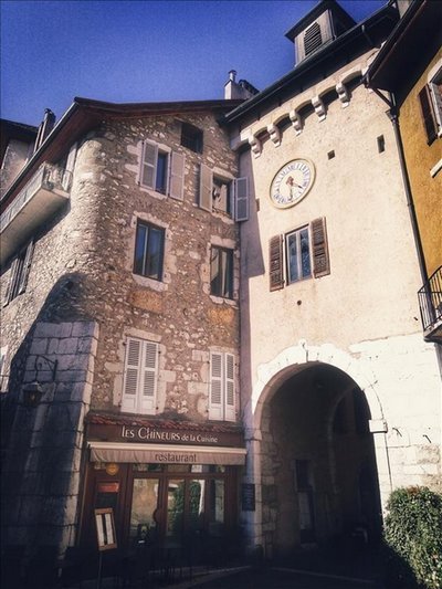
I like the idea of different tones of colors of old walls of buildings due to age and probably how the sunlight falls on them. Also old arch and cobble stones bring their challenges for artists and I love challenges.
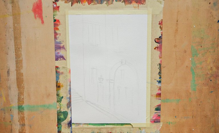
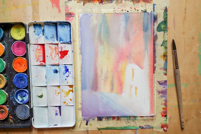
In order to plan my painting I usually try little test painting first to identify what will be easy and difficult part for the work.
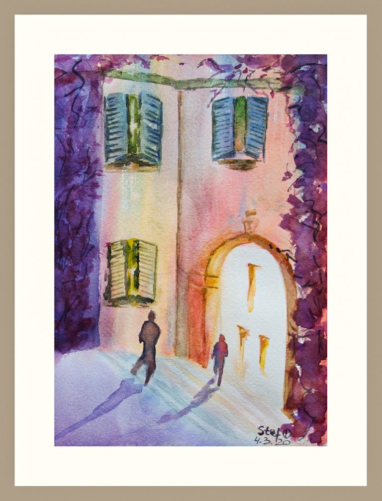
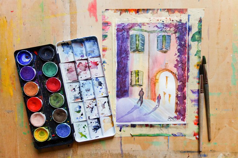
So after getting @barbara-orenya’s permission to use her photography as a reference I thought to work today on windows and shutters in first instance but also arch that is letting light through.
Of course seeing empty painting is boring that is whyI just added two figures so that it does not look too empty. But as conclusion from this work I have work better on dark values it looks too monochrome, because if I want on bigger format that may look too dominant and boring.





I hope you enjoyed my post and thank you for viewing :-)
I think it looks great! Watercolours dry out lighter colour than when first applied so I would try placing really dark tones to start with almost black and see how it looks when it dries out. :)
Hi Ian, thank you for your opinion, I saw how Artists on video were using what was looking black as wet wash and then when it was dried up it was blue and violet tones and it was looking pretty good. My weak side I am not patient and can't wait, seeing too dark I tend to go and add water or go again with wet brush over that sometimes leads to messy appearance. So need just to try more and often :)
Hi Stef, I think it was John Singer Sargent who was known for applying very dark watercolor paint straight on to canvas. It doesn't have to be as a wet wash, next time I paint with watercolors I will try paint with colors much darker than they actually appear in real life because I know they will lighten when they dry. But yes you have to be patient when using watercolors :)
It turned out great ! Love the colors you have used here 😊
Thank you Barabara for your nice words, that was a first test and I hope to do few more in the future :)
Very cool and beautiful colors you used here. I also love the shadow reflection.
Posted using Partiko Android
Thank you Max, sometimes it feels once you have done reflection it has completely different apperance, like you anchored the figures and they are not floating int he air :)
Yeah, but if one looks closely, one would definitely understand what you are trying to depicts. Sometimes, art is not all about realism, but the message you are trying to pass through what you've drawn.
Very cool painting! Such nice colours! Amazing work! 😎
Thank you @trincowski, it was an experiemnt with watercolor and it is nice to hear that it is looking well :)
멋진 빛의 표현입니다
Posted using Partiko Android
Thank you Veronica, I am glad you noticed that. Recently I learnt from one of watercolor artists that using white of paper gives a good contrast to dark colors. That is I am trying now to use dark, medium and light tones on my works :)
(google-translator) 베로니카 감사합니다. 최근에 일부 수채화 작가들이 백서 생산의 이점에 대해 어떻게 이야기하는지 읽었습니다. 이것은 어두운 그늘과 대비됩니다. 요컨대, 나는 지금 내 작품에서 어둡고, 중간이며 밝은 톤을 사용하려고합니다. :)
Spricht mich farblich total an!
Danke Andy, die alte Architektur mit farbenfrohen Gebäuden sieht immer hübsch aus :)
his work is admirable is subtle and beautiful, his technique is very good, I congratulate you, greetings friend and I invite you to my blog so that you can enjoy my latest art publication so I can see your opinion