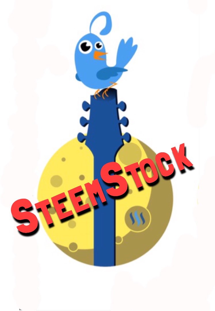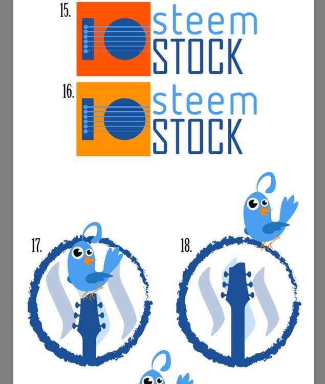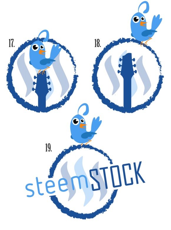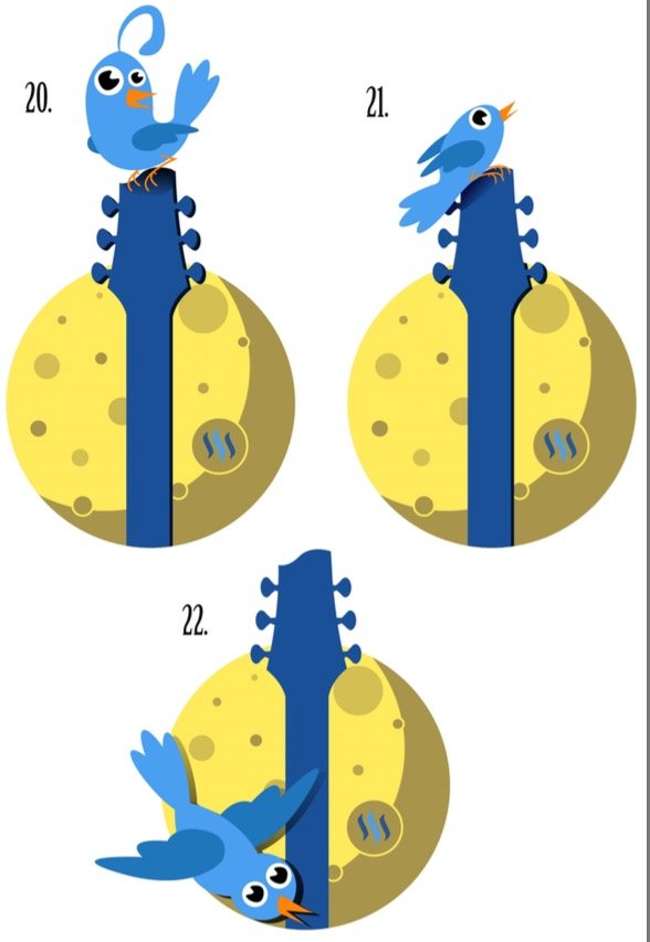
@rigaronib has made changes to the steemstock logos and has come up with new designs. I think he has done an awesome job. Its hard to narrow it down because they are all good. We could use some feed back now more than ever! The logo above is the one I ended up liking the most, I just added the wording. Does anyone agree with me? If so, what about the font and the color of the letters? Or do you like one of the others below? He even numbered them to make it easier to refer to them. PLEASE give any feedback you can. Like I said last time, I want STEEMSTOCK to be a creation of the community :-).


Also, @danilamarilu has confirmed that she will be doing henna tattoos at steemstock. She will be accepting steem as payment and she might even give you a better deal if you prepay. She will be posting more about it soon, so please follow her and stay tuned.
Remember, if you want to be added to the steemstock mailing list send an email to [email protected]. I have not sent out any mass emails yet but I wanted to assure everyone that when I do, they will be sent individually. So no one will see each other's email addresses.
Lastly, I just want everyone to know that I have been super busy at work so I haven't had much time to dedicate to steemstock. I hope to be all caught up soon so that we can get steemstock moving FULL STEEM AHEAD!!!!!!!
Facebook & Twitter.@steemstock, your post has been chosen by @STEEMNEWS.ONLINE as one of today's promoted posts for its excellent content. We've upvoted, resteemed and published it through
As the author of a SNO featured article, you've been awarded one TRAIL coin. Please stop by the SteemTrail Discord server to learn more about how to claim your TRAIL coin. You will need an Open Ledger account to do so.
Streemian, in addition to steemtrail.STEEMNEWS.ONLINE is the @SteemTrail for #news and watches the #steemnews tag most closely. Please consider supporting excellent news articles by making steemnews.online one of your operators on
Thank you for your hard work and contribution of excellent content to Steemit.

If you would rather not be promoted by STEEMNEWS.ONLINE, please inform us by replying to this comment and we will honor your request.
Number 7, though the bird is a cool mascot. :)
Thank you for you support and you comments!!! FULL STEEM AHEAD!!!!!!
I had a thought... should we integrate the date/year into the logo?
I think that would be best at this point, and let me know when you are in chat!
;-)
I agree re -- date.
Of course! Like an "Est. Nov, ? 2017"?
Well I was thinking 2017 for this year but established would also be cool so in 10 years from now we can be reminded of when it all started
Perfect!
Putting the date into this is a super idea, why did I not think of this LOL
Great work @rigaronib
I like it!
To the moon!
I just updated post with other logos. I forgot to include them.
11 & 13 would be my personal favorites.
Here is my feedback:
1/ The bird I don't like -- it clutters things up, reminds people of Twitter and mixes the media message and frankly, this bird has nothing to do with anything which ties to my point about being cluttered.
2/ any of the first 13 look good to me.
3/ those ones are also easiest to add a date to - which as I said here is a great idea, and should be done for sure, asap. Even just a simple "month/date" format for now, to give the idea shape and focus.
4/ clean and simple is the way to go I think.
5/ @rigaronib is the man.
6/ @riosparada I am glad you are catching up and busy with work and you are doing a great job here.
7/ Pizza. That is all.
I like your #7 the most. HahaAwesome feedback! Thanks so much @barrydutton!
Most people do
lol
It's a balanced food group people, quit fighting it!
#Pizza
Just go with it.
Whoops, just realized my gif was a broken link! haha
hahaha, I do love my pizza a lot, a quick search of my name reveals how committed I am to this food group.
I was wondering what you were getting at w the other one bro.
Lol! I'll have to do a google search! haha
I know, I had a bit of a moment the first time, obviously. lol
Sums me up.
I have them daily. Concussions.
Don't get run over, it sucks.
Seems like sound advice!
The bird reminds me of Twitter.
Is that good or bad lol?
Me too, first thing it came to my mind, though it ain't bad I think it'd be better to differentiate steemit from twitter.
In my opinion I like 8, 9 & 12, there is something about contrasting color that always catches my eye.
Followed you
Yeah I definitely think we need to change the color of the bid from blue
Awesome! I can't wait for SteemStock, I'm so happy to be doing henna at this event!
I happy you will be there!
like no. 3 now :)
I also think the blue bird is too much like twitter , even blue is the steemit color ! You should for sure use blue but not on the bird , why not a blue backgound like a blue guitar with a yellow bird !? After all Snoopys little friend named "Woodstock" was a little yellow bird ! 👍🐤🐥
That's so true!! Thank you for you support and your input!
No problem ! Good luck , they all look good to me !👍😉
Hey bud! I'm glad you like them!
HERE is a better image for you to use in your post, so it isn't cropped and such.I didn't realize that the image hosting sites wouldn't allow .pdf until just now. :)
Edit: Scratch that, it doesn't show up large enough. lol I'm making a post about it now, so I will fix it there!
Also, here is a couple of different versions of the bird one that you like with different color birds:

Btw, I do like the font that you put on, so if that is the one that you like, I will need the file to add it into the finished product - If this is the one that is chosen, we can make the font color match the bird color!
What do you think of the different colors here? :)^ @papa-pepper, @karenmckersie, @simplysara, @danilamarilu
It's so hard to pick which color for the bird
I'm having the same problem. haha
I'm thinking red but keep the words red too?
I like it!
I like #20 as well.
What color bird do you think would've the best?
I like the white bird but that will never pop against white. The red bird looks great to me. Definitely stay away from the blue bird because Twitter lol.
Yes I think that's the consensus lol
I like magen 19 with the white bird,
In realida any that left selected is well, all the images are very good
Thanks for your input and support friend:-)
Showee, I completely understand your dilemma! They are all stunning! And I must say I also lean towards your choice!
Here is my suggestion... :)
I would like to see the desighn you chose, with the logo between the tuners on the headstock of the guitar instead, then on the neck of the guitar I woupd try to add a woodgrain pattern almost faded in (not too harsh lines)
Mabe start off with a less dense woodgrain pattern, that tightens up to denser woodgrain pattern towards the top, so that the steemit logo flows from the tighter woodgrain lines on the headstock.
The reason I like tye idea of woodgrain, is because it adds depth as well as a slight hint of realism to the logo, also because wood symbolises growth, and subconsiously people assosiate with that. Also it reminds me of a tree -thus explaining the happy bird! LOL
The reason I think the logo should go on the headstock, is again because of the subconsious assosiasion that the mind makes of unity with steemit and the concept of steemstock and the logo...
The steemit logo just appears excluded and neglected where it is now in my opinion... almost out of place.
Hahaha, and nobody puts steemit in the corner LOL
Just my thoughts! But I believe you are definately on the right track!!!!!!
ONE LOVE!
Thank you for your input and support!! FULL STEEM AHEAD!!!
Absolutely!
Whoooaa...
That was deep! Thanks, @breezin! :)
Hahaha wel you did ask...
Have a great day!
Of course I did! Haha
You do the same! :)