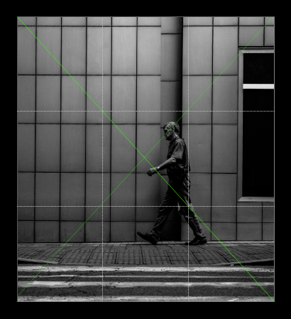
Excellent catch with the lines of the building and street and the diagonals of the man walking.
I wonder if you play with the cropping, you might be able to bring out those diagonal lines more to create a more balanced and interesting composition.

Excellent catch with the lines of the building and street and the diagonals of the man walking.
I wonder if you play with the cropping, you might be able to bring out those diagonal lines more to create a more balanced and interesting composition.

Cool advice, i would at least remove some or almost all the crosswalk, then mid or in the rule of thirds rule for the man like you sugested.
Like the grey / dark tones of this one ;)
glad to be of creative assistance
I was just reading a great article about diagonals in composition
so it was top of mind for me and your image seemed like a good candidate in the way his legs form a triangle plus all the other lines of the image
http://www.adammarelliphoto.com/2011/05/alfred-eisenstaedt/
hey guys, finally someone talking real shit photography on steem:D it's most of the time like "great bla bla", upvote catching without substance comments haha
I dunno, I like the play of sidewalk lines vs the upper ones but was annoyed here that window and cars prevented me to go full symmetry and I didnt want to photoshop it...
I would prefer Maria Svarbova-like symmetry here (just in gritty black and white ) (if you know her work, although it's heavily photoshopped and staged)
I was not familiar with her photos but just had a look.
See what you mean about the sublime (even if manufactured) symmetry. I still like the natural look of your image as it is - cropped or not.