A Step By Step Guide on How to Read the Charts

Future gazing with data...
Candles, moving lines, and looming skyscraper volumes can be a forest of pictographic overload. Alternatively, these symbols can be an excellent guide to the twists and turns of market. Your best ally in this rich story, where being able to read the finer lines might make you just that.
If you want to move beyond "Green and an upward trending line = Good; Red and down = Bad;" - read on.
What the Tech?
Technical analysis is a lot like consulting the oracle, except it's images are drawn from data. Arrangements of what has happened (past data) to make an educated assumption about what might happen in the future.
In cryptocurrency particularly (and particularly at this time) - before widespread regulation and mainstream adoption really kick off - it is important to note volatility. As steady and predictable as an upward trending line can seem, there is always a whale, influencer or government policy shift that can send proceedings sideways, round-ways and all ways - off ways.
So always remember: as with any good oracle, the onus is on you.
You are reading what has happened to help shape your own fate, there are zero guarantees, but being prepared is the best place to be and that is what technical analysis is all about.
Being prepared.
Common Chart Elements

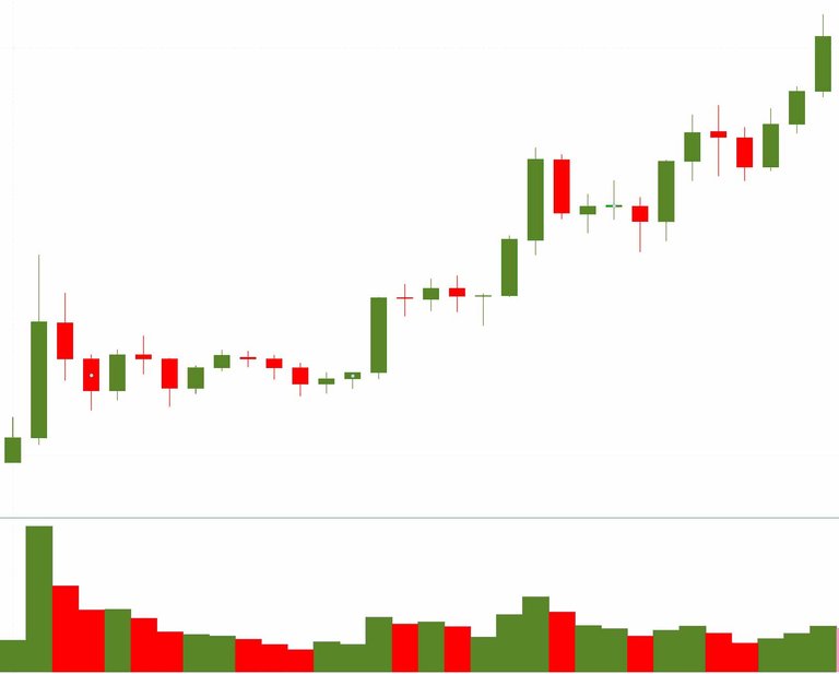
Greens, reds, candles and volumes, absent SMA.
Candlesticks
Green and Red rectangles dancing across the chart with what looks like a candle wick poking out the top - sometimes out the bottom, sometimes both - all over the screen.
Green Candle
The bottom of a green candlestick is the 'open' price for a given timeframe and the top of that candlestick is the 'close'.
Red Candle
Whereas, if the candle was red, the bottom of the candle is the 'close' and the top is the 'open' price for that timeframe.
Wicks
The little wicks poking out? They represent the highs and lows of the pricing during that time period.
Putting it all Together
A candle is green when the 'close' price is higher than the 'open' price, and conversely a candle will be red when it 'closes' lower than the 'open' price. Candle wicks can also be an indicator of market volatility - think 'long wicks means super flammable'.
Volume
The line of skyscrapers at the bottom of the chart.
Literal Volume.
No tricks here, exactly how it sounds, how many coins traded during a given period of time (usually a day).
Dollar Volume.
Slightly different, dollar volume is the price of the coin multiplied by the 'literal volume' (see above) during a given period of time.
'Dollar Volume' and 'Literal Volume' are both really helpful when comparing coins of different value.
For example;
A token is valued at $1.
1 million tokens are traded in 'Literal Volume'.
The 'dollar volume' for this trade equates to 1 million dollars.
A second valued at $100 is traded 100,000 times
This $100 token despite having a much lower 'Literal Volume' has a much higher dollar volume of $100 million.
Moving Averages
Only armed with an understanding of Volume and Candlesticks you have some knowledge for the short game but for more long-term trading 'Moving Averages' start to become your friend.
The solid wandering lines following along the path of candles mark general trends visible.
Simple Moving Average⇨SMA
Quite simply the SMA (or just MA) is the average closing price over time. For example, a day's SMA is calculated as that day's closing price, plus the closing prices of the previous six days divided by seven. If the average you're calculating is longer than 7 days, for example, 50 days, simply add the last 50 days closing price and divide by 50. On a standard chart, the SMA usually has the number of days it represents in brackets.
SMA in action, trading patterns - 'Death Cross' / 'Golden Cross'
A 'Death Cross' is when a 50-day MA crosses below the 200 day MA. The 'Death Cross' is held as a sign of bearish movement and further losses expected.
Compare the 'Golden Cross', which is when a short term MA breaks upward over a long term MA - if there are several skyscrapers of volume as well, this can be taken to herald an upcoming bull run.
Exponential Moving Average⇨EMA
The EMA is much like the SMA but instead of giving equal importance to all days, it weighs the days closest to current as more important. As a result EMA is way more responsive to volatile moves in the market
The major difference between SMA and EMA is the type of trading strategy you are applying to them. If you are following a more long term trading strategy then SMA is your friend, but in closer day-trading, with traditionally more short-term strategy, the more reactive EMA is required.
No spoilers
Technical analysis as a technique is not a crystal ball. However, it can help you be prepared for future moves in the story of the market. Having some knowledge of the terms in this article and what they mean will always put you ahead.