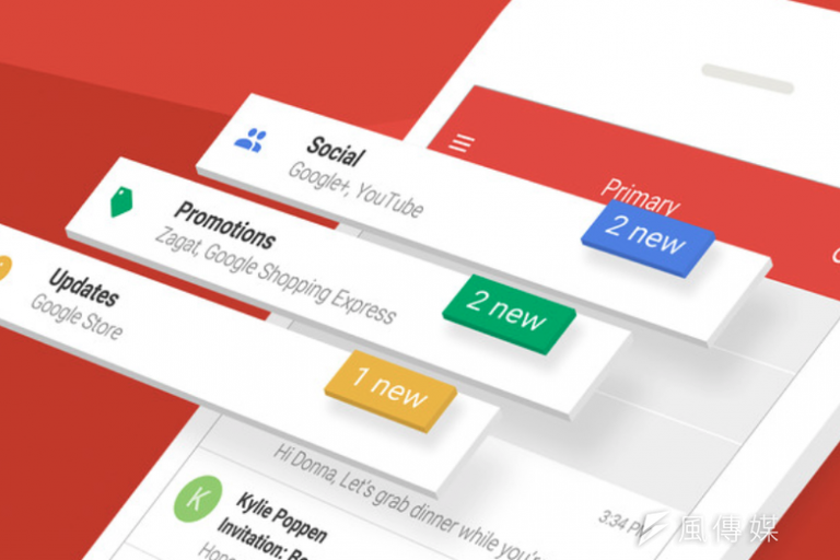
Didn't we all hate the old UI of Gmail web on PCs and Laptops? We all know how ugly it looked compared to Gmail apps on Android and iPhone. I fact Google has been updating it's all services like Google maps, Google calendars, Google drive and all other Google product's design to match the Nice and attractive Material Design guideline that Google introduced a couple of years ago, which actually looks stunning. But Gmail UI for Web hasn't been ever updated to match the material design. But not anymore!

According to TechCrunch, a reader has seen a Google employee testing the new design on public transport. He claims the new design looks like “a hybrid of Gmail and Inbox”. Whether that’s true or not it’s guaranteed to follow Google’s Material Design concept.
Google has promised to share more details on The Keyword and the G Suite Update blog when the EAP opens. We’ll be sure to keep our eyes firmly peeled to find out when the new web version of Gmail is going to be made available to ordinary Gmail users.