A chart pattern is a visual representation, within a chart, of a financial instrument.
Humans are creatures of habit. We do the same things over and over. We can see this reflected on our charts as well. There are many patterns and we will go over some of the common ones within this section of the course. Whether you are trading forex, binary options, stock, futures, or the price of rice in china, you can use chart patterns to help you gauge the market.
The main patterns we will discuss in the next few articles are:
-
Trend Line Bounce or Break
-
Double Top/Bottom
-
High and Tight Flag
-
Triangle
-
Consolidation
-
Head and Shoulders
-
Expanding Wedge
-
Fibs
-
Japanese Candle Stick Patterns
An Example to get you Started…
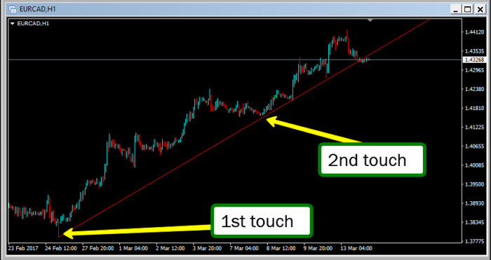
First let’s look at an example of what a chart pattern actually is. We will look at a trend line, which is the most simple pattern of all. You learned what a trend line was earlier in this course but here is a refresher.
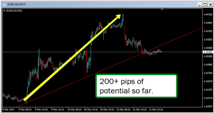
Here is a trend line bounce and what it looks like on a really short term chart. The rules are this…
On the 3rd touch of this trend line, BUY it, because it is in an UP trend.


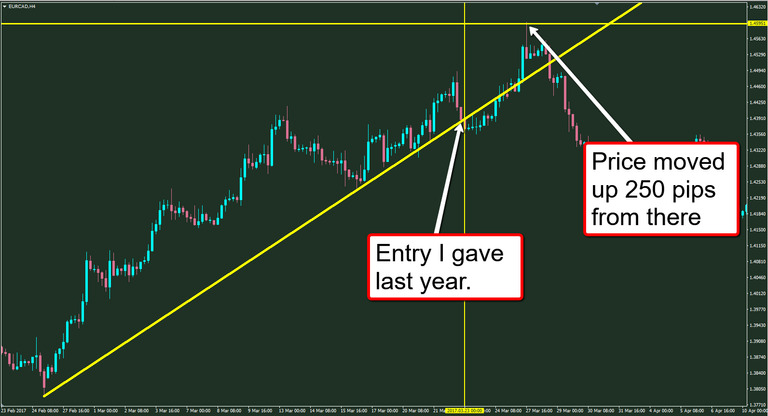
I uploaded those pictures over a year ago, on December 2016. Let's see if any profit way possible.

Price gave 250 more pips before pulling back.
Why do Chart Patterns Seem to Work?
There once was a man who bought a very expensive computer for a cheap price!
There once was a man name Frank. Frank was a tech savvy guy who wanted an expensive computer but didn’t have a lot of money to spend on one. Every time he tried to buy the X42 8 Core 20ghtz, 12 monitor system, it was just too expensive.
Frank watched as price rose and then fell from week to week. This week, price was at $5,000. The following week, price was at $6,000 and then $7k and he noticed a ‘price pattern…
He also noticed that every time price got too expensive, the news would have a headline, ” X43 Computer Company can’t sell any more computers, due to the excessive price” and then price would begin to fall.
As price fell, there would be a point when all of Franks friend began talking about how cheap the computer are now. As price fell more and more, Every Tom, Dick, and Harry would go to the local electronics store and begin buying these deep discounted computers.
Price had fallen from $7k all the way down to $6.5k for crying out loud. Everyone saw the price as a cheap price, even though it was more expensive than the starting price.
This drove the demand back up, and likewise, the price. X42 began raising their prices until there were no more buyers. As price peaked, they began to lower their price to attract more sales. There was a ‘sweet spot’ when the company could begin raising prices again.
…and the cycle continues…
This is why patterns act the same. Chart patterns are just visual representations on the actual buying and selling behavior of traders. Since humans are creatures of habit and do the same thing week after week and year after year, patterns in the market tend to repeat week after week and year after year.
Now lets move onto the next article... 😎

Hey @herronryan, great post! I enjoyed your content. Keep up the good work! It's always nice to see good content here on Steemit! Cheers :)
thank you! it is nice to hear things like this. I am continuing to move over a lot of my content from wordpress to here so there will be more to come! Happy Trading!