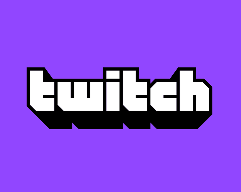
I always find it interesting when companies change their brand's logo and identity. It's common for brands to do this as they desire to stay relevant and appeal to new customers. At the same time, you don't want to turn away current customers and lose your identity completely.
For this reason, a logo update is often minor and not something that everyone notices, so I'm curious how many people noticed the new twitch logo?
Let's go through the logo updates. It's a game of find the differences.
Have a look below.
| OLD | NEW |
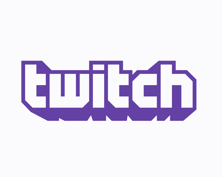 |
 |
What did you notice? The major thing I noticed right away was the change in contrast. I don't mean the background colors, but they outlined the new logo with black and filled the inside with white. This creates a very visible contrast.
This kind of change reminds me of the recent Snap logo change where they simply increased the stroke on their logo, which resulted in slightly better contrast.
The second thing I noticed were the small details in the word mark. For example, the cut in the 'w' changed from the right side to the left side.
Along with the word mark twitch updated glitch, their emoticon / mascot / logo. Check it out below.
| OLD | NEW |
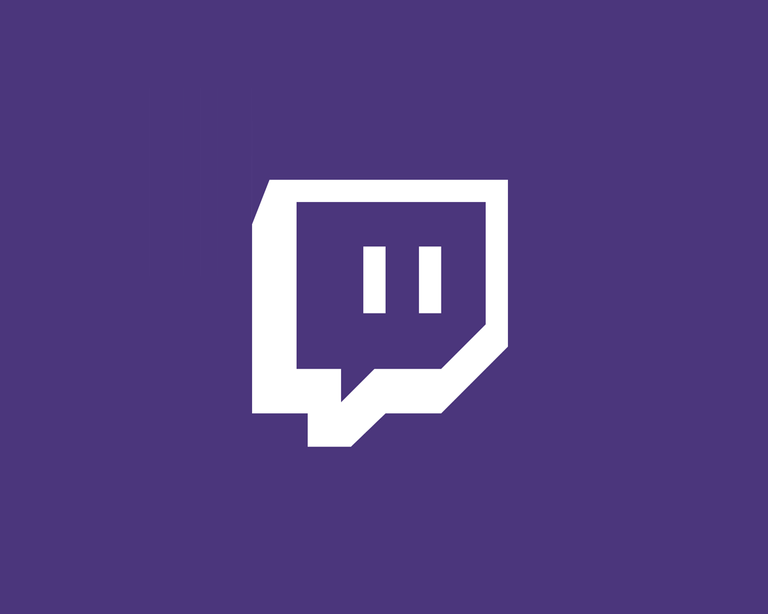 |
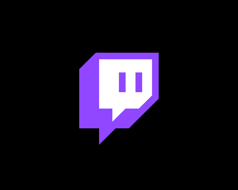 |
Well, what do you think? Do you like the new look for twitch?
Let me know in the comments.
I've been taking some lessons on Logo Design recently. It's fun comparing the logos like this and trying to guess what the psychology was behind their decision to change it. I actually really like the updated version too.
I enjoy comparing and thinking about what ideas were behind changes such as this too!
Thanks for the comment @etblink! :)