What Will I Learn?
- Create element horizontal card
- Create SASS horizontal card
- Implement horizontal card
Requirements
- Intermediate CSS , HTML, Javascript
- Basic SASS
- Watch Create cards
Difficulty
- Basic
Create Element
In the previous tutorial Create cards we have created a system card. in this tutorial we will make variation card with horizontal type. The first thing we have to do is create elements of cards.
Element HTML:
<div class="container">
        <div class="columns">
            <div class="column cards">
                <img src="assets/example-img.png">
                <div class="title">Title Cards</div>
                <p>Lorem Ipsum is simply dummy text of the printing and typesetting industry. Lorem Ipsum has been the industry's standard dummy text ever since the 1500s, when an unknown printer took a galley of type and scrambled it to make a type specimen book.</p>
            </div>
        </div>
    </div>
- class="container", class="columns column ": In the previous tutorial we have created the class = "container", which is useful to set our web content and spacing to be in the middle of the browser view.
for more details you can see in my tutorial Make grid system. - class="cards": we still use the class "cards" because we need it to create a card system.
This the SASS cards
.cards
    background: white
    box-shadow: 0 1px 3px 0 rgba(0, 0, 0, 0.12), 0 0 3px 0 rgba(0, 0, 0, 0.04)
    border-radius: 3px
    .title
    font-size: 20px
    font-weight: bold
    margin: 10px 0px
    img
        width: 100%
for more details, you can see in my tutorial Create cards.
Create SASS horizontal card
We will combine the class "cards" and class = "horizontal", so that the horizontal class is more specific and only in use when combined with class cards.
SASS Cards Horizontal:
.cards
    background: white
    box-shadow: 0 1px 3px 0 rgba(0, 0, 0, 0.12), 0 0 3px 0 rgba(0, 0, 0, 0.04)
    border-radius: 3px
    &.horizontal
        display: flex
    img
        width: 100%
- &.horizontal: We can combine both classes by using & .horizontal.
- display: flex: Display flex in the CSS serves to make the elements in it to be aligned neatly or in accordance with the wishes that you want.
Use the horizontal cards:
<div class="columns">
            <div class="column cards horizontal">
                <img src="assets/example-img.png" class="avatar">
                <div class="title">Title Cards</div>
                <p>Lorem Ipsum is simply dummy text of the printing and typesetting industry. Lorem Ipsum has been the industry's standard dummy text ever since the 1500s, when an unknown printer took a galley of type and scrambled it to make a type specimen book.</p>
            </div>
</div>
- class="column cards horizontal": How to wear it easy, just need to add the horizontal class in class cards class = "cards horizontal". with use like this, this means we merge class cards(&.horizontal) and horizontally. cards act as parent class.
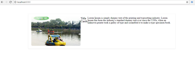
Result:
Open a command prompt on your project and run gulp. Open http://localhost:8080/ in your browser to see the results.

Styling content horizontal card
We have seen the results, but we have to style the existing content in horizontal cards to look neater and elegant.
Styling Image:
We will create a class to set 
SASS:
.avatar
    width: 100px
    height: 100px
    border-radius: 50%
- width: 100px,height: 100px: We make the image smaller by changing the CSS property to
width: 100px,height: 100px. - border-radius: 50%: To beautify the look of the image I will make a groove in the image section by using the CSS border-radius property. We give value 50%, Value can also be in px(pixel).
The result:

Now we need to fix the title and the paragraph in the cards. because we use display: flex, the contents of our content cards to be parallel to the side. to remove the effect we wrap our content cards in .
Why use div to remove display flex?
Because flex displays have properties similar to inline-block, so we need to use , because by default div has block properties(display:block) , So if we wrap content cards with div, automatically content contents are not affected with flex effect
Example:
<div class="column cards horizontal">
                <img src="assets/example-img.png" class="avatar">
                <div>// Start div wrapper
                    <div class="title">Title Cards</div>
                    <p>Lorem Ipsum is simply dummy text of the printing and typesetting industry. Lorem Ipsum has been the industry's standard dummy text ever since the 1500s, when an unknown printer took a galley of type and scrambled it to make a type specimen book.</p>
                </div>// End div wrapper
            </div>
The result:

I hope you can Trying to replace the CSS property to make it look nicer and beautiful. I use simple CSS. because the purpose of this tutorial would like to explain how the concept to make element cards
Curiculum
Posted on Utopian.io - Rewarding Open Source Contributors
Thank you for your contribution, but it cannot be accepted.
Chat with us on Discord.Need help? Write a ticket on https://support.utopian.io.
[utopian-moderator]
Desicion has been reversed. Please check comment below.
Thank you for your contribution, but it cannot be accepted for several reasons, including:
Chat with us on Discord.Need help? Write a ticket on https://support.utopian.io.
[utopian-moderator]