Details
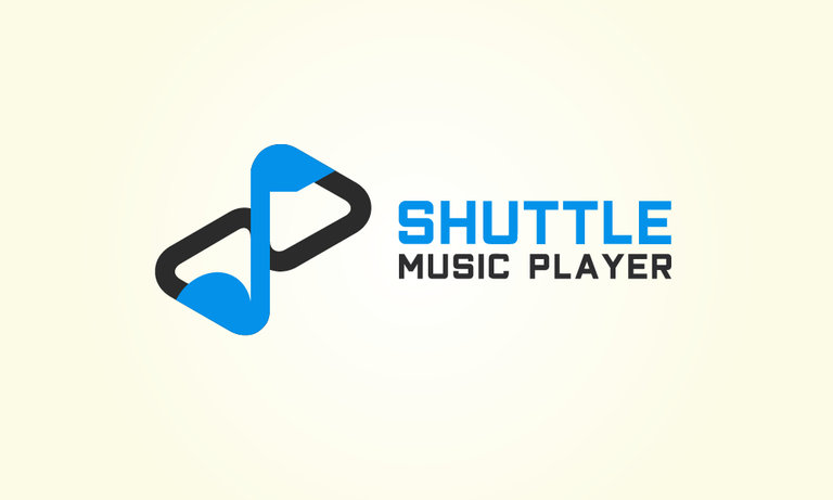
In this great opportunity I would like to continue my contribution in Utopian. I propose a new logo design for Shuttle Music Player
Shuttle is an open source, local music player for Android.
Shuttle comes in two flavours:
- Shuttle (free)
- Shuttle+
The free version includes an option to upgrade via an IAP, which unlocks the features otherwise available in Shuttle+.


Alternative Version
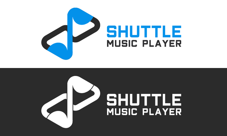
There are so hard to make synchronization and combination for "S" element and note music element, while it must look aesthetic too. So as recommendation of Moderator, I create another version of the logo design. There's no more differences, between head and bottom of music note and "S" element. Both of them looks rounded in this alternative version.

Benefits / Improvements
The new logo has many improvements from the previous logo. The new logo showing and combining the "S" element, player element, and music note element. That makes the logo more iconic and more powerful. Also, the logo hide the generic idea of music on the previous logo. The more important, the new logo become more eye-catching and stronger than the previous one.
Tools
Using Adobe Illustrator CS6 to create the logo and presentation.

Using Adobe Photoshop CS6 to the mockup

Original files
Posted on Utopian.io - Rewarding Open Source Contributors
You've got upvoted by
Utopian-1UP!You can give up to ten 1UP's to Utopian posts every day after they are accepted by a Utopian moderator and before they are upvoted by the official @utopian-io account. Install the @steem-plus browser extension to use 1UP. By following the 1UP-trail using SteemAuto you support great Utopian authors and earn high curation rewards at the same time.
1UP is neither organized nor endorsed by Utopian.io!
good job mr. @anharismail
Terima kasih bg
Your contribution semoga bisa approved.
I recommend you membuat lebih banyak postingan.
You can see my post on iqbalhood
[@steemit.medan]
Lagi-lagi ya bg.
Gak boleh lagi support nih , ??
Boleh lah, apalagi kalau 1UP
sudah di upvote yaa, upvote back ya
trima kasih buat vote nya om... horas medan :D
Horas juga kak
Please explain why are these parts not the same.

It is representing music note symbol like this. Sharp on the head and round on the bottom
It looks like forgoten... I recommend making them more different or same.
In my humble opinion sir, too sharp on the head,showing no more synchronization between the shape (head and bottom). And hiding the similarities of 'S' element.
I've tried making the head sharper when i creating it, but it's decreasing the aesthetical.
How about it sir?
Keep this one, but add alternative version.
Version 2 - same heads
Thank you for the contribution. It has been approved.
You can contact us on Discord.
[utopian-moderator]
this post has been updated and thanks sir
Hey @anharismail I am @utopian-io. I have just upvoted you!
Achievements
Community-Driven Witness!
I am the first and only Steem Community-Driven Witness. Participate on Discord. Lets GROW TOGETHER!
Up-vote this comment to grow my power and help Open Source contributions like this one. Want to chat? Join me on Discord https://discord.gg/Pc8HG9x