Details about CuteHMI
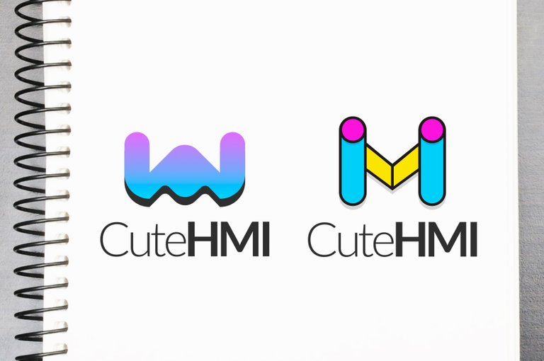
CuteHMI is an open-source HMI (Human Machine Interface) software written in C++ and QML, using Qt libraries as a framework. For more information check here.
Tools I used while working:
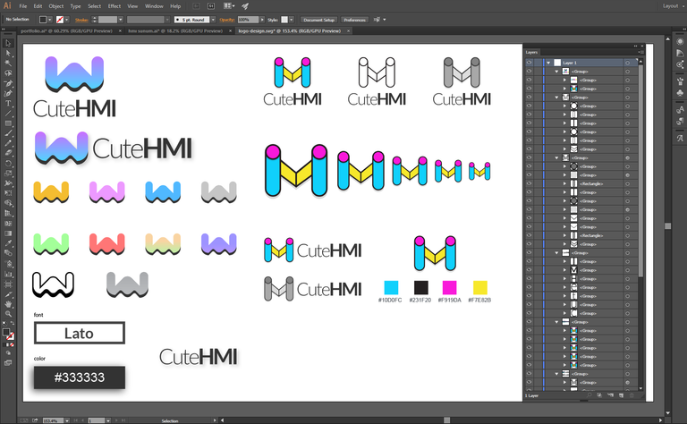
- Adobe Illustrator CC 2015 (logo design)
- Adobe Photoshop CC 2015 (presentation&mock-up design)
Necessary links about whole design and design process:
Repository of Project
Pull-Request
Communication with Project Owner
Google Drive
Proof of Work Done
Font: Lato
Mockup

This work is licensed under a Creative Commons Attribution 4.0 International License
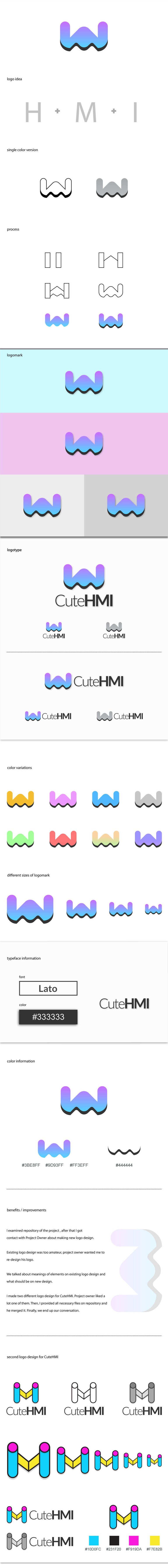
As I mentioned earlier, I'd rather skip one font weight. Of course it's a matter of choice but I would suggest that to every designer.
I really like the second version, it's looking solid without gradients etc. It's easier to see those H + M + I letters. Second one has more fluid look and in my opinion it's still open to improvements. Such as that shadow looks to strong maybe a softer shadow could work better.
Your contribution has been evaluated according to Utopian policies and guidelines, as well as a predefined set of questions pertaining to the category.
To view those questions and the relevant answers related to your post, click here.
Chat with us on Discord.
[utopian-moderator]Need help? Write a ticket on https://support.utopian.io/.
Interesting, I like the second logo more. It has those HMI letters like the current logo in a better way. And first logo directly reminded me that is a spaceship from a shooter game and a little bit of batman logo because of that shadow.
As a suggestion if I'm not seeing wrong. When I use two different font weights I just only skip one weight. Like if there is regular - medium - semibold and bold. I choose to combine regular with semibold or medium with bold. Otherwise I believe it cause some trouble when you need to resize the logo.
I agree with your comments about the logo designs. Actually, I avoid from using similar thicknesses without big differentiate on logo designs thats why I skipped two weight but yes, I realized that it made too much difference for this font. Thank you for suggestion, I should not forget to look to logo design from long distance again.
Thank you for your review, @oups!
So far this week you've reviewed 2 contributions. Keep up the good work!
Thanks for contributing on Utopian.
We’re already looking forward to your next contribution!Hey @baranpirincal
Want to chat? Join us on Discord https://discord.gg/h52nFrV.
Vote for Utopian Witness!
Congratulations @baranpirincal! You have completed the following achievement on Steemit and have been rewarded with new badge(s) :
Click on the badge to view your Board of Honor.
If you no longer want to receive notifications, reply to this comment with the word
STOPCongratulations @baranpirincal! You have completed the following achievement on Steemit and have been rewarded with new badge(s) :
Click on the badge to view your Board of Honor.
If you no longer want to receive notifications, reply to this comment with the word
STOP