Your contribution cannot be approved because it does not follow the Utopian Rules.
Hard rules broken:
- No benefit over their existing logo design. Your symbol is not understandable. Their existing logo works better.
- You should explain your idea in your presentation. If you wanted to show "T" in negative space, it looks like "Y" more then "T".
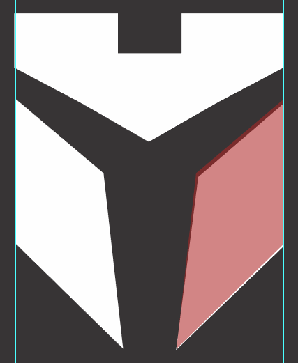
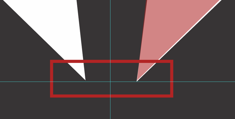
- Your logo has proportional and alignment problems:
Shapes are not same and not aligned

Suggestion:
- Be more careful about symmetry and alignment
- Be sure that your logo has more benefit over their existing design for project owner
You can contact us on Discord.
Hey @baranpirincal, I just gave you a tip for your hard work on moderation. Upvote this comment to support the utopian moderators and increase your future rewards!