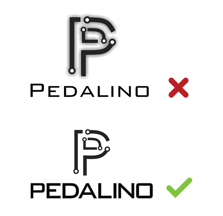
Hey, your idea is good but I suggest that, don't use drop shadow like this. It seems like mistake. I think it would be better.
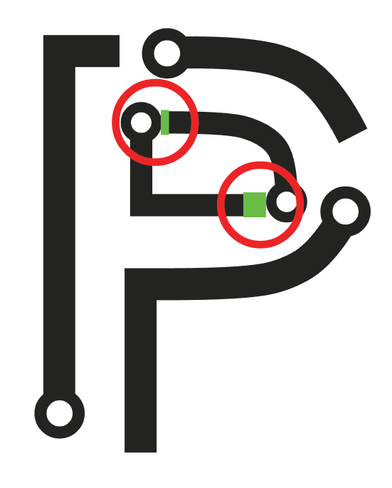
Some spaces between elements are not same and because of this your design looks unbalanced. Also, empty spaces between the letters are different too as you can see below. Finally, why 'P' letter bigger than others I did not understand.


Here I removed drop shadow and made empty spaces between elements and letters are same.

Your contribution has been evaluated according to Utopian policies and guidelines, as well as a predefined set of questions pertaining to the category.
To view those questions and the relevant answers related to your post, click here.
Chat with us on Discord.
[utopian-moderator]Need help? Write a ticket on https://support.utopian.io/.
well but I think that wasn't the best idea. anyway, thanks for the review.hi @baranpirincal I didn't realize the logo was unbalanced, the P is bigger than the others because this is the "uppercase" of the font, but actually, all is uppercase in the font.
Thank you for your review, @baranpirincal!
So far this week you've reviewed 12 contributions. Keep up the good work!