New Logo Design Kontalk Messenger

in #utopian-io7 years ago (edited)

Details

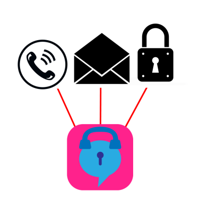
In this logo design I wanted to summarize the application by using phone, message and padlock symbols together.

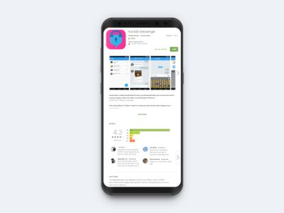
mockup1.jpg
logo.png
font.png

Differences between old and new logo

newandold.png

App Store

mockup23.png
mockup2.png

New logo different colors

colors.png
colors2.png

New logo different sizes

px.png

New logo different backrounds

backround.png

One Color

onecolor.png

Inspiration

inspiration.png

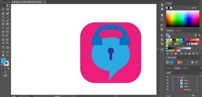
Stages

Screenshot_1.png
Screenshot_2.png
Screenshot_3.png
Screenshot_4.png
Screenshot_5.png
Screenshot_6.png
Screenshot_7.png
Screenshot_8.png
Screenshot_9.png
Screenshot_10.png
Screenshot_11.png
Screenshot_12.png
Screenshot_13.png

Original files

App Store : Kontalk Messenger

Github : Link

Google Driver : Link

Mockups Source : 1 2

Font : 1

Inspiration Photo : 1 2 3


Posted on Utopian.io - Rewarding Open Source Contributors

Sort:  

Your contribution cannot be approved because it does not follow the Utopian Rules.

Hard rules broken:

  • "A contribution must contain .... benefits of your work to the project owner." Their logo desing has 'lock' and 'message balloon' too and it works well. Only added value is phone in your logo design and I'm not entirely sure but the application does not have a phone call feature. I just looked their interface design on GooglePlay
  • Very low color contrast usage reduces intelligibility

Suggestion

  • Try to design a logo for projects with really bad logo design or without any logo design
  • Be more careful about color usage

You can contact us on Discord.

[utopian-moderator]