Repository
Welcome to the Tutorial of An Efficient Approach to Responsive Web Design Using CSS (Key Frames, Transitions and SASS)

What Will I Learn?
- You will learn how to create a complete stunning web design like our project “Course-City”
- You will learn about the latest CSS techniques and frameworks
- You will learn how to develop a responsive web design to render on different devices
- You will learn about the SASS, its architecture and deployment
- You will learn about the transitions and animation in web design
- You will learn about the font definitions and clip part elements
Requirements
System Requirements:
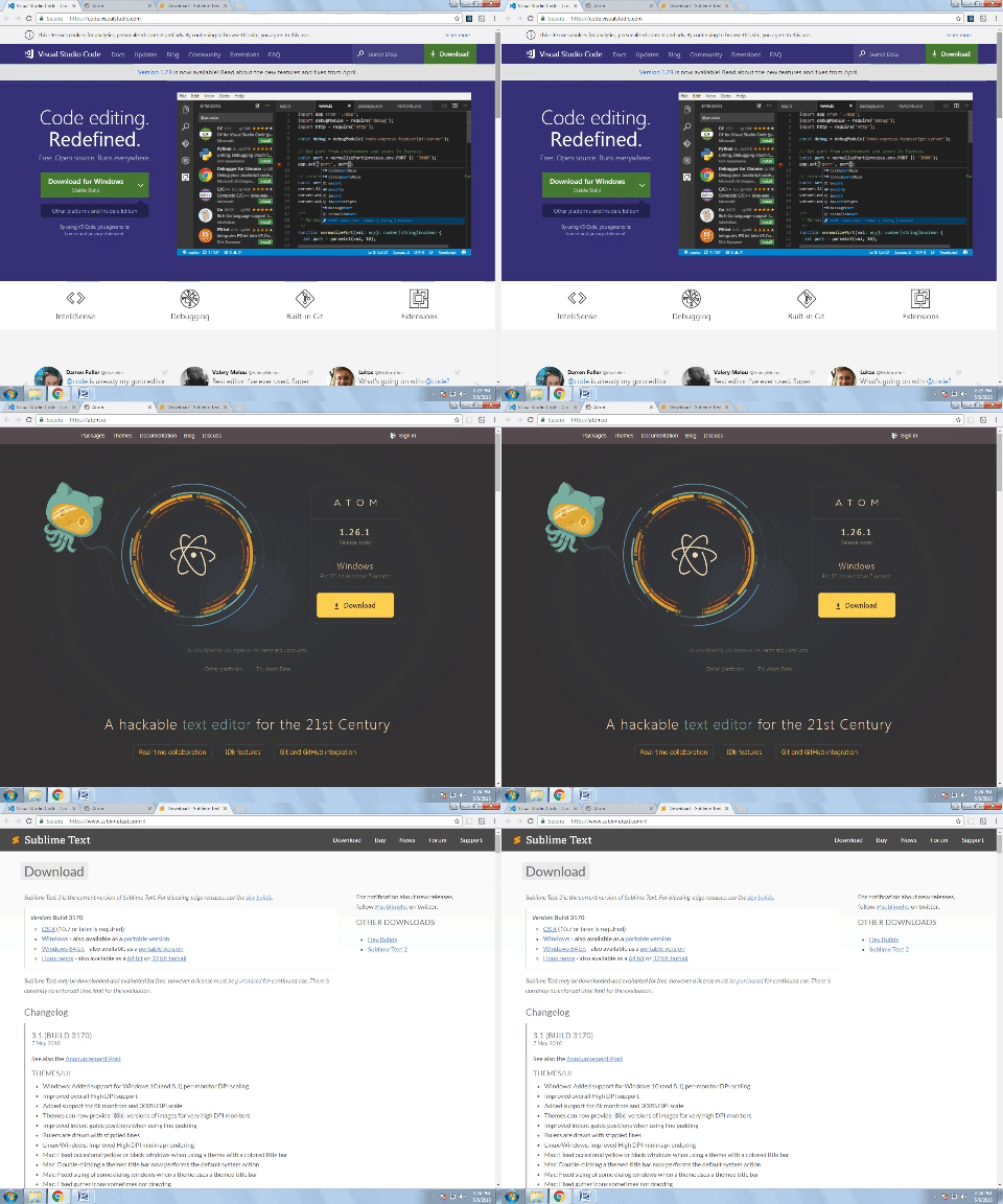
- Visual Studio Code or Atom or Sublime Text 3 or any editor for code editing
- A computer with basic functionalities and Web browsers
OS Support:
- Windows 7/8/10
- macOS
- Linux
Difficulty
- Intermediate
Resources
https://www.creativebloq.com/web-design/what-is-sass-111517618
https://www.w3.org/standards/webdesign/htmlcss
https://fonts.google.com/specimen/Merriweather?selection.family=Merriweather
Required Understanding
- You just need a good knowledge of HTML and CSS.
- A fair understanding of programming background is a plus
- A thirst for learning and developing something new
Description
In this tutorial we will learn how to get command over the latest CSS technologies that put our web design to the ultimately new level. We will see how the latest CSS frameworks put essence and uniqueness to our CSS design. We will also have a look at how to create a amazing responsive web project in this course which is Course-City.
It is basically a website that offers users a new way of learning programming languages. It provides different courses and students will get book a course according to their needs. At the end of the tutorial we will complete this project.
What is CSS and SASS?
- CSS is the language for describing the presentation of Web pages, including colors, layout, and fonts. It allows one to adapt the presentation to different types of devices, such as large screens, small screens, or printers. CSS is independent of HTML and can be used with any XML-based markup language. The separation of HTML from CSS makes it easier to maintain sites, share style sheets across pages, and tailor pages to different environments
- SASS is a CSS preprocessor, which adds special features such as variables, nested rules and mixins (sometimes referred to as syntactic sugar) into regular CSS. The aim is to make the coding process simpler and more efficient. It also helps to keep things organized and allows you to create style sheets faster. SASS is compatible with all versions of CSS.
Setting up the Environment:
Now we have to install the code editor for our project. I recommend using Visual Studio Code but you can use Sublime, Atom or any other code editor that meets our requirements.

Now at this stage we have installed code editor. Let’s get started to create our web design.
Starting Our Project:
First of all create the project folder and create a basic HTML file with some references to the css styles and has font details.
<!DOCTYPE html>
<html lang="en">
    <head>
        <meta charset="UTF-8">
        <meta name="viewport" content="width=device-width, initial-scale=1.0">

        <link href="https://fonts.googleapis.com/css?family=Merriweather":100,300,400,700,900" rel="stylesheet">
        <link rel="stylesheet" href="css/style.css">
        <title>Course-City | Educating People With The Latest Skills</title>
    </head>
    <body>
<header class="header">
This is our project "Course-City"
</header>

    </body>
</html>
Now this Is our basic HTML file which give the details about the HTML character type. It tells about the title of our project and it has a header section as well.
Designing the Layout:
We are now move to CSS and open styles.css.First thing is to perform the basic reset and normalize the css. In order to make cross browser reset so that every browser render the page in the exact same way. Doing so, is still valid but its no longer necessary to do it as browsers are now getting better and modified.
*{
  margin: 0;
  padding: 0;
  box-sizing: border-box;
}

body {
  font-family: "Merriweather", sans-serif;
  font-weight: 400;
  font-size: 16px;
  line-height: 1.7;
  color: #777;
 }
*
We are using universal selector to reset. It will select each and every element on the page and then applies declaration to the project.
margin: 0; padding: 0:
Applying some margin of 0 pixels and then padding of 0 pixels as well. By default browser apply some margin and padding to elements. Like on H1 elements some margin that is applied by browser and we don’t want these margins and padding.
box-sizing: border-box:
Box sizing property used to border box. Box-sizing change the box model so that the borders and the padding are no longer to the total width and height that specifies for a box.
font-family:
Font property applies in the body element selector and why we do this in this way because the property related to fonts is usually inherited so we using the power of inheritance here. Font-family applies to the parent element and then it is inherited by all the Childs of the family. We set it to Merriweather as it we are using in the HTML
font-weight:
Font weight is set to be 400 pixels and font size is 16 pixels, line height is set to 1.7 which means that it is 1.7 bigger than the predefined line height that we would have without this.
color:
Color tag is used to apply the color we set it to 777 which is grey in the RGB.
With this code we performed a reset and project wise font definitions because they all be inherited to their child elements
Inheritance:
CSS Inheritance significantly decreases the time needed to develop a website. Think about just how much CSS you would need to write to put the color on almost all children of the body tag. This could be time intensive, fault prone, and hard to hold. Likewise, you can imagine such a nightmare it might be in case you had been pushed to set the actual font-family or even font-size on every child element of the container.
Class Selector:
The Class selector within CSS , which references the class attribute utilized on HTML elements. The Class selector starts with a dot(.) and then a class name that you choose. As opposed to the id attribute, several elements might share exact same class name, additionally an element may possibly belong to multiple class.
Creating the Header And Effects:
Now we are going to formatting the header element and remember it has a header class so we have class selector and then the header.
.header {
     height: 95vh;
     background-image: linear-gradient(
to right bottom,
#26D1F3,
#A6F1FF),
    url(../img/bgcc.jpg);
    background-size: cover;
    background-position: top;
}
height:
Height is set to 95 vh and it means at every point height of the box of this element should be 95% of the view port height. Now we could put 100% here so the element will be exactly the same height but we choose 95% to get the almost 100%
background-image:
Background image that we want is in our img folder and we select this image by writing url and then the path to the image. Since we are currently in the css folder and we have to go up one folder to be in the project folder that’s why we type ../img/bgcc.jpg
background-size:
Background size is set to be cover and what cover does is whatever the width of the viewport or the element. It always tries to fit the element which is inside the box.
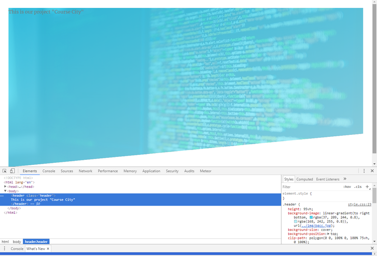
Our background image is adapted nicely to the viewport and it does perfect. You can see the white bar is the remaining 5% of the viewport height. So, 100% fills every point. Also you can see the text we put at the top and it is styled with Merriweather font-family and 16 pixels in size with grey color.
background-position:
Background position is set to top and it insures that whatever the viewport size the top of the image is remains at the top of the container. We can also change it to bottom and center
Linear gradient is added in the background image property by specifying linear gradient in the background image tag. So we put linear gradient with colors that we want with our image.
We choose three colors with contrast of blue and then specifying each color separating by comma. So, we have basically two images one on top of the other. First one is the linear gradient going from the first color to the other. After that is our bgcc image in the background.
We have changed the colors hexa code to rgba format and adjust the opacity of our image. So, that it will be visible on the screen
rgba(37, 209, 244, 0.8),
rgba(168, 242, 255, 0.8),
Another parameter in the linear gradient is the position where it go and place it as to right bottom. Now are gradient goes to right bottom corner
To make our image and header looks more prominent we should add some padding here:
padding: 30px;
Now header looks like this after updating the colors and padding,
.header {
     height: 95vh;
     background-image: linear-gradient
to right bottom,
rgba(37, 209, 244, 0.8),
rgba(168, 242, 255, 0.8)),
    url(../img/bgcc.jpg);
    background-size: cover;
    background-position: top;
    padding: 30px;
}
Applying Polygon:
Now we used clip-path to specify a polygon to make the image visible. So we make sure that it looks perfect with our header.
polygon ():
The polygon() function is required in order to define more advanced arbitrary shapes applying any number of points. The function takes in some coordinate pairs (x y, x y), each set indicating the positioning of a point. The 1st argument signifies the x-position of a point, along with the 2nd argument represents the y-position. The particular set of points make up the shape. The web browser will link the last vertex within the list using the first vertex in the list to close the polygon.
Clip-path: polygon(0 0, 100% 0, 100 75vh, 0 100%)
After adding polygon function our header looks like this:
.header {
   height: 95vh;
   background-image: linear-gradient(to right bottom, rgba(37, 209, 244, 0.8), rgba(168, 242, 255, 0.8)), url(../img/bgcc.jpg);
   background-size: cover;
   background-position: top;

  clip-path: polygon(0 0, 100% 0, 100% 75vh, 0 100%);
}
We don’t want to move the X-Axis so we assign 0,0 in first coordinate. In the second place we want change in the X-Axis so we assign it to 100% of the width of the element from the left side. In third the X-Axis will be same but there is change in the Y-Axis so we assign this value to the viewport height. In Fourth point X-Axis back to 0 here and Y-Axis becomes 100%

Curriculum
This is the first part in this tutorial, when further tutorials will create then they will be place here.
Summary
In this tutorial we have learned about the our project creation that is Course-City. A website that provides development courses. We have learnt how to create a header with some margins and padding. How to align a webpage and render it to different sizes. We also studied about how can we make webpage looks interesting and promising. In the later parts of the tutorial we will see how we add SASS to our project and also keyframes.We will create our project more effective in the next part of the tutorial
Complete Source Code
index.html
<!DOCTYPE html>
<html lang="en">
    <head>
        <meta charset="UTF-8">
        <meta name="viewport" content="width=device-width, initial-scale=1.0">

        <link href="https://fonts.googleapis.com/css?family=Merriweather":100,300,400,700,900" rel="stylesheet">

        <link rel="stylesheet" href="css/style.css">

        <title>Course City | Educating People With The Latest Skills</title>
    </head>
    <body>
<header class="header">
This is our project "Course City"
</header>

    </body>
</html>
style.css
/*
dark blue: #26D1F3                      rgba(37, 209, 244, 0.8),
light blue: #A6F1FF                    rgba(168, 242, 255, 0.8),               medium blue:#81EBFF


*/

*{
  margin: 0;
  padding: 0;
  box-sizing: border-box;
}

body {
  font-family: "Merriweather", sans-serif;
  font-weight: 400;
  font-size: 16px;
  line-height: 1.7;
  color: #777;
  padding: 30px;
 }

 .header {
   height: 95vh;
   background-image: linear-gradient(to right bottom, rgba(37, 209, 244, 0.8), rgba(168, 242, 255, 0.8)), url(../img/bgcc.jpg);
   background-size: cover;
   background-position: top;

  clip-path: polygon(0 0, 100% 0, 100% 75vh, 0 100%);
}
The content of your tutorial is easily found on the internet and well documented. Please, in the next tutorial try to make a subject that really contributes to the open source community. Thank you.
Need help? Write a ticket on https://support.utopian.io/.
Chat with us on Discord.
[utopian-moderator]