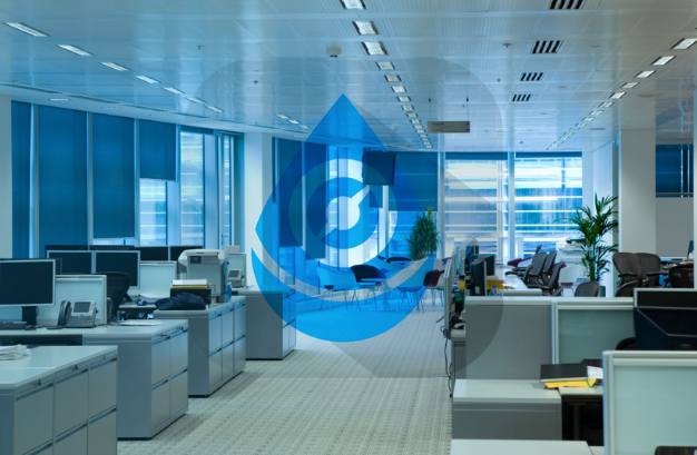
Hello!!! Nice logo :)
I don't know why people do this, but I have seen many making the same mistake:

Your logo looks perfect without the square!

Those squares with round corners are recommended only for the icons (android, playstore, or other ICON uses) for the logo itself it's not necessary and it's actually wrong.
Here is very low contrast:

Did you try the white one? and make the background a bit darker if necessary. And withouth the square, I am sure it will look much better!
Rough sample:

In general, your logo is really cool, just the applications of it are a bit incorrect.
I Need a new logo for my own project, i'll made it by myself ;)
< That is so fun! I have to talk to myself in github too when I create my logos or other stuff for my projects xD
Greetings!
I am not utopian moderator, take my advice if you want. I am a graphic designer graduated in 2009; founder of @wearecodex team.
I Love your statement, I admit I'm inexperienced, I'll welcome your comments with my pleasureOMG @fabiyamada, this is really a constructive comment!
LOVE FABIYAMADA
You're welcome! Even with your lack of experienced you did very good :D
Hey @fabiyamada Here's a tip for your valuable feedback! @Utopian-io loves and incentivises informative comments.
Contributing on Utopian
Learn how to contribute on our website.
Want to chat? Join us on Discord https://discord.gg/h52nFrV.
Vote for Utopian Witness!