Hello @tobaloidee.
Overall an aesthetically pleasing logo that speaks to the crystal and audio themes of the project. The choice of color, and dark on light, is visually delightful, though the blue parts of the gradient on the "Quartz" text makes me squint a bit when on light colors. A variation that changes up the gradient to emphasize the purple, as in the logo, might help ease the eyes.
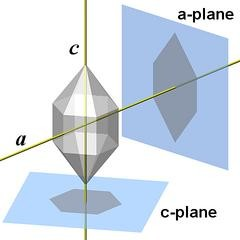
Now a few too many words on the choice of shape. I see one place where you might have gotten the quartz shape:

via http://www.quartzpage.de/gen_struct.html
But decided to do some more digging. I always do a background search when considering logos, since lots of generic shapes, while perfect for a given brand idea, are still already linked up with a different brand. I recognized the quartz shape immediately, and was wondering why that might be (aside from staring at hexagonal phage heads while designing @king-of-disease graphics), so I did some research to see if that hexagonal quartz showed up in another logo.
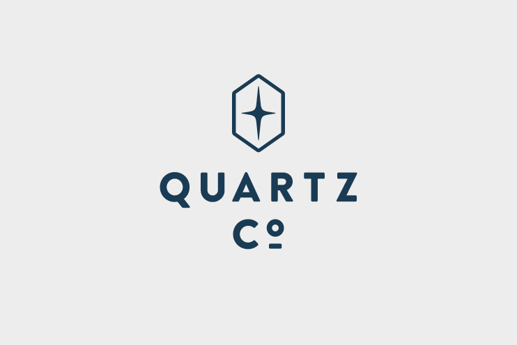
Unfortunately Quartz Co., a Canadian company selling winter apparel, also uses that hexagonal quartz in its logo:

via https://fontsinuse.com/uses/17340/quartz-co
Most importantly, Quartz Co. and the Quartz project are in entirely different industries, so the trademarks don't infringe on one another to begin with. Also, your quartz logo has some marked differences that make it visually distinct (and safe from cries of plagiarism), including breaking at the corners, thinner overall shape, and sharper top/bottom angles:

While there are other crystalline quartz shapes you could have chosen, you've differentiated it enough to make it safe to use for this project.
Thank you for continuing to contribute to open source projects! It's great that you dive into GitHub looking for new projects to bring your visual talents to.
Your contribution has been evaluated according to Utopian policies and guidelines, as well as a predefined set of questions pertaining to the category.
To view those questions and the relevant answers related to your post, click here.
Need help? Chat with us on Discord.
Thanks for your review but I respectfully disagree that my design was generic by just using a generic hexagonal shape ..I have given the project unique logo for its theme and feature. I don't understand why did you display comparison with another logo when you already know that it is a different brand and is visually different.
It is like comparing you king of disease design with this image..
http://cedrichohnstadt.tumblr.com/post/107989172893/doodle-pirate-daddy-long-legs-pirate-spider
Thank you for your review, @gutenmorganism! Keep up the good work!