Details
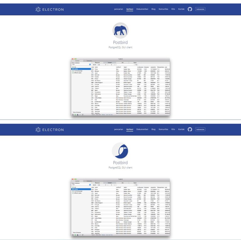
today I am contributing to create a logo, as I usually look for open source apps and I found an application called Postbird, this application is very good, but something very strange in this application is in the logo using the elephant icon as its logo, while the name of this application is Postbird, so this time I make a logo according to the name of this application so this app looks like it should, you can see the details of the application here, and the github repository here
Original and New Logo
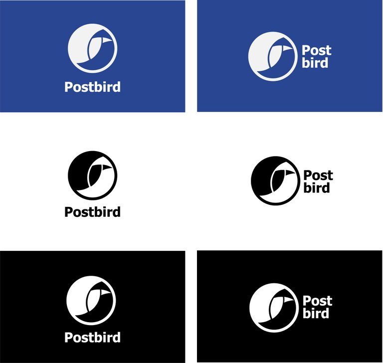
Color Variations

Color Code to Create variations
- f2f2f2, 294692
- f2f2f2, 8e283e
- f2f2f2, 872989
- f2f2f2, 298e4a
Logo Size
512px
215px
144px
Logotype
MockUp
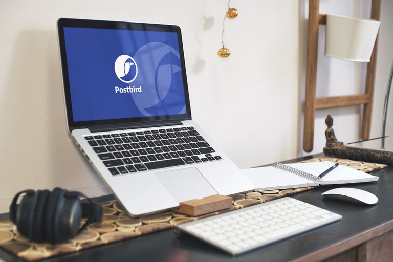
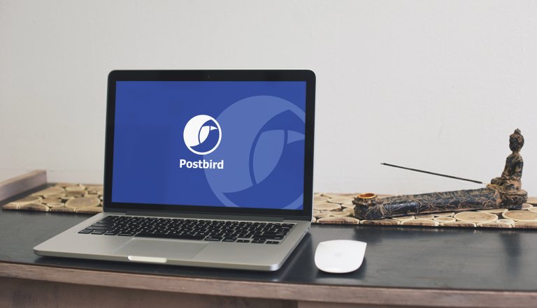
MockUp link here
Work Proccess
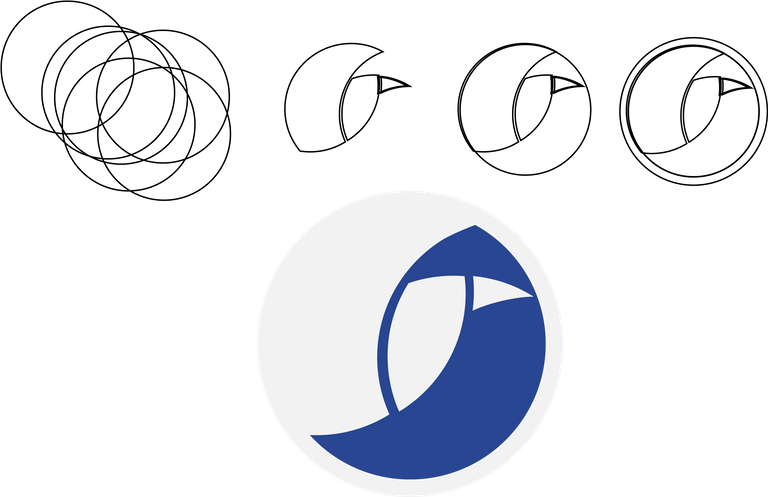
Font Used
Tahoma Bold | Download
Benefits / Improvements
the idea of this logo is a bird, and this idea comes from the name of the application so this logo is very suitable for use by this application, this logo is simple but good to see, the color of this logo I equate with the logo initially so that it fits with this application, and I'm sure this logo will have a big effect on this app, and the users can know what the app is for via this logo
Tools
When designing something, I always use the Adobe app. I am using Adobe Illustrator CC 2017. I often create logos and this is one of my hobbies and I love to do it.
Proof Work
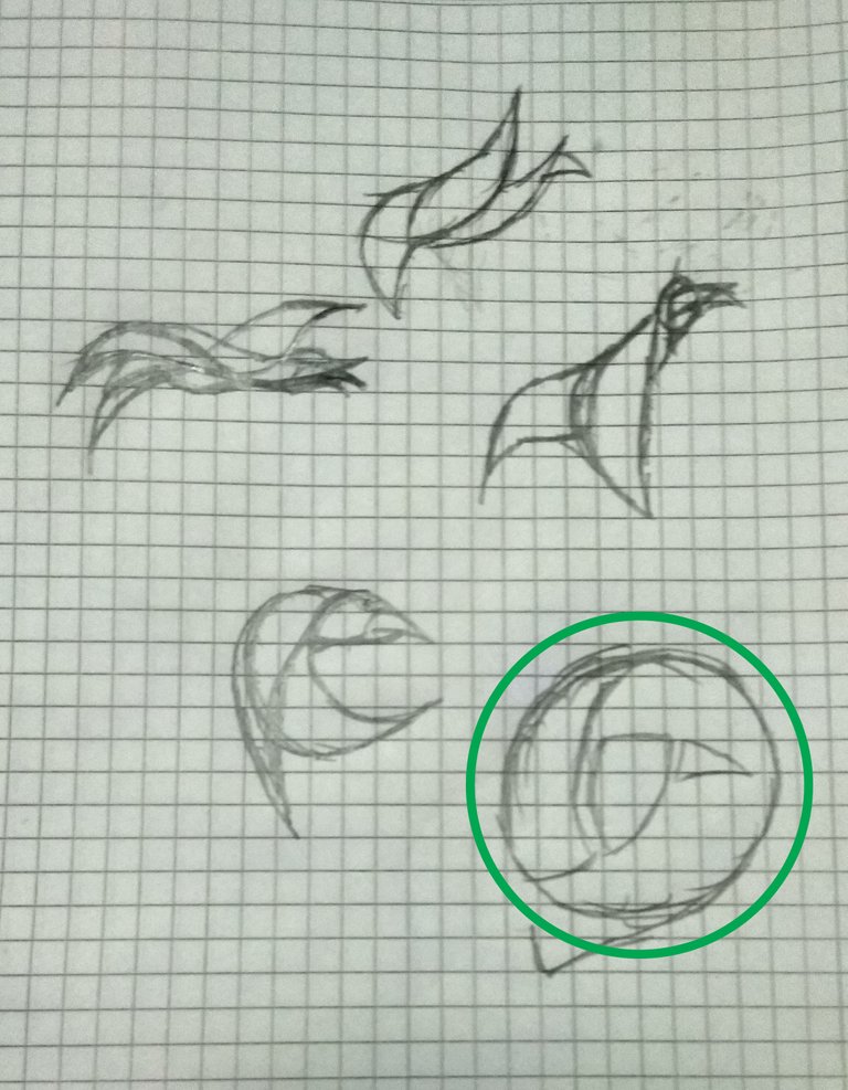
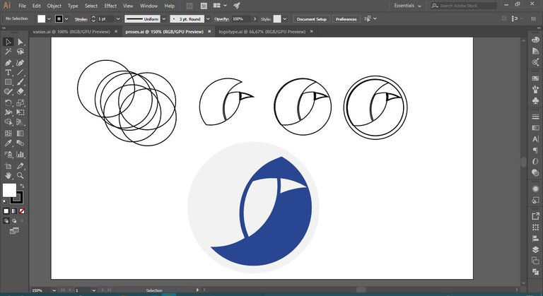

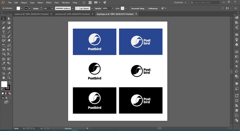
Original files
All vector and editable files is HERE
Posted on Utopian.io - Rewarding Open Source Contributors


I liked your logo proposal. Do you know of a design contest? . Well many times they do not place the logo according to the name of the company, maybe that elephant represents something more for them something emotional.
Me gustó tu propuesta de logo. Sabes de algún concurso de diseño? . Bien muchas veces no colocan el logotipo de acuerdo a al nombre de la empresa, quizás ese elefante representa algo más para ellos algo emotivo.
thank you @luzfermin, every graphic designer has different ideas and creativity, as you said on elephant logo, graphic designer might think the elephant represents something more for them something emotional. :)
If you can you show me the links of the contests
Just an opinion - not request:
I think this distance should be much bigger, or none at all.
Right now its just a small difference and it look like a mistake - misalignment. It should be more obvious it was intentional. Try it and ask for someone elses opinion too.
Thank you for the contribution. It has been approved.
You can contact us on Discord.
[utopian-moderator]
Hey @healthinfact I am @utopian-io. I have just upvoted you!
Achievements
Community-Driven Witness!
I am the first and only Steem Community-Driven Witness. Participate on Discord. Lets GROW TOGETHER!
Up-vote this comment to grow my power and help Open Source contributions like this one. Want to chat? Join me on Discord https://discord.gg/Pc8HG9x