MY NEW ICON DESIGN FOR ODYSSEY MUSIC PLAYER

This application is a small and functional player. It allows to browse and play directly from file system.
DIFFERENT COLOR

ICON IN ONE COLOR

COMPARISON FROM EXISTING ICON

FOR THE CONCEPT

My icon is easy to understand as a music player application.
FOR DIFFERENT SIZES
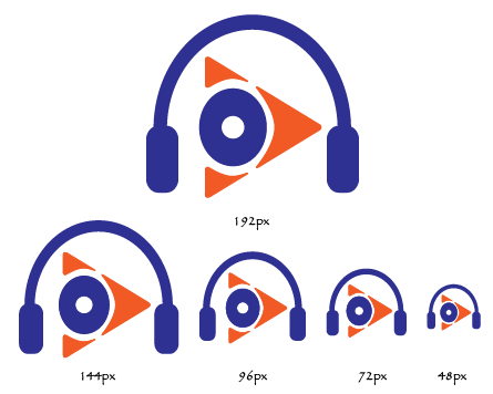

ICON ON MOCK UP DEVICE
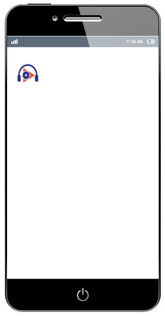
MOCKUP SOURCE
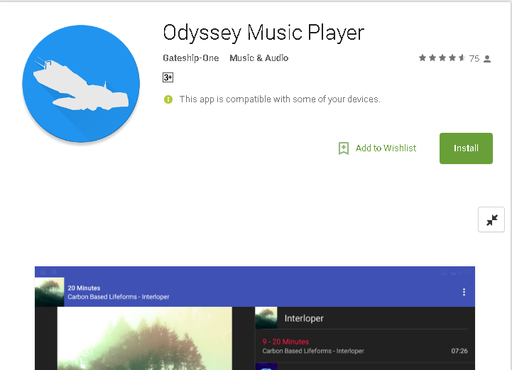
OLD ICON
USING MY DESIGNED ICON
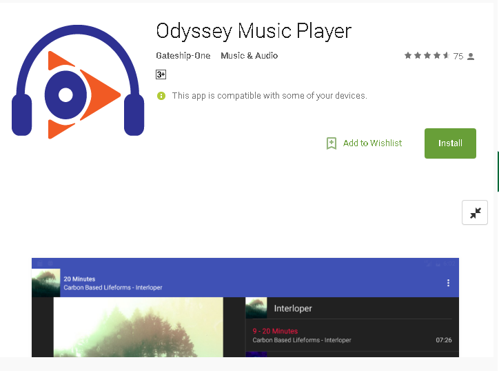
y
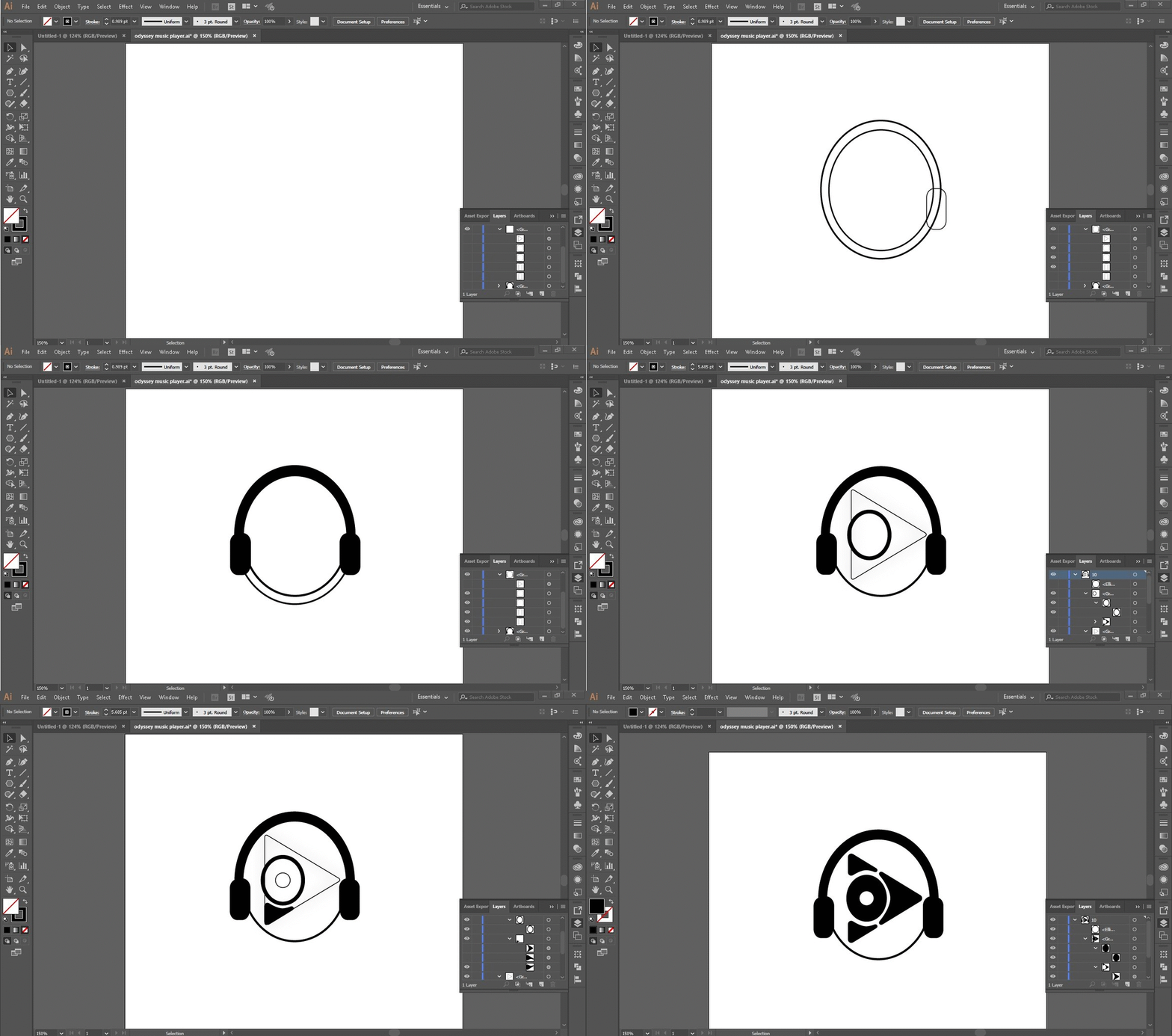
You can see the quick preview of my work using Adobe Illustrator CC 2017
Original files
https://drive.google.com/drive/folders/1CGr50pTfWTJS03h01R5kqYrTWeByZVv6?usp=sharing
Posted on Utopian.io - Rewarding Open Source Contributors
For more details of the app. https://github.com/gateship-one/odyssey
Your contribution cannot be approved because it does not follow the Utopian Rules.
You can contact us on Discord.
[utopian-moderator]
@nilfanif Hello it is not a disc it is O stands for Odyssey as you see in my concept please check it again that is why it is not perfect circle
Even though it was letter O, you should make it pefrect circle so it would look nice and balance, also it can represent two things, letter O and disc/vinyl.
Overall, we can't accept your logo, because there is no benefits over their existing logo.