RedReader
An unofficial, open source client for reddit.More App. Info Here.
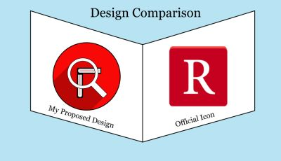
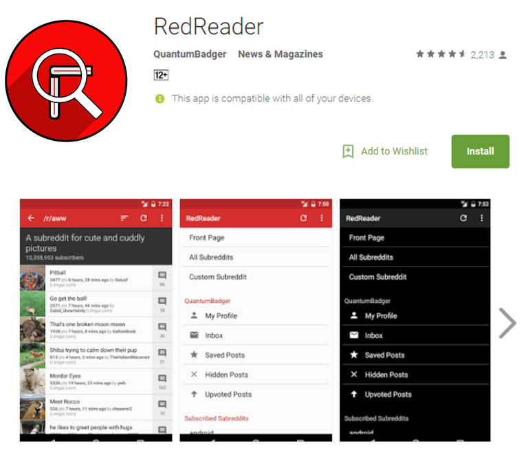
Original vs. Official Icon
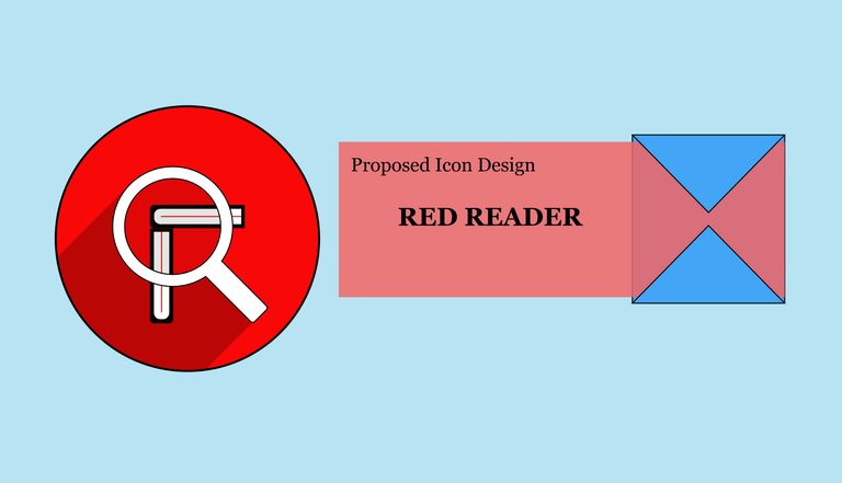
The new proposed design icon is more detailed and attractive. The design composed with creativity concept according with the application that is more suited to the application compare to its original design icon.
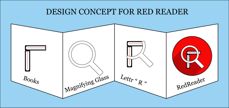
Design Concept
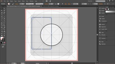
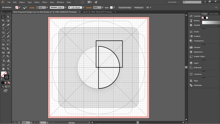
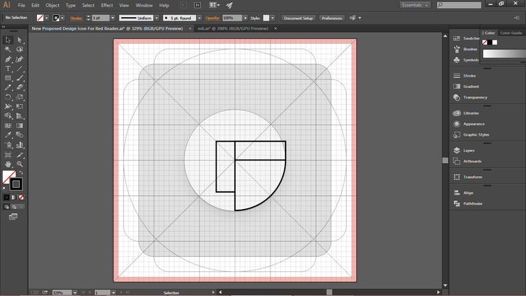
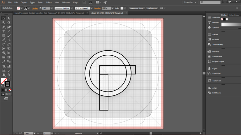
My concept in this design is combining three subjects to form a single icon including icon simplicity. The three objects represents a two books that are perfectly perpendicular to each other, magnifying glass used to read the book and combined objects forming letter " R " with the connection to its original design icon.
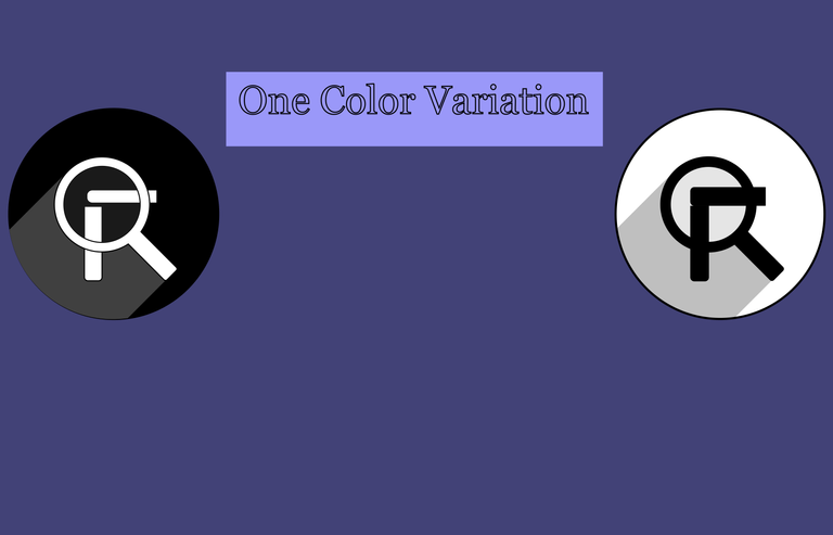
Color Variation
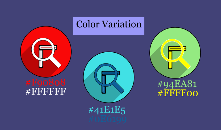
One Color Variation
New Icon Mock-Up
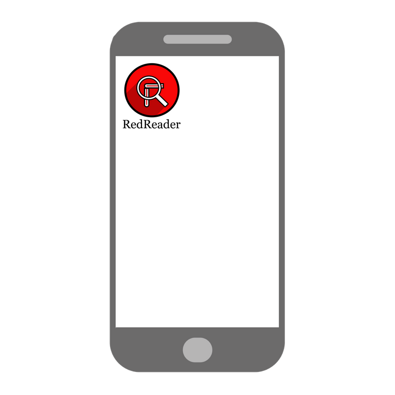
Including how it look likes in real world.
GitHub Repository

Mobile Icons and Sizes
192x192 pixels

144x144 pixels

72x72 pixels

I used the default font provided by the Adobe Illustrator CC 2015.

Benefits/Improvement
In this new designed logo, it will provide more detailed, creative and attractive icon display based on the application. The original logo is quite simple and can't easily determine what is the application for, so I created a simple design that will best fit for the application with the same color variant to make a better comparison and also from the application name itself.
Tools
I used the Adobe Illustrator CC 2015 in the creation of this new icon as well as the presentation
Proof of Work
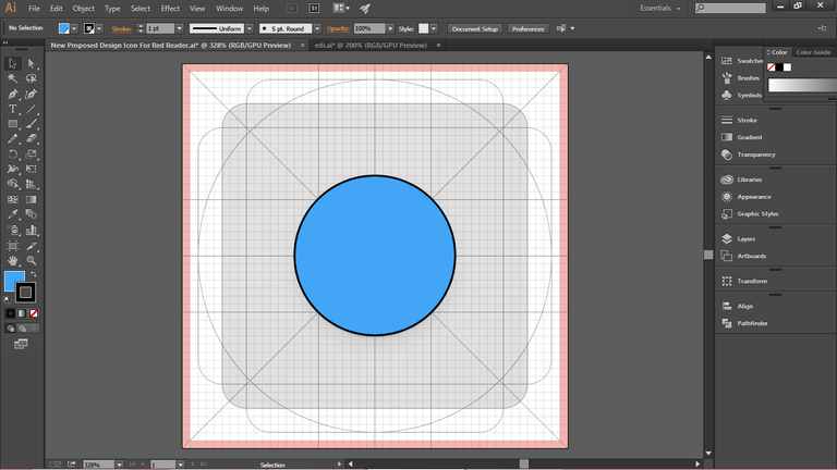

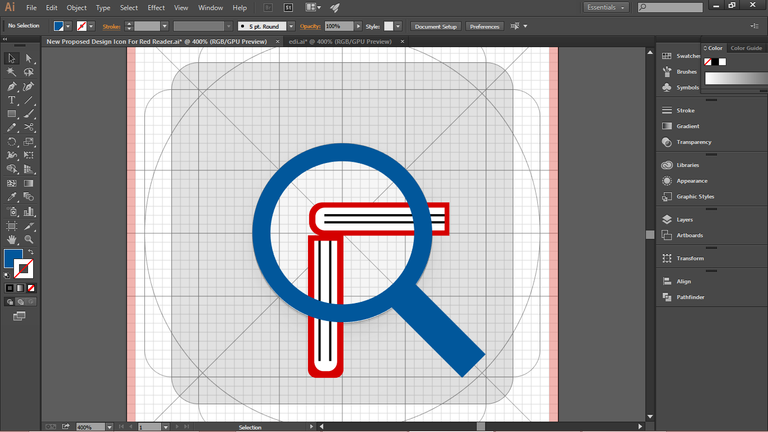
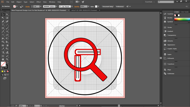

Original files
Here are the links of the files I used in creating the design.
I provided adobe illustrator available export formats.
Thank you for taking time to view my design.
Posted on Utopian.io - Rewarding Open Source Contributors
Your contribution cannot be approved because it does not follow the Utopian Rules.
You can contact us on Discord.
[utopian-moderator]