Material Dialogs
Material dialog is a design language developed by Google. It makes use of grid-based layouts, responsive animation, and transitioning.
This is a sample project for my library on GitHub: LINK HERE
If you are not an Android Developer, this application has no use to you!
Google play : LINK HERE
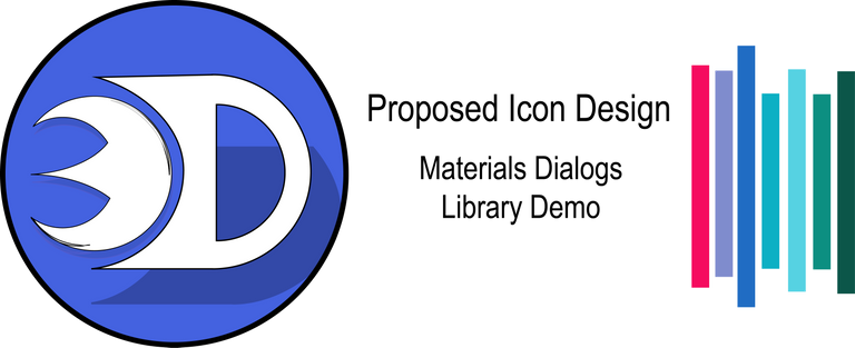
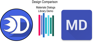
Proposed Vs. Original Icon
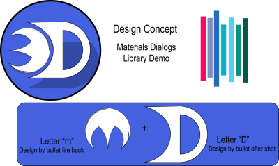
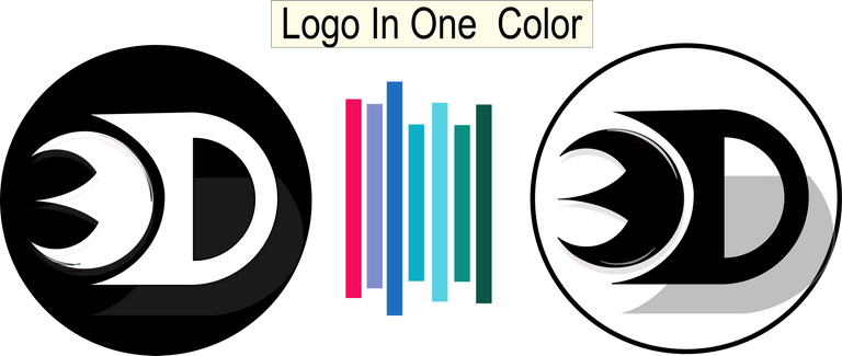
And i came up with this concept suited for the application with the same color of the original for a better comparison.
Provided a Color Variation as well for optional design of the application
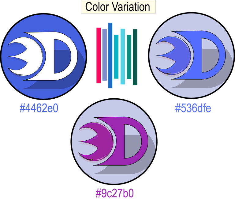
Including Black and white color for visibility check
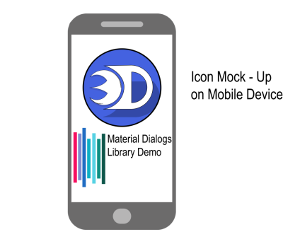
Icon Mock-up on Mobile Device
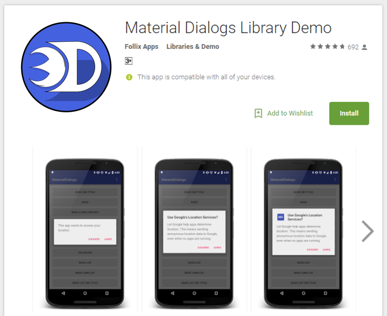
Including how it look likes in real world
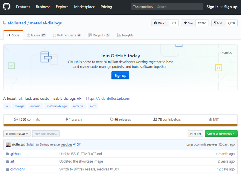
GitHub Repository
With this Icon Sizes
192x192px
144x144px
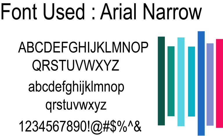
I used the default font provided by the Adobe Illustrator CC 2015.
Benefits / Improvement
In this new designed logo, it will provide more creative and attractive icon display based on the application. The original logo is quite simple so I created a simple design that will best fit for the application.
Tools
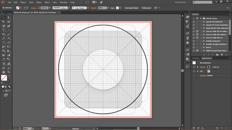
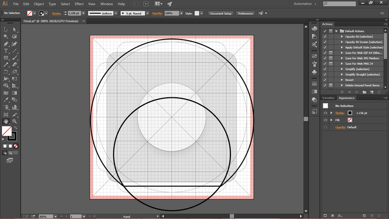
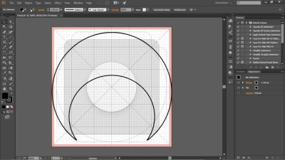
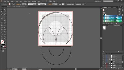
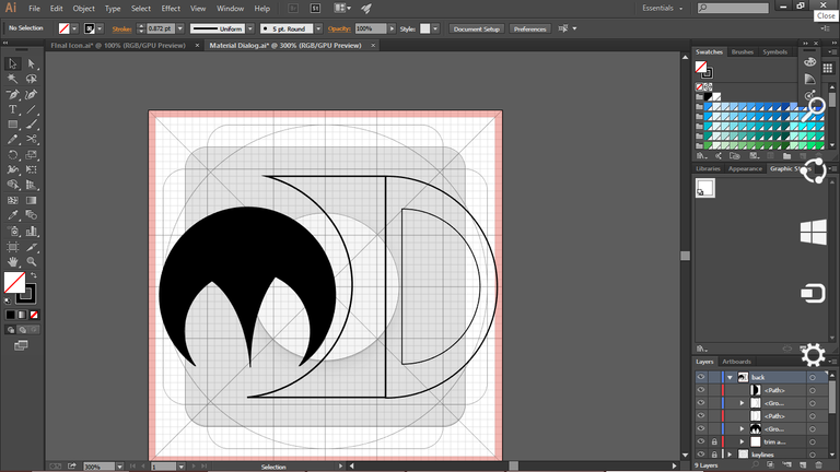
I used Adobe Illustrator CC 2015 in creating this new proposed logo for Material Diaglogs Library Demo.
Proof of Work

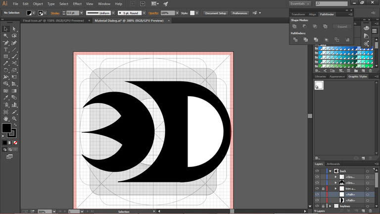
Thank you for viewing my work.
Posted on Utopian.io - Rewarding Open Source Contributors
Petha ..
Your contribution cannot be approved because it does not follow the Utopian Rules.
You can contact us on Discord.
[utopian-moderator]