
Details
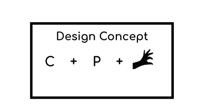
This is my new proposed icon for the android application Color Picker using Adobe Illustrator CC 2017 version. My design concept is to combine letters C and P that stands for the initials of the word "Color Picker" along with the picking hand gesture.
One Color Logo Variation
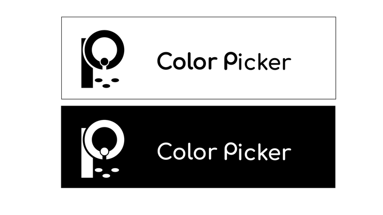
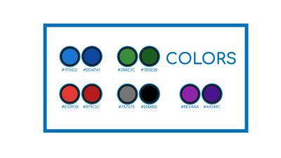
Color Variation


Icon Sizes
- 192px

- 144px

- 96px

- 72px

Icon Comparison
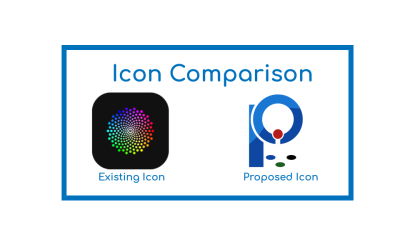
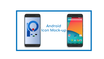
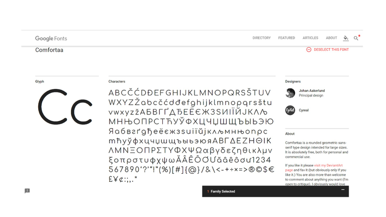
Google Font Used - Comfortaa
Benefits / Improvements
It will have a more modern look that the existing icon and still recognizable when resized on smaller scales compared to the current icon that is over detailed in color. And it will also represent the initials of the application's name.
Tools
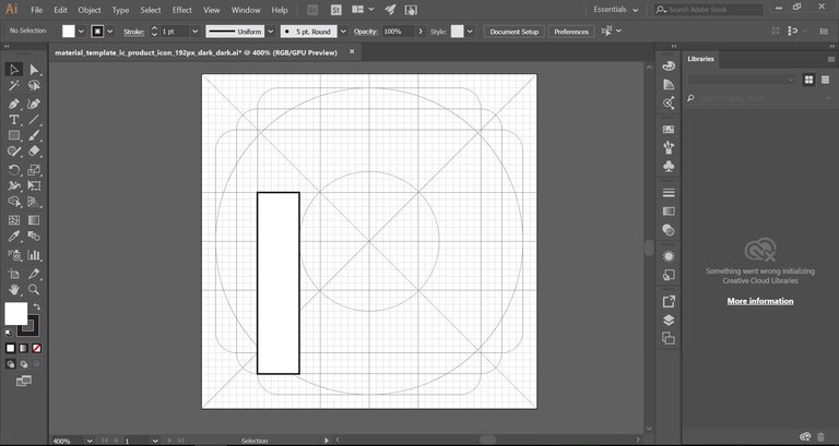
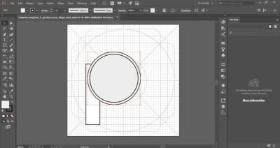
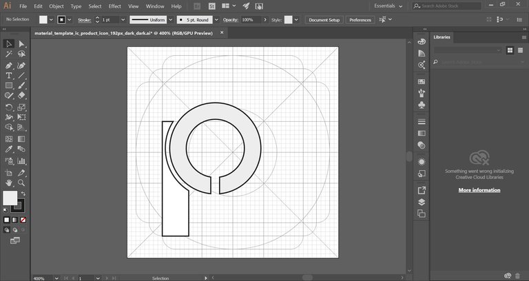
I used Adobe Illustrator CC 2017 version when designing the icon and the presentation as well. Here are some screenshots for design process and proof of works.

Original files
You can download all files of (.svg , .pdf, .eps, and .ai) by clicking this link
Posted on Utopian.io - Rewarding Open Source Contributors
Thank you for the contribution. It has been approved.
You can contact us on Discord.
[utopian-moderator]
Wtf? This aint a inprovement? Wow ...
thanks mod!
Amazing information for us
Elegant looking!!!
thanks man
Great design @julstamban! You really have a creative mind :) I like it!
thanks
yet again such creative and cool design work this one really looks so professional
thanks man really appreciate your compliment
You’re welcome
Your contribution cannot be approved because it does not follow the Utopian Rules.
Changed after decision of supervisor @espoem
You can contact us on Discord.
[utopian-moderator]
its okay thanks for your moderation :)