This PR adds some additional features from the todo list of KnackSteem, several UI upgrades, bugfixes and visible error messages for the user.
Repository & Pull Request
https://github.com/knacksteem/knacksteem.org
https://github.com/knacksteem/knacksteem.org/pull/13
About knacksteem.org
"Do you have any talent? If yes! then KnackSteem is for you."
"Rewards people with talents, it can be any talent, anything you know how to do best is highly welcome on the platform."
Technology Stack
- JavaScript ES6+ with Babel
- React + Redux
- Ant Design
Main Changes / New Features
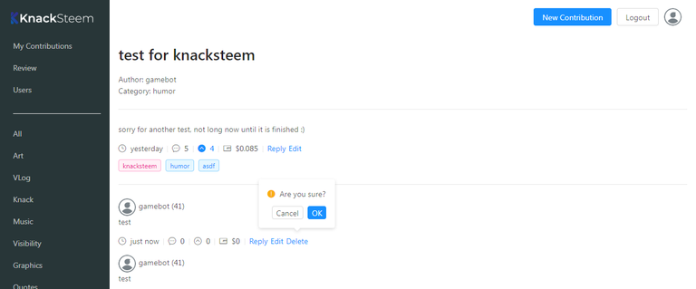
- Deleting does not just happen anymore, there is a
PopConfirmdialog now before articles or comments get deleted. - There is a loader animation for the delete operation now, and upvotes show up immediately instead of waiting for the backend return.
- Avatar images are not stretched anymore if they are not square. Also, there is an avatar images for the logged in user in the header now.
- Categories are not hardcoded in the client code anymore, they get loaded from the server on startup.
- Searching for articles happens server side now, before it was only possible to search through the loaded ones.
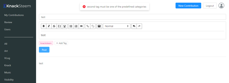
console.logentries have been changed to error messages visible to the user (with Ant Designmessages).- The favicon got replaced by the KnackSteem icon - it was the React icon before.
SteemConnecthappens through a cached JavaScript module now (aka Singleton).- Bugfixes: The sidebar background height is 100% now. Menu items are highlighted correctly after programmatic route changes.
Screenshots
Header with tooltip

Delete confirmation

Error messages

Details
Loading categories from the server was actually planned from the beginning, there was an array in a Redux reducer already that just gets popuplated with a Redux action now:
/**
 * get categories from server
 */
export const getCategories = () => {
  return async (dispatch) => {
    try {
      let response = await apiGet('/categories');
      dispatch({
        type: types.CATEGORIES_GET,
        payload: response.data.results
      });
    } catch (error) {
      message.error('error getting categories');
    }
  };
};
(actions/articles.js)
The Avatar component of Ant Design does not work with non-square images, so I have used a custom container to include them as backround image. This is the CSS to fit the image correctly:
.avatar {
  display: inline-block;
  background-size: cover;
  background-repeat: no-repeat;
  background-position: 50% 50%;
  border-radius: 50%;
  width: 32px;
  height: 32px;
  vertical-align: middle;
  margin-right: 5px;
}
(assets/styles/index.css)
...and this an example of the simple custom container:
<div className="avatar" style={{backgroundImage: `url(${data.authorImage})`}} />
(components/Comments/SingleComment.js)
PopConfirm works by just putting the component around another element. You can specify what function will get called if the user confirms the dialog. Of course, nothing will happen if he clicks "No":
<Popconfirm title="Are you sure?" onConfirm={this.onDeleteClick} key="action-delete">
  <a>Delete</a>
</Popconfirm>
(components/Common/ArticleMetaBottom.js)
Error handling is a big part in this PR, the backend server handles a lot of stuff but you don´t even need to hit the backend if the user made some obvious errors. The Editor component includes a function to check for missing elements before posting/editing articles or comments now:
//check for correct input before posting/editing
checkFieldErrors = () => {
  const {title, value, tags} = this.state;
  const {isComment} = this.props;
  const {categories} = this.props.articles;
  let error = false;

  //check if title is existing
  if (!isComment && !title.length) {
    message.error('title is missing');
    error = true;
  }
  //check if there is something in the rich text editor
  if (!value.getEditorState().getCurrentContent().hasText()) {
    message.error('content is missing');
    error = true;
  }
  //check if the second tag is one of the predefined categories
  if (!isComment && categories.map(elem => elem.key).indexOf(tags[1]) === -1) {
    message.error('second tag must be one of the predefined categories');
    error = true;
  }

  return error;
};
(components/Editor/index.js)
SteemConnect got initialized for every single operation, so I moved it to a cached module (aka Singleton):
import sc2 from 'sc2-sdk';
import Config from '../config';

const api = sc2.Initialize({
  app: 'knacksteem.app',
  callbackURL: Config.SteemConnect.callbackURL,
  scope: Config.SteemConnect.scope
});

export default api;
(services/SteemConnect.js)
Now you can just import the module and directly use it without initialization. The access_token gets set in the login action:
SteemConnect.setAccessToken(accessToken);
(actions/user.js)
Error messages can be shown to users easily with the message component of Ant Design. You just import it and then use it like this somewhere in your code:
message.error('my error message');
(See Screenshots)
Ant Design was a good choice, appearently :)
Roadmap
- The possibility to upload images in the editor needs to be implemented.
- Maybe some bugfixing?
How to contribute?
Talk to @knowledges (or me) :)
My GitHub Account: https://github.com/ateufel
Thank you for your contribution. Again a good contribution, keep it up.
Your contribution has been evaluated according to Utopian policies and guidelines, as well as a predefined set of questions pertaining to the category.
To view those questions and the relevant answers related to your post, click here.
Chat with us on Discord.
[utopian-moderator]Need help? Write a ticket on https://support.utopian.io/.
Congratulations @luschn! You have completed the following achievement on Steemit and have been rewarded with new badge(s) :
Click on the badge to view your Board of Honor.
If you no longer want to receive notifications, reply to this comment with the word
STOPThanks for contributing on Utopian.
We’re already looking forward to your next contribution!Hey @luschn
Want to chat? Join us on Discord https://discord.gg/h52nFrV.
Vote for Utopian Witness!