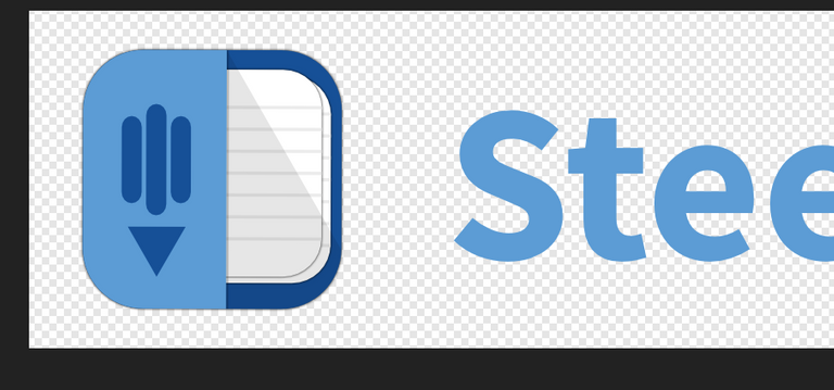
i think it would be better if the logomark not tilted.
The pencil's body should be smaller with the gaps wider to make more room for the elements to breath.

Your contribution has been evaluated according to Utopian policies and guidelines, as well as a predefined set of questions pertaining to the category.
To view those questions and the relevant answers related to your post, click here.
Chat with us on Discord.
[utopian-moderator]Need help? Write a ticket on https://support.utopian.io/.
Thanks for feedback. I believe you meant something like this for pencil's body? Hmm yeah it looks better. I don't know why I didn't think of it .
But on logomark being tilted I think it's a subjective thing, personally I like it more tilted.