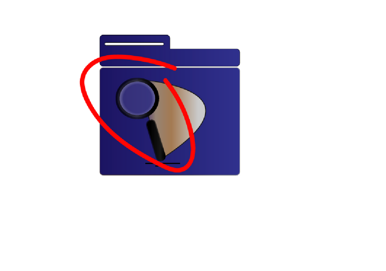
Your contribution cannot be approved because it does not follow the Utopian Rules.
- I don't see it as an improvement to the existing logo. if you see, the loop in your logo is not optically balanced. and the gap betwen top part and bottom part is too thin it will be not noticable when you scaled it down.

You can contact us on Discord.
[utopian-moderator]