Hi @naufal, thank you for your contribution.
First of all, i would like to say that i am really impressed with your presentation, it has improved a lot. i really like how you did your mockups.
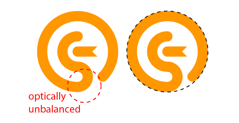
for the logo, i think it is a perfect example to explain optical balance in logo design, as you can see bellow, i circled a part where mathematically it is a perfect circle (if you put a circle on top of it) but optically it's not balanced, it appears like the the logo is not a perfect circle.
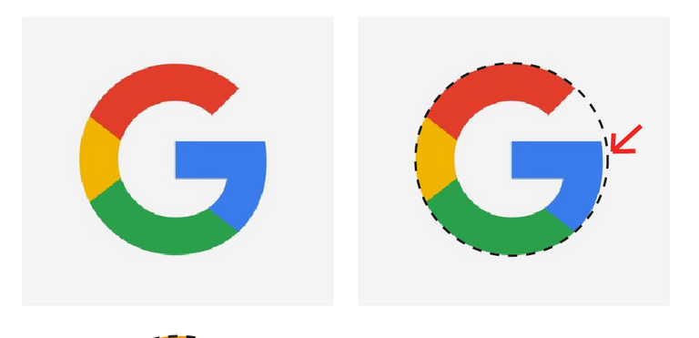
So, how you can fix this, take a look at the Google logo, they basically tweak the unbalanced part, they move it inward a little bit so the logo appears more balanced.
in the two line logotype variation, the logotype is too big, you don't want it to be taller than the logomark. the logomark should be the main focus as it will be the icon of the project.

Also i don't understand how Yellow is the identity of Germany, their flag color is black, red, and yellow, i don't think you can call it their identity with only yellow color.
overall this is a solid contribution, and i think you have choose the perfect font for this logo.
Your contribution has been evaluated according to Utopian policies and guidelines, as well as a predefined set of questions pertaining to the category.
To view those questions and the relevant answers related to your post, click here.
Chat with us on Discord.
[utopian-moderator]Need help? Write a ticket on https://support.utopian.io/.
sudah kuduga xD
actually i feel it first. but I think there is no too much problem because i made it perfect circle. but thanks for your advice, it's very useful for me.
Thank you for your review, @nilfanif! Keep up the good work!