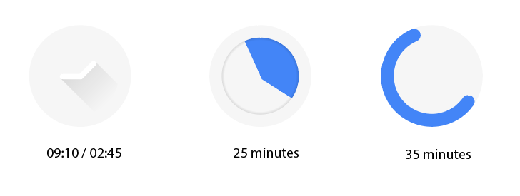
At first sight I can see 3 different indications of clock/time. Without any visual hierarchy it makes it complicated to understand what's going on.
Using white with a slight shadow on a white background is such a bold decision. It almost disappears on your mockup, I can imagine even smaller sizes it would be impossible to notice.
For the mockup it would always better to display in a real life use case, instead of displaying it like a splash screen, I'd rather to see it as a app icon.
You know it's an android application yet you didn't provided any app specific assets.
Logotype is too long and it makes it too wide you may think of using double lines instead of a single line.
You always telling you used "Inkscape and Adobe Illustrator CS6" as your tools but I never see a screenshot from Illustrator yet didn't understand the reason to use both vector based applications. Do you mind telling when you use illustrator and what benefits it offers over Inkscape?
Your contribution has been evaluated according to Utopian policies and guidelines, as well as a predefined set of questions pertaining to the category.
To view those questions and the relevant answers related to your post, click here.
Chat with us on Discord.
[utopian-moderator]Need help? Write a ticket on https://support.utopian.io/.
Here is a very similar design with proper contrast and less detail.

https://play.google.com/store/apps/details?id=com.tjeannin.alarm&hl=en
Thank you for your review, @oups!
So far this week you've reviewed 1 contributions. Keep up the good work!
Previously, Thank you for your review @oups. I have made some mistakes as you said.
In the clock indication, I make time randomly. The blue indication indicates the remaining time. Maybe it seems that this is complicated to understand if it is without hierarchy.
I designed this logo in inkscape. Then in the illustrator I just checked the error with the features it has. And also I export the file format to EPS, AI and PDF through Adobe Illustrator.
I do not know that there is a logo that is similar to the logo that I designed.