Details
ErpNext is an open source app created by Frappé Innovations Pvt. Ltd. It is a simple app that helps manage your business needs and inventory.
Process

Color Variations

Logotypes


Official and Proposed Icon

Proof of Works


Benefits / Improvements
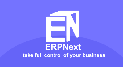
I want to create a new design for the app that will make a symbol and identity that can help future users easily recognize the app. The new icon has also a concept which symbolizes a box where everything you need is inside it.
Tools
Adobe Illustrator CC 2017
Original files
Posted on Utopian.io - Rewarding Open Source Contributors

Your logo is good Your logo idea is very good ... There is a lot to learn from you and learning comes from
Hadn't heard of ERPnext until now, but I really like the designing of the logos! The different color variations look perfect.
Your contribution cannot be approved because it does not follow the Utopian Rules.
You can contact us on Discord.
[utopian-moderator]
Thanks for reviewing my contribution. Hope i'll meet your standards next time.
remember. Not about @andrejcibik standards. but global standards and utopian quality standards
I know that @podanrj. I dont mean to offend you and andre but we all know that andre is more strict among all the mods in graphics. While some mods take more considerations to effort and give chance for corrections. I hope you understand what i mean here.