Details
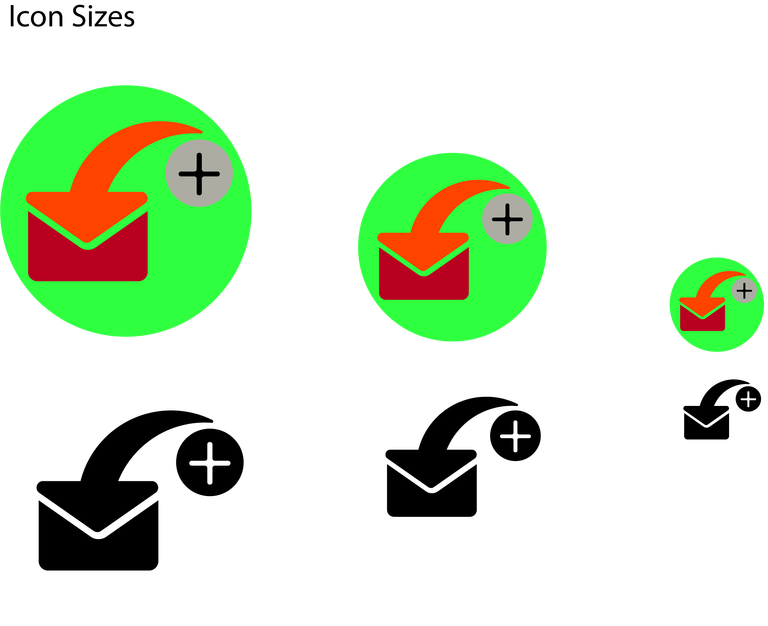
This is my proposed icon for the open source application "SMS Backup +".
This application is used to backup your SMS in your mobile phones by syncing it to your e-mail.
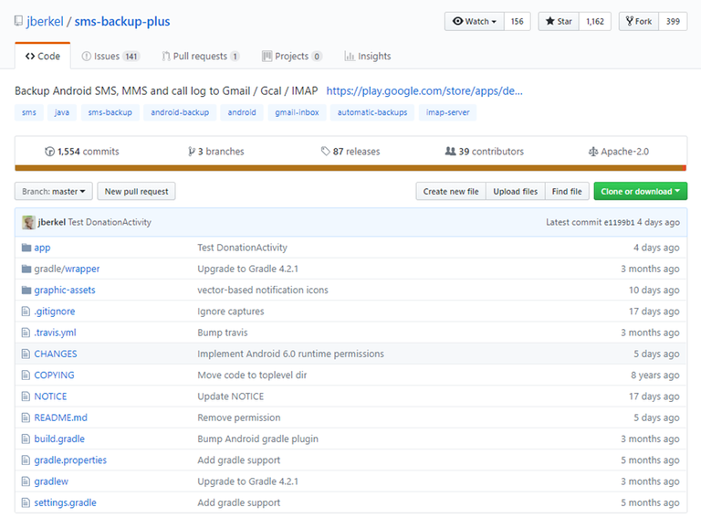
You can check the link here for more details of the application .
Google Playstore
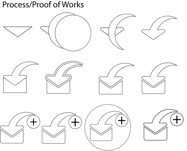
I will show you below the process and how i created the designs.
Proposed and Official icon

My Concept
The New concept i made is merging a typical restore icon style as a cover of a message icon at the same time adding the plus sign based on the icon name SMS Backup Plus.. Here is the Process.
Color Variations and Color Codes
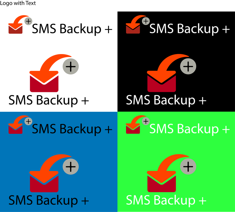
The colors i used in the design was based on the original icon then rearranging it accordingly to the design.

Icon with Text and Different Backgorunds
Font Used
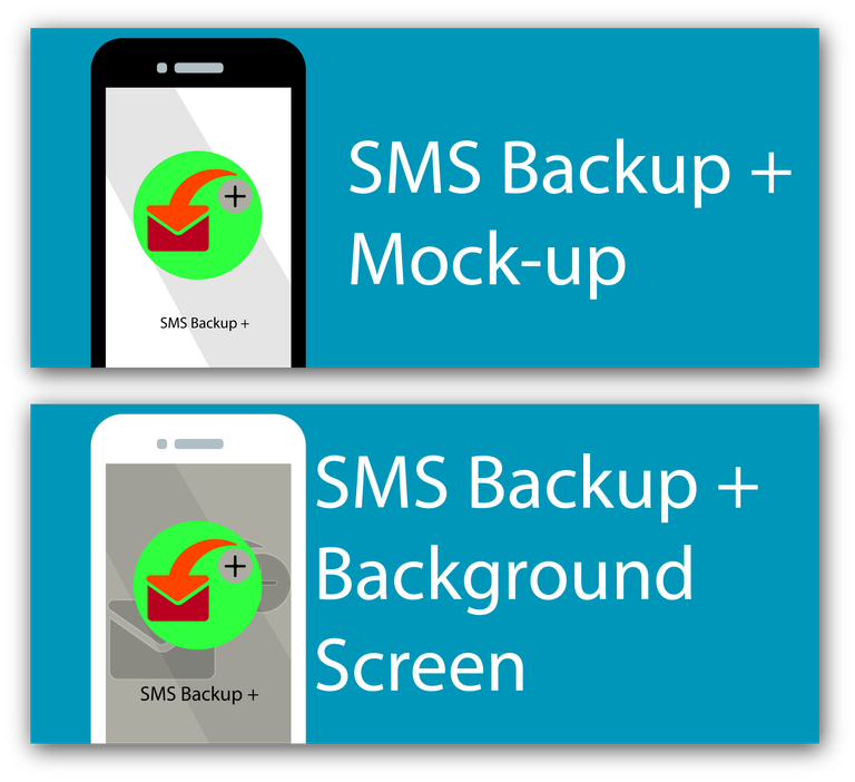
Icon Mock-up
Benefits / Improvements
The new design i made will bring benefits to the owner for they will have another options if ever they want to change their icon. The design is made using vector formats and provided the files they will need if they want to add revisions on my design.
Tools
Adobe Illustrator CC 2017
Original files
Here are the links of the files i used in creating the design.
All files and presentation materials i used in this design are all originally created by me.
ALL FILES(Ai,eps,png,svg,pdf)
GithubLink
I provided adobe illustrator available export formats.
Thank you for your time viewing my design :)
Posted on Utopian.io - Rewarding Open Source Contributors
@patricjames, Contribution to open source project, I like you and upvote.
Wow, who ever though so much effort would be put into selecting the physical characteristics of an icon
Hope you luck brade.Good looking with complete presentation @patricjames but the decision is in the moderator.
Maybe we need more consideration like before.Thanks @jaldesign, yeah you're right. No matter how good the design and how you strictly followed the rules that they're implementing it all depends on their taste. It is sad to see many posts got rejected by the moderators without even realizing that those people are not even professional designers just like me.
@patricjames I will not comment much about it, which obviously I know is in your position.
"The new design i made will bring benefits to the owner for they will have another options if ever they want to change their icon." - but why?
Please remove the shadow and increase contrast of colors used.
Hi @andrejcibik. I already edited my design according to your request thanks
Thank you for the contribution. It has been approved.
You can contact us on Discord.
[utopian-moderator]
Thanks approving my post @radudangratian
Hey @patricjames I am @utopian-io. I have just upvoted you!
Achievements
Community-Driven Witness!
I am the first and only Steem Community-Driven Witness. Participate on Discord. Lets GROW TOGETHER!
Up-vote this comment to grow my power and help Open Source contributions like this one. Want to chat? Join me on Discord https://discord.gg/Pc8HG9x