
Repository
React
https://github.com/facebook/react
Material-ui
https://github.com/mui-org/material-ui
My Github Address
This Project Github Address
https://github.com/pckurdu/Build-An-Application-With-React-Hooks-Material-UI-and-Firebase-Part2
What Will I Learn?
- You will learn the benefits of useState
- You will learn
Typography,Paper,Avatarin material-ui - You will learn
FormControl,Input,InputLabelin material-ui - You will learn
withStylesin material-ui - You will learn
LinkandwithRouterin react-router - You will learn
useStatein react hooks - You will learn
preventDefault()in javascript
Requirements
- text editor (I used visual studio code editor)
- Basic javascript information
- Basic react information
Difficulty
- Basic
Tutorial Contents
Hello to everyone,
We have created our previous tutorial de react application and implemented the router settings. We have also made our design in compliance with material-ui standards.
We will design the pages we created in this tutorial and we will perform the router settings. Also will capture the values entered in the inputs using the useState property in the react hook.
The definition of useState is introduced to our lives by reack hooks, and they are used to replace states, but they are built to make the complex structure of states easier. With the use of the useState, the setState() function has disappeared.
In this tutorial, In addition to the basic design components of material-ui, we will also learn how to use the useState.
This tutorial consists of 4 parts and I aim to teach different things in each section and this tutorials parts are available below.
- Create HomePage page
- Create Login and Register pages
- Setting the Router
- Use of useState
Let’s start,
Create HomePage Page
In this section we will create the welcome page of the application and use the material-ui components for the design. We will also learn how to use material-ui typography, paper, avatar, buttons.
In order to use these components, we need to import to the page first.
In HomePage/Index.js
import React from 'react'
import { Typography, Paper, Avatar, Button} from '@material-ui/core'
import LockOutlinedIcon from '@material-ui/icons/LockOutlined'
import withStyles from '@material-ui/core/styles/withStyles'
If we are developing design using material-ui we can use the Typography component to use the header tags. With the Paper component, we can create a special field for the page and we can place things we want to specify with the Avatar component.
const styles = theme => ({
    main: {
        width: 'auto',
        display: 'block',
        marginLeft: theme.spacing.unit * 3,
        marginRight: theme.spacing.unit * 3,
        [theme.breakpoints.up(400 + theme.spacing.unit * 3 * 2)]: {
            width: 400,
            marginLeft: 'auto',
            marginRight: 'auto',
        },
    },
    paper: {
        marginTop: theme.spacing.unit * 8,
        display: 'flex',
        flexDirection: 'column',
        alignItems: 'center',
        padding: `${theme.spacing.unit * 2}px ${theme.spacing.unit * 3}px ${theme.spacing.unit * 3}px`,
    },
    avatar: {
        margin: theme.spacing.unit,
        backgroundColor: theme.palette.primary.main,
    },
    submit: {
        marginTop: theme.spacing.unit * 3,
    },
})
If we want to make our own designs in our application, we need to use withStyles module. We have created a style sfunction that uses the theme and we have made our own design within this function.
I will not explain the codes we wrote because think you have the necessary css information.
For these codes to work, we need to place styles in withStyles when exporting the HomePage function.
export default withStyles(styles)(HomePage)
The styles that we have created can be accessed through the classes in the props of the HomePage function.
function HomePage(props) {
    const { classes } = props

    return (
        <main className={classes.main}>
            <Paper className={classes.paper}>
                <Avatar className={classes.avatar}>
                    <VerifiedUserOutlined />
                </Avatar>
                <Typography component="h1" variant="h5">
                    Hi Steemit User
                </Typography>
                <Button
                    type="submit"
                    fullWidth
                    variant="outlined"
                    color="primary"
                    className={classes.submit}>
                    Register
                </Button>
                <Button
                    type="submit"
                    fullWidth
                    variant="contained"
                    color="primary"
                    className={classes.submit}>
                    Login
                </Button>
                <Button
                    type="submit"
                    fullWidth
                    variant="contained"
                    color="secondary"
                    className={classes.submit}>
                    Dashboard
                </Button>
            </Paper>
        </main>
    )
}
So we created the homepage page.
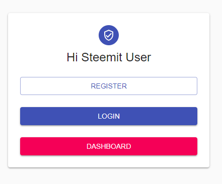
We defined the VerifiedUserOutlined icon in the avatar and set its color to primary. The variant feature allows you to fill or empty the buttons.
Create Login and Register Pages
In this section, we will use and learn FormControl, Input and InputLabel components except the components we use on the homepage page.
Into the FormControl component, it takes the Input and the InputLabel and output components and ensures that the two are together.
In Login/Index.js
import React from 'react'
import { Typography, Paper, Avatar, Button, FormControl, Input, InputLabel } from '@material-ui/core'
import LockOutlinedIcon from '@material-ui/icons/LockOutlined'
import withStyles from '@material-ui/core/styles/withStyles'

const styles = theme => ({
    main: {
        width: 'auto',
        display: 'block', // Fix IE 11 issue.
        marginLeft: theme.spacing.unit * 3,
        marginRight: theme.spacing.unit * 3,
        [theme.breakpoints.up(400 + theme.spacing.unit * 3 * 2)]: {
            width: 400,
            marginLeft: 'auto',
            marginRight: 'auto',
        },
    },
    paper: {
        marginTop: theme.spacing.unit * 8,
        display: 'flex',
        flexDirection: 'column',
        alignItems: 'center',
        padding: `${theme.spacing.unit * 2}px ${theme.spacing.unit * 3}px ${theme.spacing.unit * 3}px`,
    },
    avatar: {
        margin: theme.spacing.unit,
        backgroundColor: theme.palette.secondary.main,
    },
    form: {
        width: '100%', // Fix IE 11 issue.
        marginTop: theme.spacing.unit,
    },
    submit: {
        marginTop: theme.spacing.unit * 3,
    },
});

function Login(props) {
    const { classes } = props

    return (
        <main className={classes.main}>
            <Paper className={classes.paper}>
                <Avatar className={classes.avatar}>
                    <LockOutlinedIcon />
                </Avatar>
                <Typography component="h1" variant="h5">
                    Sign in
                </Typography>
                <form className={classes.form}>
                    <FormControl margin="normal" required fullWidth>
                        <InputLabel htmlFor="email">Email Address</InputLabel>
                        <Input id="email" name="email" autoComplete="off" autoFocus />
                    </FormControl>
                    <FormControl margin="normal" required fullWidth>
                        <InputLabel htmlFor="password">Password</InputLabel>
                        <Input name="password" type="password" id="password" autoComplete="off" />
                    </FormControl>
                    <Button
                        type="submit"
                        fullWidth
                        variant="contained"
                        color="primary"
                        className={classes.submit}>
                        Sign in
                    </Button>
                    <Button
                        type="submit"
                        fullWidth
                        variant="outlined"
                        color="secondary"
                        className={classes.submit}>
                        Register
                    </Button>
                </form>
            </Paper>
        </main>
    )
}

export default withStyles(styles)(Login)
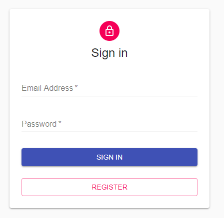
In Register/Index.js
import React from 'react'
import { Typography, Paper, Avatar, Button, FormControl, Input, InputLabel } from '@material-ui/core'
import LockOutlinedIcon from '@material-ui/icons/LockOutlined'
import withStyles from '@material-ui/core/styles/withStyles'
import { Link, withRouter } from 'react-router-dom'
const styles = theme => ({
    main: {
        width: 'auto',
        display: 'block', // Fix IE 11 issue.
        marginLeft: theme.spacing.unit * 3,
        marginRight: theme.spacing.unit * 3,
        [theme.breakpoints.up(400 + theme.spacing.unit * 3 * 2)]: {
            width: 400,
            marginLeft: 'auto',
            marginRight: 'auto',
        },
    },
    paper: {
        marginTop: theme.spacing.unit * 8,
        display: 'flex',
        flexDirection: 'column',
        alignItems: 'center',
        padding: `${theme.spacing.unit * 2}px ${theme.spacing.unit * 3}px ${theme.spacing.unit * 3}px`,
    },
    avatar: {
        margin: theme.spacing.unit,
        backgroundColor: theme.palette.secondary.main,
    },
    form: {
        width: '100%', // Fix IE 11 issue.
        marginTop: theme.spacing.unit,
    },
    submit: {
        marginTop: theme.spacing.unit * 3,
    },
})

function Register(props) {
    const { classes } = props

    return (
        <main className={classes.main}>
            <Paper className={classes.paper}>
                <Avatar className={classes.avatar}>
                    <LockOutlinedIcon />
                </Avatar>
                <Typography component="h1" variant="h5">
                    Register Account
                </Typography>
                <form className={classes.form}>
                    <FormControl margin="normal" required fullWidth>
                        <InputLabel htmlFor="name">Name</InputLabel>
                        <Input id="name" name="name" autoComplete="off" autoFocus />
                    </FormControl>
                    <FormControl margin="normal" required fullWidth>
                        <InputLabel htmlFor="email">Email Address</InputLabel>
                        <Input id="email" name="email" autoComplete="off"  />
                    </FormControl>
                    <FormControl margin="normal" required fullWidth>
                        <InputLabel htmlFor="password">Password</InputLabel>
                        <Input name="password" type="password" id="password" autoComplete="off"  />
                    </FormControl>
                    <FormControl margin="normal" required fullWidth>
                        <InputLabel htmlFor="fruit">Your Favorite Fruit</InputLabel>
                        <Input name="fruit" type="text" id="fruit" autoComplete="off" />
                    </FormControl>

                    <Button
                        type="submit"
                        fullWidth
                        variant="contained"
                        color="primary"
                        className={classes.submit}>
                        Register
                    </Button>

                    <Button
                        type="submit"
                        fullWidth
                        variant="contained"
                        color="secondary"
                        className={classes.submit}>
                        Go back to Login
                    </Button>
                </form>
            </Paper>
        </main>
    )
}

export default withStyles(styles)(Register)
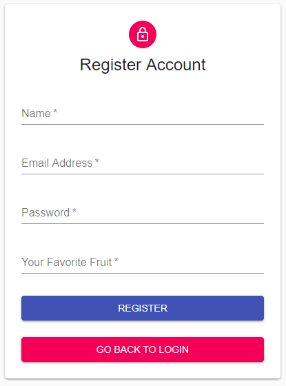
Setting The Router
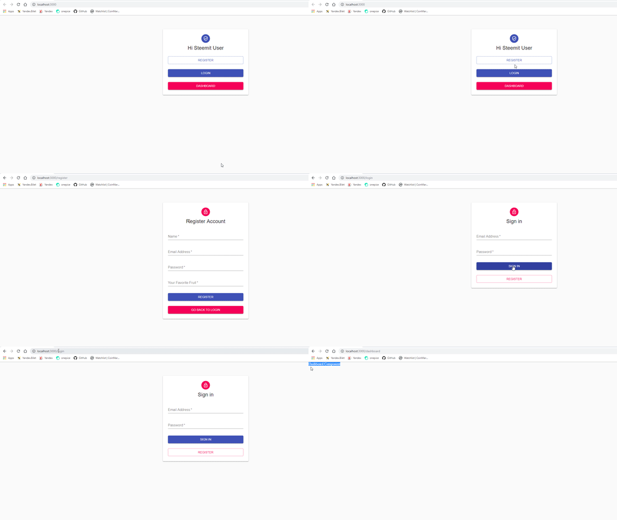
In the previous tutorial to we learn the necessary infrastructure to do the router. Thanks to this infrastructure, we can move from different pages to different pages.
We need the Link module included in the react-router-dom package to enable us to router. When the button is clicked we need to give this Link module to the component property so the button works like the a tag.
We also need the to attribute to do routing. We need to type the router address of the page to be directed to attribute. We defined these router addresses in the app function.
HomePage/Index.js
…
import { Link } from 'react-router-dom'
…
<Button
                    type="submit"
                    fullWidth
                    variant="outlined"
                    color="primary"
                    component={Link}
                    to="/register"
                    className={classes.submit}>
                    Register
                </Button>
                <Button
                    type="submit"
                    fullWidth
                    variant="contained"
                    color="primary"
                    component={Link}
                    to="/login"
                    className={classes.submit}>
                    Login
                </Button>
                <Button
                    type="submit"
                    fullWidth
                    variant="contained"
                    color="secondary"
                    component={Link}
                    to="/dashboard"
                    className={classes.submit}>
                    Dashboard
                </Button>
For register page and login page, we will use withRouter module included in react-router-dom package.
We cannot direct files other than the homepage using the Link module. We need to use withRouter mode for pages to be redirected within itself such as register and login pages and pages with export should be in withRouter.
Register/Index.js
…
import { Link, withRouter } from 'react-router-dom'
…
<Button
                        type="submit"
                        fullWidth
                        variant="contained"
                        color="secondary"
                        component={Link}
                        to="/login"
                        className={classes.submit}>
                        Go back to Login
                    </Button>
…
export default withRouter(withStyles(styles)(Register))
Login/Index.js
…
import { Link, withRouter } from 'react-router-dom'
…
<Button
                        type="submit"
                        fullWidth
                        variant="outlined"
                        color="secondary"
                        component={Link}
                        to="/register"
                        className={classes.submit}>
                        Register
                    </Button>
…
export default withRouter(withStyles(styles)(Login))
Use of useState
We can now use the useState property found in the reaction hooks.
useState has been created to eliminate the complexity of the state property found in the react. Because of this state confusion, they are usually formed by the redux structure when creating react applications. If we use useState we will not need redux structure and we will create our react applications very easily.
Let's use the useState in the login function and then explain.
First of all, we must import the useState module in the react packages.
Login/Index.js
import React,{useState} from 'react'
Then we must produce objects from the useState.
Login/Index.js
// I'm produce state using useState.
    // The second parameter that will keep the first parameter value will change the value.
    const [email, setEmail] = useState('')
    const [password, setPassword] = useState('')
When using useState, a two-parameter array is created. the first parameter is the variable that will hold the data, the second parameter allows you to update the object that will hold this data and the parameter of the useState function assigns the initial value to the variable that holds the data.
Login/Index.js
<FormControl margin="normal" required fullWidth>
                        <InputLabel htmlFor="email">Email Address</InputLabel>
                        {/* When the e-mail field is changed, setEmail will run and assign the e-mail to the value in the input. */}
                        <Input id="email" name="email" autoComplete="off" autoFocus value={email} onChange={e => setEmail(e.target.value)}  />
                    </FormControl>
                    <FormControl margin="normal" required fullWidth>
                        <InputLabel htmlFor="password">Password</InputLabel>
                        {/* When the password field is changed, setPAssword will run and assign the password to the value in the input. */}
                        <Input name="password" type="password" id="password" autoComplete="off" value={password} onChange={e => setPassword(e.target.value)}/>
                    </FormControl>
We have defined above how to use this useState in inputs. When the onChange event is triggered, we update the first parameter with the help of the second parameters of the useState array.
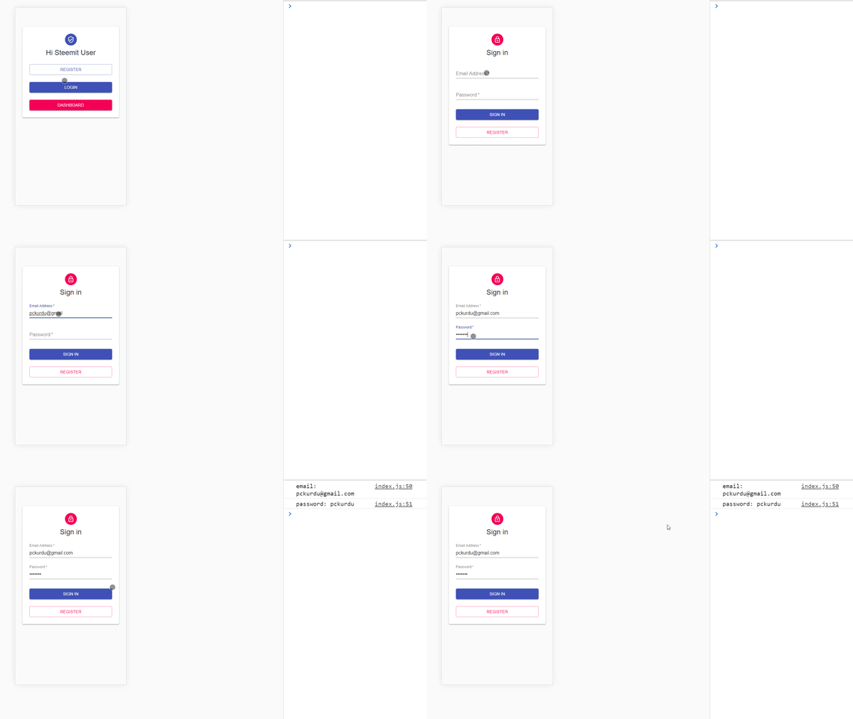
Let's capture the form submit event and show the objects in the console.
Login/Index.js
<form className={classes.form} onSubmit={onSubmit}>
…
//When the form is submitted it will run
    function onSubmit(e){
        e.preventDefault()//blocks the postback event of the page
        console.log('email: '+email)
        console.log('password: '+password)
    }
Thanks to e.preventDefault() we have blocked the default properties of the page. The page had a postback when the submit event occurred in the default properties of the page and this caused the data to be reset.
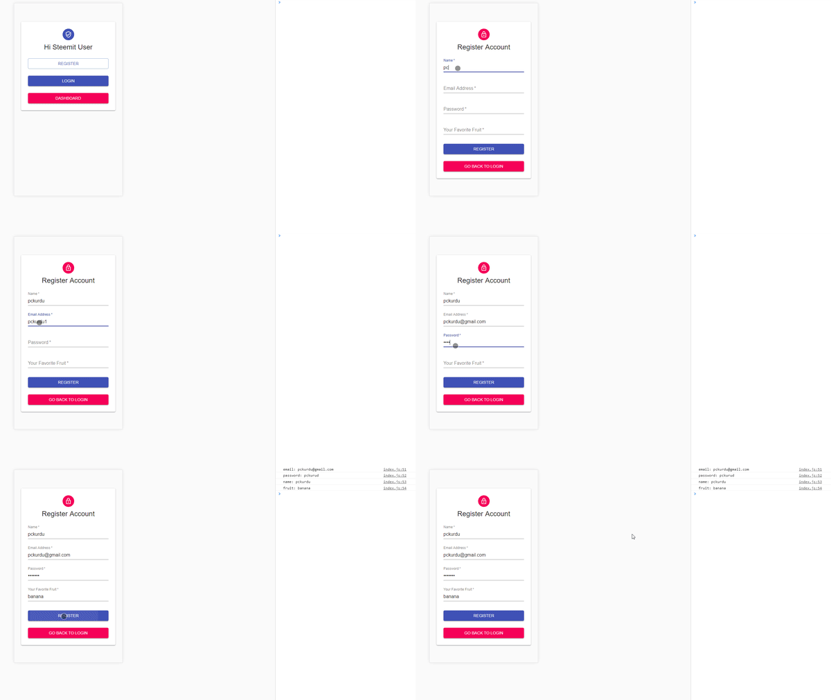
We should also apply these properties to the register page.
Register/Index.js
import React,{useState} from 'react'
…
// I'm produce state using useState.
    // The second parameter that will keep the first parameter value will change the value.
    const [email, setEmail] = useState('')
    const [password, setPassword] = useState('')
    const [name, setName] = useState('')
    const [fruit, setFruit] = useState('')

    //When the form is submitted it will run
    function onSubmit(e){
        e.preventDefault()//blocks the postback event of the page
        console.log('email: '+email)
        console.log('password: '+password)
        console.log('name: '+name)
        console.log('fruit: '+fruit)
    }
…
<form className={classes.form} onSubmit={onSubmit}>
…
<FormControl margin="normal" required fullWidth>
                        <InputLabel htmlFor="name">Name</InputLabel>
                        {/* When the name field is changed, setName will run and assign the name to the value in the input. */}
                        <Input id="name" name="name" autoComplete="off" autoFocus value={name} onChange={e => setName(e.target.value)}  />
                    </FormControl>
                    <FormControl margin="normal" required fullWidth>
                        <InputLabel htmlFor="email">Email Address</InputLabel>
                        {/* When the e-mail field is changed, setEmail will run and assign the e-mail to the value in the input. */}
                        <Input id="email" name="email" autoComplete="off" value={email} onChange={e => setEmail(e.target.value)}   />
                    </FormControl>
                    <FormControl margin="normal" required fullWidth>
                        <InputLabel htmlFor="password">Password</InputLabel>
                        {/* When the password field is changed, setPassword will run and assign the password to the value in the input. */}
                        <Input name="password" type="password" id="password" autoComplete="off" value={password} onChange={e => setPassword(e.target.value)}  />
                    </FormControl>
                    <FormControl margin="normal" required fullWidth>
                        <InputLabel htmlFor="fruit">Your Favorite Fruit</InputLabel>
                        {/* When the fruit field is changed, setFruit will run and assign the fruit to the value in the input. */}
                        <Input name="fruit" type="text" id="fruit" autoComplete="off" value={fruit} onChange={e => setFruit(e.target.value)}  />
                    </FormControl>
Curriculum
Proof of Work Done
https://github.com/pckurdu/Build-An-Application-With-React-Hooks-Material-UI-and-Firebase-Part2
Thank you for your contribution @pckurdu.
After analyzing your tutorial we suggest the following points:
Putting comments in the code is very important because it helps less experienced readers to better understand your code.
In your next tutorial put more innovative features. These features you presented are very basic.
Using GIFs to show results is definitely better than standard still images.
Your contribution has been evaluated according to Utopian policies and guidelines, as well as a predefined set of questions pertaining to the category.
To view those questions and the relevant answers related to your post, click here.
Need help? Chat with us on Discord.
[utopian-moderator]
Thank you for your comment @portugalcoin
The next tutorial will include innovations.
Thank you for your review, @portugalcoin! Keep up the good work!
Hey, @pckurdu!
Thanks for contributing on Utopian.
We’re already looking forward to your next contribution!
Get higher incentives and support Utopian.io!
Simply set @utopian.pay as a 5% (or higher) payout beneficiary on your contribution post (via SteemPlus or Steeditor).
Want to chat? Join us on Discord https://discord.gg/h52nFrV.
Vote for Utopian Witness!
Congratulations @pckurdu! You have completed the following achievement on the Steem blockchain and have been rewarded with new badge(s) :
Click here to view your Board
If you no longer want to receive notifications, reply to this comment with the word
STOPDo not miss the last post from @steemitboard:
Vote for @Steemitboard as a witness and get one more award and increased upvotes!