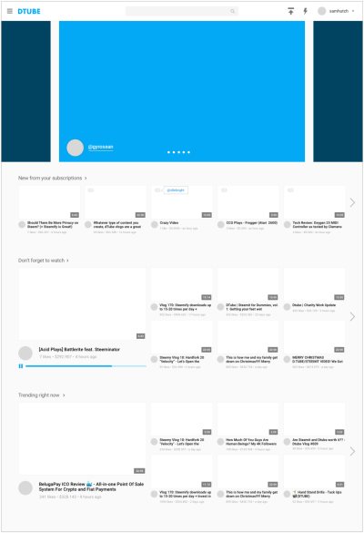
There are many reasons to love DTube. However, the thing that drew me in the most is its ability to remove the corporate middlemen between creators and their fans. DTube and other decentralized social media platforms have the opportunity to create strong communities where everyone can directly interact and contribute.
I am a user experience designer by education and trade. Since graduating from Parsons, I’ve been building startups for over four years now, focusing mainly on measuring and managing communities online and off. I’ve also done some live streaming and vlogging on YouTube. You can see why DTube excites me so much. I believe DTube has a lot of potential, especially with a little UX love!
This is the first of a series of UX redesigns and suggestions I plan to share. I decided to start with a logged in homepage because that’s an extremely important page for discovery when you enter the site. I am only focusing on the architecture and layout of the site, not the content itself.
The main challenge DTube currently faces is differentiating itself from YouTube in its experience and design. Though YouTube has attracted a huge audience, the interface does not directly translate for the new audience coming to the decentralized version. DTube needs to define their mission and attract the users they want by giving themselves a clear voice and optimizing their site for new users.
In my redesign, I took this all into consideration from the overall appearance to the choice to display likes. Below I will list out the suggestions more clearly and the thinking behind them –
1. Add in notifications
Most centralized social media platforms have some form of notifications integrated. This helps users see what’s important to them, who interacted with their content, and most of all, draws them back in and around the site. Without even having in-app notifications, I have no idea where to go, how well I’m doing, or if my friend has uploaded something new. This communication has to happen on other sites like steemd.com or direct communication with the person through centralized social media. A notifications feature would change the user’s experience drastically for the better.
2. Making iconography more clear (like upload in the main navigation)
The current upload icon implies that videos are uploaded to “the cloud” – a centrally controlled network of distributed storage nodes. However, DTube uses IPFS – “a peer-to-peer hypermedia protocol to make the web faster, safer, and more open”. (I’m a big fan.) I would avoid using iconography that doesn’t describe these new concepts fully to users who don’t know the details of how this all works. Give a new icon or simply just use an upload icon by itself.
3. Putting a D in the logo
It’s very clever to use shapes in logos, but it becomes a legibility problem. Also, it would help to differentiate themselves from YouTube more so people don’t expect a duplicate experience.
4. Cleaning up the site architecture (downplaying the settings)
The example I’m pulling from here is in the navigation, specifically the settings menu. It shouldn’t be necessary to access account settings daily for a user. Those interactions should be front and center through the rest of the site. For example, choosing your voting power can be integrated into the experience of upvoting during the moment someone performs that action (like on Busy.org).
5. Adding a featured section
DTube is very new and has very little content compared to its centralized competitors. I think adding a featured section where they can announce DTube updates and feature content that demonstrates what type of content they’d like their users to produce. The implementation could be as simple as pulling the user’s thumbnail and username, restyling, and posting the video for a set amount of time. Other users will be incentivized to produce similar quality content.
6. Giving the copy a voice
The copy on the site is very minimal, so every word that’s chosen is important. On the homepage, the website copy is the title for each of the sorted lists. Even changing “Subscribed Feed” to “New from your subscriptions” gives DTube a more casual and friendlier tone. Also, titles like “Hot” and “Trending” are too similar to differentiate easily for a first time user. For example, “Trending right now” provides a clearer idea of what type of content is being presented to them.
7. Personalizing lists to fit individuals
I’m sure this is a “coming soon” feature on DTube, but I wanted to point out the lack of personalization in discovery. YouTube is a search engine for videos, and if you’re going to be the decentralized version of this, then discovery needs to be a priority. Creating a “Don’t forget to watch” section that streams videos that other friends are watching or videos similar to the ones they’re interested in would continue the personalization of the subscription feed down the page.
8. Add a see all button to the lists
Though there is the option of scrolling through the lists horizontally, if there are hundreds of videos in that category, it is going to feel tedious to click that much. A simple solution for this is to add a “see all” button. In my design, I simply placed an arrow next to the title that would link to another page that shows the full list of each category.
9. Play with the hierarchy
True that equal sizes level the playing field, they aren’t the most dynamic content to scroll through. Adding variation to the sizes of the thumbnails would also lead the user’s eye down the page. In my design, I chose to enlarge the featured video at the beginning of lists give them an idea of what else might be available in that category.
10. Show me who reposted what content
I absolutely love the repost feature. The issue I’ve noticed is that I have no idea who reposted the content. I can see the original creator, but there’s no name when someone reposts. In my redesign, adding a hover state with a small popup of the reposter’s username (linkable to their profile) would help with this. You could also add it to the other metadata below the image.
11. Use the photo of the user who posted
This could actually work as a great addition instead of a replacement, but adding in the visual element of the creator’s profile photo would make the content more easily identifiable in the feed.
12. Add relevant metadata depending on the time
Voting for rewards only lasts for seven days, so showing the amount of money that a post has made becomes less relevant the longer it’s up. Users will definitely be searching for older existing content in the future, so displaying likes with value and then switching it to views with likes would make more sense for older content.
13. Draw them in with movement
The great thing about video (and gifs) is that it’s visually enticing based purely off movement. Testing a feature that allows for automatic video playback or hover states that show video previews would attract attention to certain videos and help convince the user to click. My design suggests a rotating automatic play feature, similar to how Facebook automatically plays videos for you in your feed (with the sound off of course), but this one would rotate through the videos as each one finishes, providing new content and higher discoverability.
...
There’s a lot more I wanted to do with the homepage, like go into the navigation, but I’ll save that for another post. :)
To view my proof of work, you can check out my DTube review video, the sketch file, and the screenshots below. I’ve also provided a full vector copy of the DTube homepage in the sketch file for those who want to play around with the original.
Thank you!
...
Proof of Work
Sketch file downloadable here
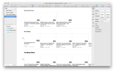
A vector recreation of the current DTube homepage
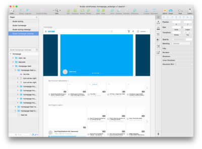
My complete redesign - taking from my recreation of the original site
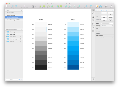
Color palette for my redesign
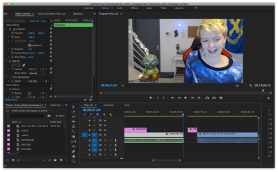
Video review of DTube on DTube (see here:
Posted on Utopian.io - Rewarding Open Source Contributors
Pretty flipping excellent amount of work here :)
I'm not sure what category you submitted the contribution as but you may get asked to move it - perhaps to 'Idea' to start with.
You have enough here though to warrant pushing it through other categories as part of a project though I think.
Hope you get some support for this,
Great job!
I love Utopian and appreciate how much has been done for this early stage project in such a short amount of time. But, it seems to me like the lack of a dedicated UX category, maybe as a child of a broader Design parent category (with UI, Graphic Design, Motion / Animation, and 3d as other coherent child categories) is an important oversight
That's the beauty of open source projects, though. If someone like me thinks that a project is missing a key piece or could use a UX redesign, I have a wide array of options to support it becoming real. I can delegate more Steem to Utopian, write up a contribution to the GitHub repo I post through Utopian myself, get active on the Utopian Discord, or eagerly await / upvote / share the contributions made by others (like @samhutch above)
Looking forward to seeing her share her design perspective on Utopian.io :)
Absolutely agree, and think this comment could be expanded on into a 'Blog' post for utopian also 😁
Perhaps you could write a suggestion to add another category for broader ui design also?
@abh12345 I was thinking the same thing. I'm working on a video about Byzantine Consensus for DTube today, but if I get done early I might just make the UX category suggestion into my first Utopian contribution – although, @samhutch would have some great things to say about that too
Thank you for the contribution. It has been approved.
You can contact us on Discord.
[utopian-moderator]
Hey @samhutch I am @utopian-io. I have just upvoted you!
Achievements
Suggestions
Get Noticed!
Community-Driven Witness!
I am the first and only Steem Community-Driven Witness. Participate on Discord. Lets GROW TOGETHER!
Up-vote this comment to grow my power and help Open Source contributions like this one. Want to chat? Join me on Discord https://discord.gg/Pc8HG9x