The mobile view is actually not quite there yet, the first draft that I send @chiren is ok but there are some issues still... what's that? Quarantine probably getting prolonged? you're in luck boys, I'll get to it 😎
EDIT:
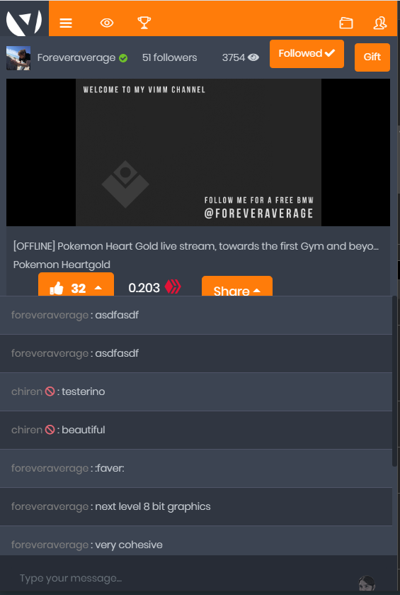
What it looks like now for me:

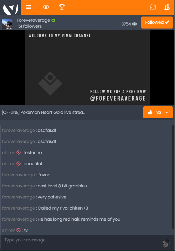
What it looks like with my new stylesheet:

Back to the basics where the 3 important things catch your attention again:
- Live stream
- Chat
- Rewarding streamers
All the rest that works on a desktop is doing more harm than good by taking away the attention from the things that should matter (I recommend reading some of Steve krugs books for those interested)
The upvote and follow button is something I'm not sure of either on mobile view, due to their size and the color difference they take quite a lot attention from the chat and live stream, after all it's the quality of the stream and chat that should invoke an upvote from the users and now the attention is taken away from the stream and chat beacause of the current design. Maybe look into hiding the follow button and making the upvote button a bit less obvious? I am sure going a few percentages less on the upvote button isn't going to harm it's usability
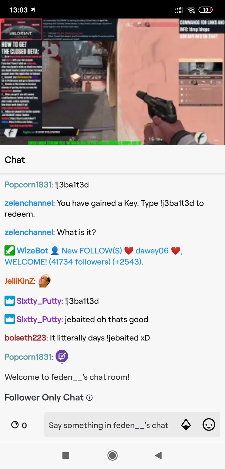
For a last note, with all the usability and gui experts that Amazon has, the thousands of options Twitch provides and the resources available there's most likely a very good reason why their mobile app is as clean as possible and focuses only on the primary functions
