The Puzzle Nebula
The Puzzle Nebula game is a take on traditional memory games. It’s most recognizable as “Simon Says”. With the emergence of virtual reality (VR) as an interactive platform, the memory game could be more than just a simple puzzle. It’s an opportunity to launch the game into a new universe. One where daily distractions are replaced by impossible experiences.
The Process
The main goal with Puzzle Nebula was to create a simple game that was easily understandable and accessible by non-VR users.
I wanted to minimize the amount of “viewer education” that needed to happen. With this in mind, I went with a familiar game and a simple layout. I did end up polishing the environment so that a new-to-VR user would have a “WOW” moment and get a taste of what VR could offer.
The Persona (Who is the intended user?)
The Puzzle Nebula is designed to be someones first VR experience. With that in mind, I designed it for…
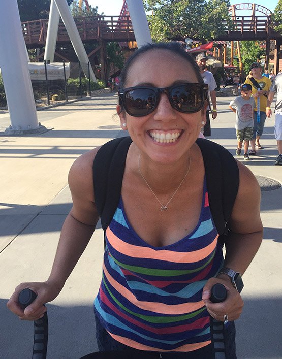
Crystal, 37 – Event Planner, Mom
“I don’t have much time between work and being a mom. But when my son goes to sleep, I like to de-stress with puzzles”
VR Level: Newbie
Design
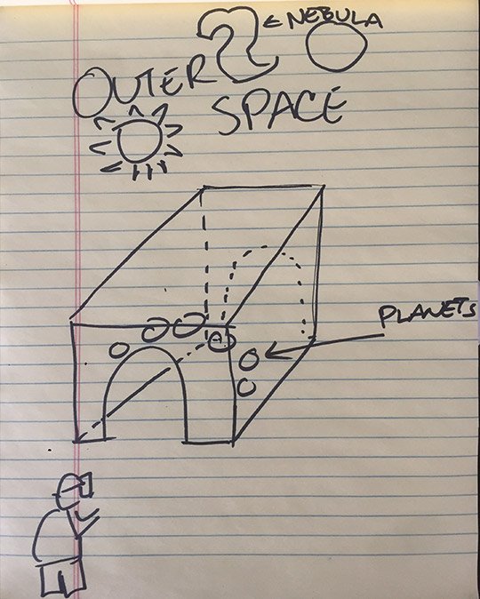
The original idea was to have a building set in outer space. Inside the building would be 5 orbs, textured as planets.
The orbs would light up a pattern that the user had to remember and repeat. They'd active the orbs by highlighting with the reticule and clicking with their finger.
Initial Sketch
The Puzzle Nebula App Development
The first version of the environment was built using the assets provided in the Udacity Class kit.
• The front half of the room was built and then copied and flipped to make the back. We’ll see from user testing, that this wasn’t enough space, so a middle section had to be added.
• The room was dressed with barrels and torches from the Udacity Kit. Each torch was given its own point light to make it seem like a flame was there.
• The orbs were placed in the room and the Game Logic was added to them. Later the orbs would be textured, scaled, tilted, and animated to be like those in our solar system.
• The skybox was given a “nebula” texture to give the user a feeling of being in outer space.
• The start and finish signs were created and added to the Game Logic
• The camera was placed in its “Start”, “Play”, and “Finish” positions and the GVR script was implemented.
User Test 1
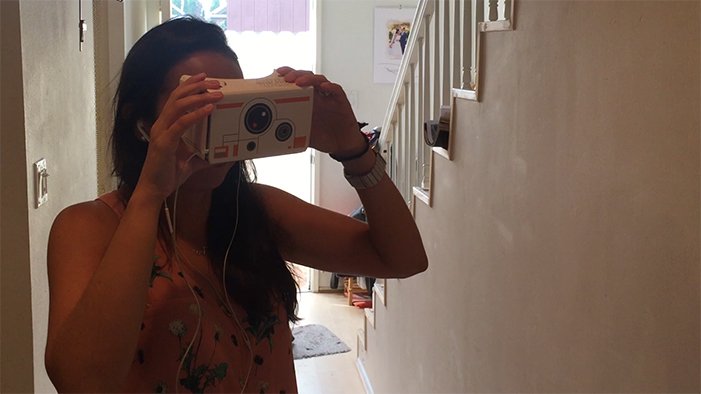
User test feedback
• The sky is pretty. I’m in outer space!
• I feel short. Am I a Hobbit or something?
• Everything’s so cramped.
• The start and finish signs are too close to me
• The room is too small.
• I couldn’t see all the orbs at the same time
• Were they supposed to be so dark?
• Why is there no ground?
User Test Outcome:
It was clear after the first user test that some scaling and camera positioning need adjusting. There was also an issue with the lighting on the orbs/planets.
Changes Made:
• Made the room longer to allow all the planets to be seen at the same time.
• Brought the camera up a bit to more closely match human height.
• Adjusted the distance between the camera and the start and finished signs.
• Added a ground plane with a grass texture
• Created layers so that I could light each planet individually.
• Scaled, tilted, and animated rotation of the planets to resemble their natural scale, tilt and rotation.
User Test 2
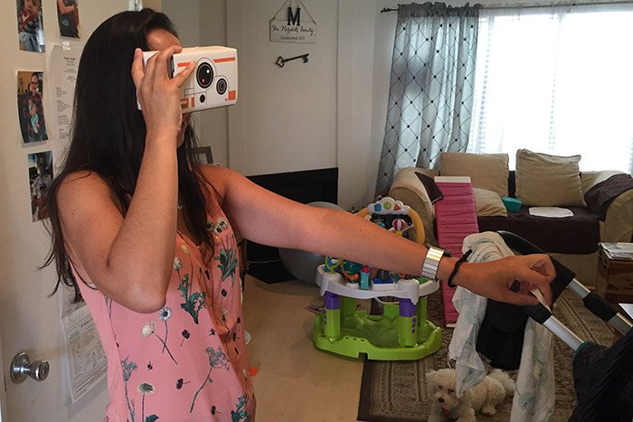
This time the user felt more comfortable in the environment. She commented that “The planets look so cool.” She said that “the game was tough” and that she “had a bad memory.”
Breakdown of Final Piece
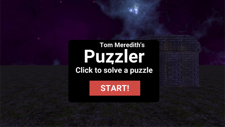
The Start Area
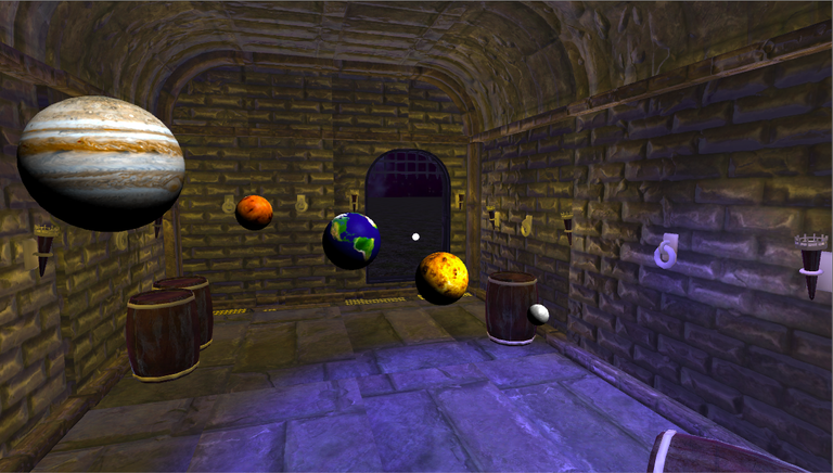
The Game Area
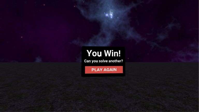
The End Area
Conclusion
Though simple, the VR game served its purpose. The game was recognizable and understandable by someone who hadn’t experienced VR before. I think they were also intrigued by what other VR experiences they could experience in the future.